#TransformTuesday: 9 July
Every week, Transform examines recent rebrands and updated visual identities. This week's picks are below. For more from #TransformTuesday, follow @Transformsays
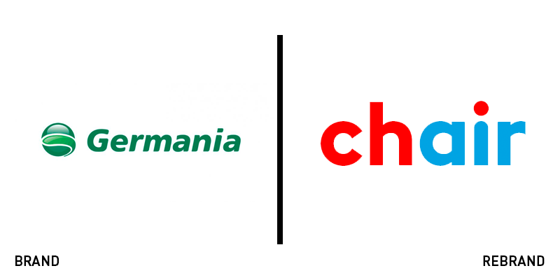
Chair Airlines
Swiss brand consultancy Branders took on the redesign of Swiss Germania Airlines, which flew out on its own after its German parent company went bankrupt. The newly named Chair Airlines is a play on words, using the English word ‘chair’ to represent Switzerland – through its typical digital abbreviation of ‘CH’ for ‘confederation Helvetica’ – and its purpose, through the word ‘air.’ The brand was designed to evoke the sense of Chair being a young, untethered and independent airline capable of confidence in the sky and a dynamic spirit. Key to the brand’s success was the design not taking itself too seriously, according to Branders. And the result is capable at achieving that tone. It’s friendly without being cheeky in terms of its tone of voice, bright without being overwhelming in its visual identity and distinctive without zaniness in its colour palette and typography.
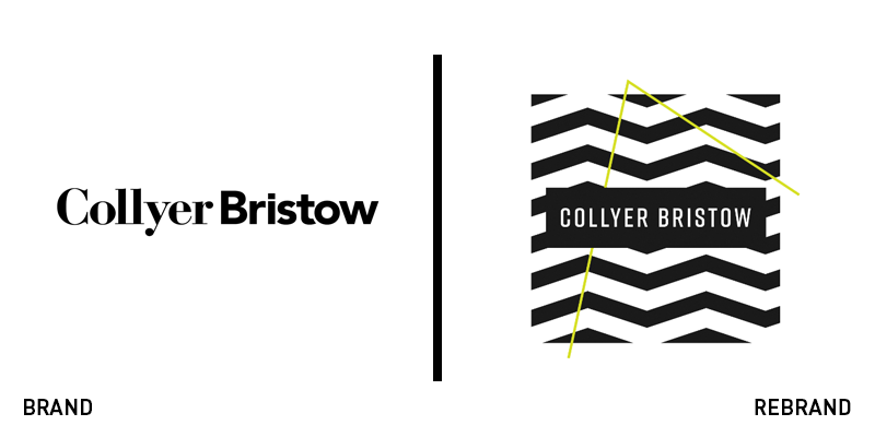
Collyer Bristow
With a commitment to working in a tailored way, developing solutions to fit the problems clients face, law firm Collyer Bristol needed a brand that would represent its personality. It turned to Bath-based consultancy realityhouse for a lively and communications-focused solution. Using research into its sector and brand, the firm found that it was perceived as having a hands-on personalised and collaborative approach, making its existing brand, a static, sector-clichéd wordmark fall short of the mark. The new identity is based on monochrome patterns with a bright citron green accent colour. The patterned logos can be used in different formats and to differentiate the firm’s work. The brand was also developed to include elements that could be deployed depending on the situation and the audience, allowing the firm to reach its clients in different sectors in the ways in which they want to be communicated with. The result is a unique approach for a sector often mired in traditional tropes and staid photography.
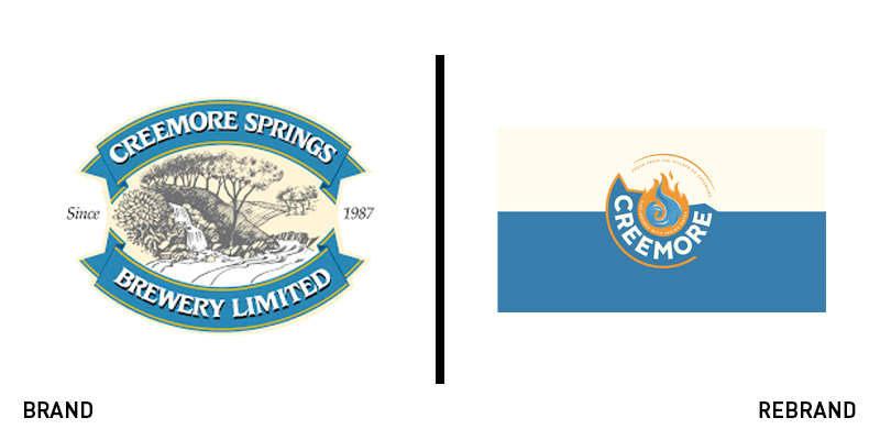
Creemore
The success of craft breweries has depended to some extent on their ability to introduce a point of differentiation into the recipe or the packaging itself. Canadian brewer Creemore has done that with a BrandOpus-developed rebrand. The brewing process for the 32 year-old brand integrates fire and water, lending the beer a distinctive flavour. BrandOpus focused on these elements in its brand redevelopment, while maintaining the brewery’s connections to its small-town spirit. Kim Dunphy, creative director at BrandOpus says, “Our aim was to showcase Creemore as an advocate for inspirational ventures. Not wanting to lose what’s special about Creemore the place and its strong sense of community, we visited the town of Creemore, felt their spirit and saw first-hand how important the brewery is to its community. The new visual identity and brand narrative now reflects their passion and uniqueness and stays true to years of brewery history.” The resulting visual identity retains the brand’s colour palette, but adds a fiery red-orange and reimagines the wordmark into a more contemporary, eye-catching design.
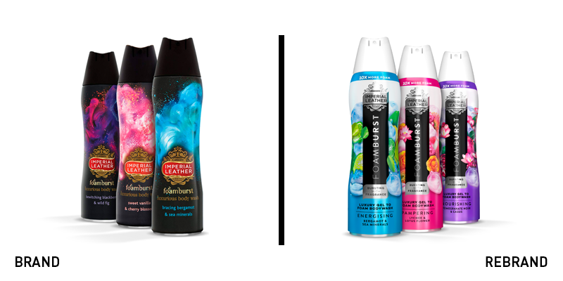
Imperial Leather Foamburst
Challenging perceptions in a competitive category with a heritage brand can be a difficult task for brand designers. That was what PB Creative was tasked with when redesigning the Imperial Leather Foamburst range of body wash. The agency focused on the way the product is used and its point of differentiation in that respect, rather than on its ingredients – like many of its competitors. The new packs however, do reference Foamburst’s ongoing commitment to indulgent fragrances and bold sensations, using explosive imagery to create a rich collage for the senses. The brand has also introduced a new wordmark that focuses on Foamburst itself, not just the Imperial Leather brand. This – along with the transition from a black bottle to a white one – helps give the range its own identity. Caroline Reynolds, global head of brand at Imperial Leather, says, “PB Creative has reawakened this iconic product and now there’s no mistaking that it’s all about a unique, luxurious, sensorial showering experience. We’re looking forward to cementing our position with consumers new and old and seeing the brand thrive as we develop it further with the new brand lock-up at its heart.”
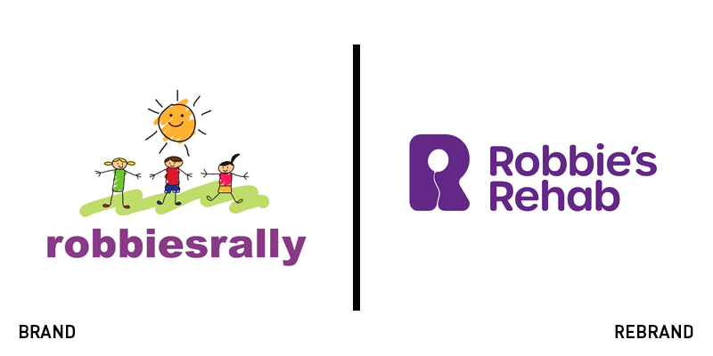
Robbie’s Rehab
Robbie’s Rehab – once known as robbiesrally– is a charity that supports children with cancer following their courses of radiation or chemotherapy. It was founded by a family, following the death of their child, Robbie, from a brain tumour. To improve the brand’s reach and support its growth, the charity worked with London-based Designhouse to update its brand. Retaining the original purple and sense of childlike play, the new visual identity uses a bubbly R logo to establish its brand architecture. Inset in the white space in the R are different images, like a balloon in the primary logo, or a trumpet, a shoe or a checkered flag, for various sub-brands. The balloon is used to commemorate Robbie as his classmates do each year when they meet and release a purple balloon in his memory. Mark Keville, Robbie’s father and founder of Robbie’s Rehab, says,
“The time is now right for us to update our existing logo so that it is more ownable and specific to us, as we step up our fundraising efforts to establish Robbie’s Rehab as an indispensable service. In this way, we will be able in due course to establish Robbie’s Rehab as an NHS-funded service across the south. As we grow, we need an identity that stays true to Robbie’s original vision and reflects our key aim of rehabilitation, helping get children who have suffered brain tumours back to normal, happy lives post treatment.”


