#TransformTuesday: 4 June
Every week, Transform examines recent rebrands and updated visual identities. This week's picks are below. For more from #TransformTuesday, follow @Transformsays
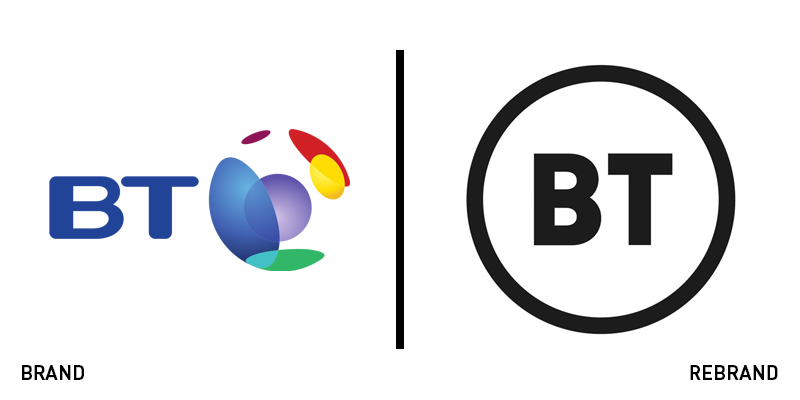
BT
Loved, hated, admired, reviled, misunderstood, the perhaps unintentionally introduced BT logo has been the recipient of the full range of emotion. But, love it or hate it, its true value is in showcasing the challenges related to brand implementation in a modern world. First noticed in a trade mark application filed on 15 May, the logo is a simple, monochrome rendering of the company’s initials. So far, it has only been deployed across TV applications, with BT’s other properties unaffected. However, speculation indicates the rebrand may roll out officially from August. BT’s logo acts as a warning to other companies working on rebrands, though, of the power of a brand update without context. A rebrand relies on far more than a new logo to make it effective, and a large part of that is the communication – with employees and external audiences – surrounding the rebrand, the visual identity in context and the positioning and strategy behind the change. Without this, brands are open to risk and criticism that might not be warranted. Therefore while this logo reflects a change for the BT Group, it is not a rebrand, not yet at least, and offers to companies the classic advice of ensuring a new brand’s launch runs as smoothly as possible.
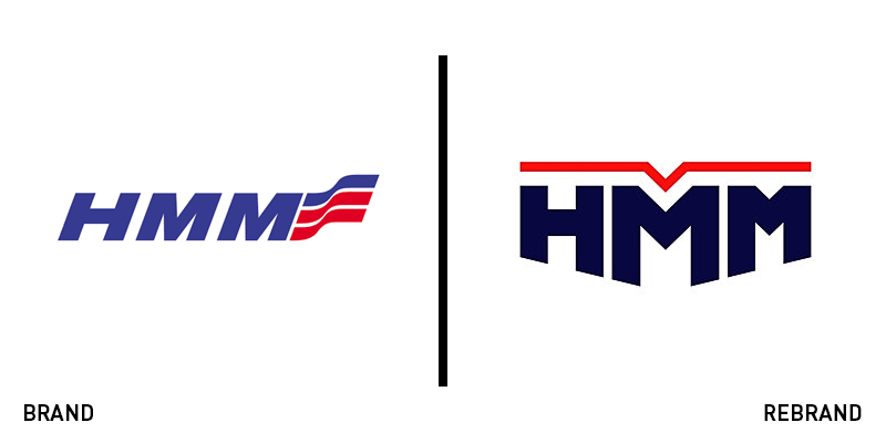
HMM
Drawing inspiration from the shape of a ship’s bow traversing the seas, the new branding for the HMM – formerly known as the Hyundai Merchant Marine – is sharp, distinctly naval and more aligned to the Korean flag’s rich hues. Replacing a logo with a streaming red and blue banner following the second ‘M,’ the updated logo is sharper. HMM CEO Jae-hoon Bae said on the launch, “It is memorable and meaningful for HMM to introduce its new CI today, which is expected to elevate the brand equity and value of the company.” The brand was put under the control of the Korea Development Bank in 2016 following its split from the wider Hyundai Group. HMM is one of the biggest shipping brands in the world, transporting most of South Korea’s exports. The company was founded in 1976 with three tankers. Now, it runs over 100 vessels across dozens of offices around the world.
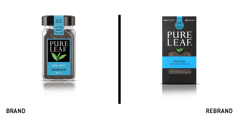
Pure Leaf
Operating in the saturated tea market requires brands to have a distinctive proposition, allowing them to stand out on shelf and in the minds of consumers. Pure Leaf, which focuses on traditional practices, sustainability and excellence in flavour, had a strong proposition, but needed a clearer packaging solution to connect the brand’s values to its products. It turned to London-based brand agency PB Creative for a refreshed visual identity. The agency found that Pure Leaf’s unique philosophy and the stories of its teas’ provenance were difficult to find on the pack. PB Creative focused on communicating those key points and securing the brand’s visual identity more firmly with category-defying black packs. Lloyd Moffat, creative director at PB Creative, says, “Building on the story of provenance and everyday premium quality was key to this brand redesign. Pure Leaf wanted to celebrate its story and the amazing quality of its products, which proved fundamental to our new look. We set out to achieve greater brand clarity and stand-out, and the results have an elegant, high-end look and feel.” The new packs are also more sustainable and allow for the brand architecture-defining colours more vividly on pack.
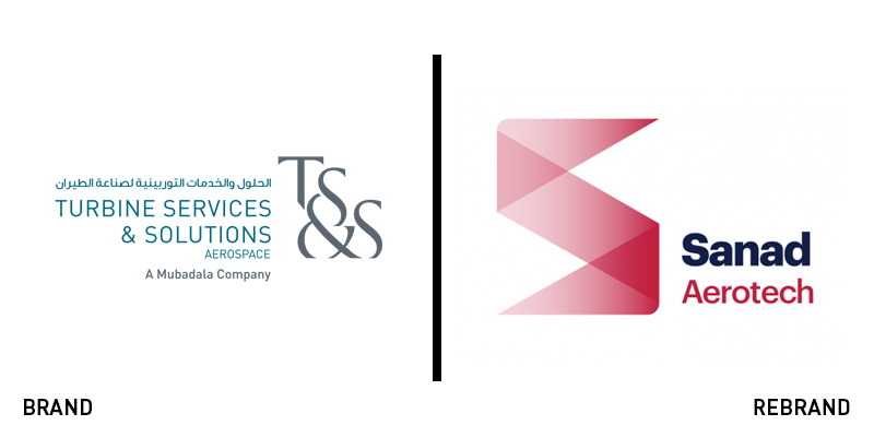
Sanad Aerotech
Owned by government-run Mubadala Investments, the aerospace arm of the company, formerly known as Turbine Services & Solutions has unveiled a new brand. The change also includes a new name, Sanad Aerospace. In Arabic, ‘sanad’ means ‘support,’ a fitting name then, for a brand built on decades of support for the aerospace industry. Operating out of the Abu Dhabi International Airport, Sanad provides services to global airlines and the oil and gas industry. Its previous brand was decidedly uncharacteristic. It fit aptly within the Mubadala corporate umbrella, but its lengthy name and awkward wordmark weren’t capable of communicating across multiple platforms. The new brand introduces an updated colour palette of complementary primary colours navy and carmine red. The brand also introduces a new logo with a strong ’S’ icon and a simplified wordmark in a sans serif typeface. The overall result allows Sanad Aerotech its own unique identity separate from its parent brand.
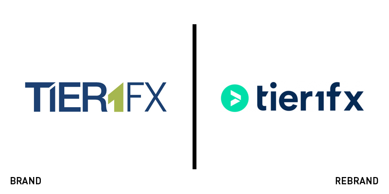
Tier1FX
Aiming to disrupt the foreign exchange model with professional, characterful branding, Tier1FX is eschewing both the overly familiar and institutionally dull approaches to brand design common in the sector. Working with Spanish agency Creatique, the forex brand redefined its long-term strategy, positioning and messaging. With new values including ‘boldness,’ and ‘agility,’ Tier1FX is communicating in a different way, leaving behind its functionality-oriented messaging. It has also dropped an uninspired visual identity full of stock imagery and a complicated online user experience. Creatique drafted a bespoke wordmark with clearer ties to the company’s sub-brands, refreshed the colour palette and transformed the company’s online profile with stronger imagery, clearer navigation and more engaging content. “Our product is 100% digital and our website is its showcase,” says Tier1FX director and COO Albert Galera. “We must take care of our online identity to the detail.” The new approach, he says is more professional, modern, simple and agile, offering the brand a strong positioning on which to build its future.


