#TransformTuesday: 30 April
Every week, Transform examines recent rebrands and updated visual identities. This week's picks are below. For more from #TransformTuesday, follow @Transformsays
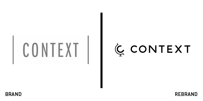
Context Travel
Context travel specialises in uniting tourists with local guides and experts, building connections across cultures. It focuses on walking tours and city tours, using its website as its primary communications platform. Evan Frank, CEO of Context Travel, says, “We knew we had a great reputation and a solid business, but we needed to elevate our brand and positioning and communicate better across our digital channels to position ourselves for growth.” The company turned to Studio Rodrigo to build brand loyalty through a consistent brand. Focusing on ‘curious’ travellers, the new website premiumises Context’s offer while ensuring a more seamless digital experience. The introduction of a globe-inspired logo and warm-toned colour palette helps the brand showcase the destinations and experiences available through its platform.
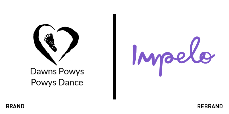
Impelo
Inspiring people to take up a new form of exercise or hobby can be difficult, but that was the vision behind Powys Dance, a Welsh charity that facilitates people exploring dance experiences. Having taken on charity status in 2015, the organisation began working with Cardiff’s Clout Branding to support its new strategy and plans for growth. The previous brand featured a typical charity logo with a minimal colour palette that didn’t have enough flexibility for a modern, digital audience. Clout’s solution was to channel the team’s ambition and creativity to redevelop the brand and its name. The result is Impelo – a moniker that evokes the word ‘impulse,’ lending a sense of momentum to the brand. Visually, Clout introduced a disruptive identity and tone of voice that allowed for the organisation to have more active messaging and communications. The new colour palette uses a vivid lilac alongside coral, bright pink, yellow and grass green to tell a deeper story about the power of dance and the opportunities available through Impelo. It also introduced more modern, Gen-Z-friendly icons like images of planets and disco balls, dancing people and confetti bursts.
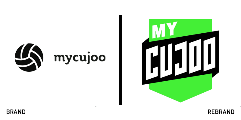
MyCujoo
Football is maybe the world’s most popular sport, with matches taking place on every continent and through massive national or international broadcasts. But, MyCujoo was set up to showcase grassroots football forgotten by broadcast media. It has built a massive global community, but its original brand was too rigid to facilitate its growth. MyCujoo worked with London-based agency We Launch to update its visual identity and positioning. We Launch introduced a bespoke typeface and introduced a bright, vibrant grassy green as the main colour. It developed a shield icon for the main logo, echoing the shields favoured by football teams worldwide. “The focus on distinctive assets aligned with flexibility to allow us to keep a creative edge was vitally important, and We Launch have provided us with a brand fit for the future,” says David Fowler, director of marketing at MyCujoo. The patterns introduced with the new brand help content curators to craft the platform they want and to build their community around a shared passion for the sport.
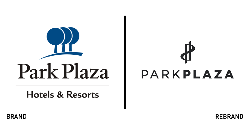
Park Plaza
Underpinned by three values – authentic service, contemporary spirit and local hotspots – Park Plaza has updated its brand to reaffirm its commitment to guest experience. The hotel brand, owned by the Radisson hotel Group and PPHE Hotel Group also released a new strapline, ‘Feel the authentic.’ Boris Ivesha, president & CEO at PPHE Hotel Group says, “Following the full transformation and repositioning of our portfolio in recent years, we are excited to unveil an enhanced brand identity for Park Plaza that further enables us to create unique experiences for guests and offer asset value to our investors. The new visual identity and logo complement the brand’s growth and represents the contemporary and sophisticated properties that are part of the estate.” The updated logo does offer something new to consumers, as it evokes a sense of luxury and calm that its previous trio of trees did not express.
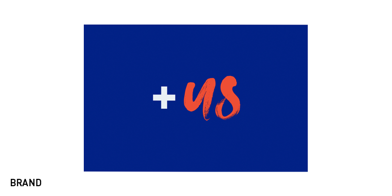
+Us
The UK’s National Health Service (NHS) relies on a massive workforce, often using temporary or contracted employees. To address this large community, the NHS worked with brand agency True North to develop a new brand that would communicate with its workforce customers. The resulting brand +Us communicates the commitment to treating every customer as an equal. Flexibility has been built into the brand so that it can provide solutions for complex situations in the demanding environment of the health service. Visually, the +Us logo is rendered in a paintbrush-like script and can be added onto other NHS wordmarks or words like ‘meticulous,’ which end in ‘us.’ The result, with bright colours and portrait photography, is striking and unites both a handcrafted quality – representing the NHS’ workforce – with a professional sense of care.
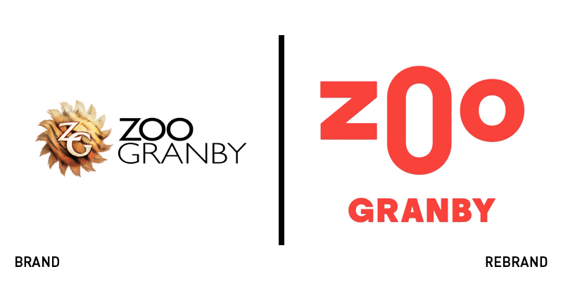
Zoo de Granby
Animals come in all shapes, sizes and colours. Now, so does the branding for Quebec’s Zoo de Granby. The zoo, which had little in the way of branding, worked with Montreal’s creative studio lg2 to put forward a new face. The agency capitalised on a simple notion – the faces of every animal – to develop a brand that is constantly changing, colourful and identifiable. The primary logo, with an elongated middle ‘O’ evoking the sense of a nose, is supported by multiple iterations that put the three letters in different configurations atop colourful patterns. For one, a giraffe’s patterned coat acts as the backdrop for the word ‘Zoo’ positioned to look like the giraffe’s long face. The elephant treatment has a super-elongated middle ‘O’ representing the animal’s trunk. It’s a fun, deceptively simple, yet creative treatment for a zoo brand that “perfectly encapsulates and unifies this mission with its modernity and dynamism, boldly launching a new era for the Zoo de Granby,” says Élaine Plamondon, sales director of marketing and communications at Zoo de Granby.


