#TransformTuesday: 23 July
Every week, Transform examines recent rebrands and updated visual identities. This week's picks are below. For more from #TransformTuesday, follow @Transformsays
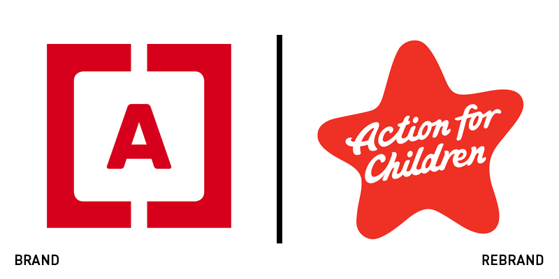
Action for Children
Celebrating its 150th anniversary, Action for Children turned to ArthurSteenHorneAdamson (ASHA) to update its brand. To better communicate the work it does to support families across the UK, ASHA focused on the theme of family as the idea behind the brand’s positioning. “It’s a simple statement of truth that expresses the essence of who they are and how they work. This sense of family permeates throughout the organisation through its staff and all its services. It’s unique to the organisation. It’s what sets Action for Children apart. This concept was the foundation for the creation of a distinctive tone of voice, a series of defining brand principles, the new brand signature and icon,” says Marksteen Adamson, founding partner of ASHA. An updated tone of voice infuses the brand with warmth and the flexibility to communicate with all of the brand’s audiences. The brand architecture was addressed as well as the visual identity, which deploys a child-friendly star logo and relaxed typeface. The primary colour palette of red and white has been retained.
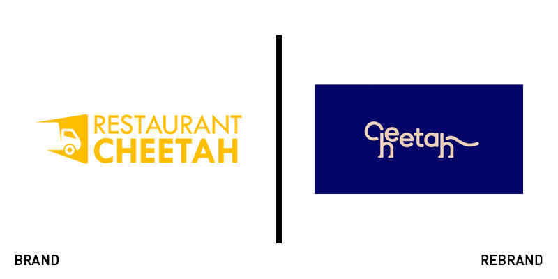
Cheetah
Channelling the spirit of its namesake, Cheetah works with restaurants to provide simpler, more efficient distribution and supply ordering. But, the brand’s serviceable brand wasn’t allowing it to own its brand positioning and support its growth. It turned to global consultancy Moving Brands to update its brand and positioning. The new wordmark is playful, evoking the shape of a cheetah in the beige slab serif typeface of the Cheetah brand name. When animated, this characteristic becomes even more emphasised. But it stays just on the right side of too quirky, adding a level of personality without detracting from the brand’s professionalism. Moving Brands introduced a set of graphics to communicate easily with people for whom English might not be their native language. The design takes inspiration from paper cut outs, eschewing the currently popular ‘animated faceless man’ illustrations. Cheetah says the new brand, “embodies the spirit of our company and vision of the new world we are creating for independent business owners.”
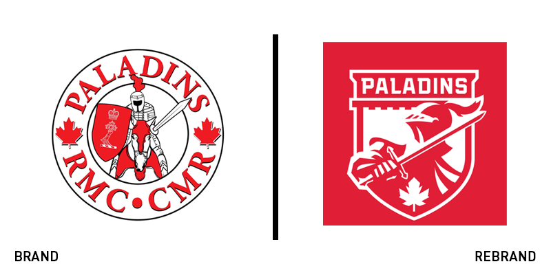
Royal Military College of Canada Paladins
Paladins were the nights of Charlemagne’s court, using the French word for ‘warrior.’ At the Royal Military College of Canada, it’s more than apt as a team name for the university’s athletics programme. But, a badge-shaped logo with a charging medieval knight didn’t have the ability to represent the elite institution’s teams, particularly across digital touchpoints. The new logo is modern and striking, reinventing the paladin itself in a strong, confident form. The paladin is set upon the RMC Memorial Arch, one of the campus’ primary landmarks. The shield, sword and maple leaf all allude to the RMC’s mission in the national defence of Canada. Well-received so far across social media, the new brand should provide a recognisable, ownable new symbol for the RMC’s teams. The uniforms were manufactured by TRI³ Hardgear.
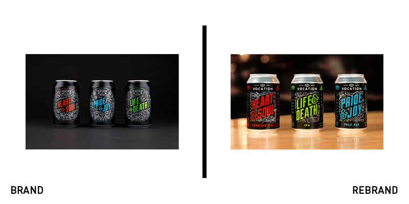
Vocation Brewery
Brand agency Robot Food, which has worked with Vocation Brewery since 2015, has updated the previous edition of the brewery’s branding to support the company’s success. As a sector, craft brewing has required brands to have a certain agility, an appreciation of the power of design and social savvy in order to succeed. Vocation, which has done so has also seen its brand stocked in more mainstream stores and on-trade locations. However, it wanted to ensure its story and heritage were still communicated on pack. Working with Robot Food, the brand has been updated to include a new brand architecture, stronger wordmark and more impact on shelf. “For the core range, we harked back to Vocation’s humble beginnings and printed the look of the label straight onto the cans. We simplified the flavourful illustrations, drawing attention to the product names of Vocation’s signature, punchy brews,” says Chris Shuttleworth, senior designer at Robot Food. The update frees the label’s illustrations from the confines of a circular shape, allowing them to flow across the pack.


