#TransformTuesday: 20 August
Every week, Transform examines recent rebrands and updated visual identities. This week's picks are below. For more from #TransformTuesday, follow @Transformsays
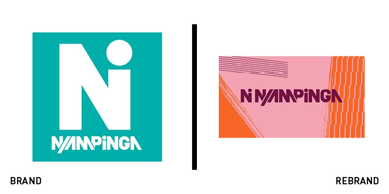
Ni Nyampinga
A Rwandan movement part of the Girl Effect non-profit, Ni Nyampinga seeks to give Rwandans the confidence and support needed to thrive economically and physically. But, its youth-oriented brand posed problems for the analog-native organisation. It turned to London-based Studio Output to digitise its magazine and brand, making it more friendly for digital-first young people. While the brand had to retain its existing users and awareness, it also had to appeal to new young women. One of the first things addressed was the colour palette, which had performed well in print, but failed to achieve the same success on digital. Each of the new colours – from a cherry red to a sunshine yellow – was rooted in Rwandan artwork or cultural heritage. Then, the agency introduced a variety of imagery offering four different styles for use across the visual identity, allowing Ni Nyampinga the flexibility to tell different kinds of stories while maintaining brand consistency. “Output’s work will play a significant role in the continued expansion of the Ni Nyampinga brand. The team were flexible in approach, accommodating of our investment level and committed to help move our brand forwards in the most appropriate way,” says Emma Roscoe, head of network and content at Girl Effect.
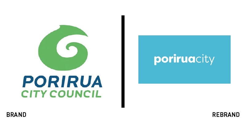
Porirua City Council
A city’s rebrand is alway a risk. Residents and business owners with strong connections to the community are often the first critics of a change in brand. The much maligned – and swiftly reversed – city of Vancouver rebrand is a prime example. But, if the communications around the rebrand are capable, the rebrand should succeed in finding support. Porirua City Council's previous brand that was uninspired, featuring a blue and green wordmark with a Maori symbol in green, reflecting the revered pounamu stone tradition. The city on the North Island of New Zealand didn't have a lot to offer in terms of brand distinctiveness. But now, it has released a new brand, which includes social media avatars of a simple lime green circle with a blue, hand-drawn smiley face. Controversy, however, has abounded as onlookers perceived the smiley as the new logo. Porirua has attempted to clarify that the smiley is simply its social avatar, and not its official one at that, by breaking down costs and myths in a recent blog post. “Our brand reflects our city, uses friendly welcoming language, colours from our natural environment, bilingual signs, inclusive first person images, user-friendly websites and is consistent and recognisable across the city. Our brand is strong, authentic and realistic,” the post says. The visual identity itself is a much cleaner update, offering more flexibility across digital and gives Porirura a more ownable brand. The wordmark is now rendered in lowercase white and can be deployed atop photos, in web applications and on signage.
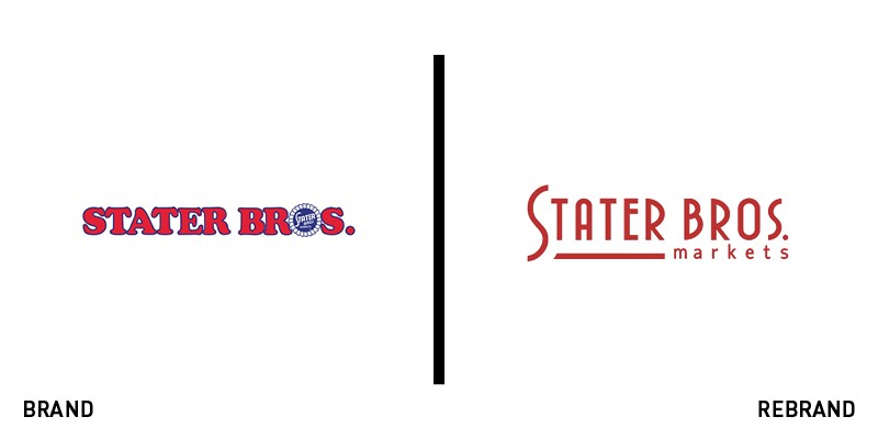
Stater Bros. Markets
With over eight decades of business behind it, California supermarket chain Stater Bros. Markets has unveiled a new beginning at the start of its 83rd year. The new brand was announced in a YouTube video on 13 August alongside the reopening of three southern California stores. “We’re making a lot of great changes, but our commitment to community, service and great value has stayed the same. If you haven’t seen us lately, you haven’t seen us at all.” The new brand gives the wordmark a much-needed update from a 1970s version of the logo that featured a blue ribbon device in the ‘O.’ The new look harks back to the original Art Deco inspired look. The updated brand includes a redevelopment of some of the spaces within the markets themselves, with the introduction of sushi counters, reimagined bakery and deli sections and a fresh fruit bar, to name a few.
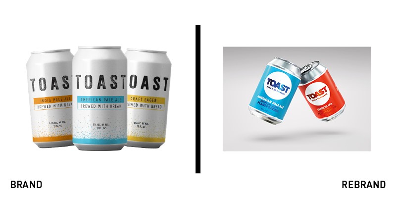
Toast
Many brands are focusing on ways in which they can address climate change and the challenges related to the earth’s strained resources. For Toast Ale, the mission to change the food production cycle is brewed into the brand itself. The B-Corp brews its beer from surplus fresh bread, thereby helping reduce food waste and overconsumption of resources. While the positioning was apt, the plain-faced brand couldn’t compete in the busy craft beer market. It turned to London-based B&B studio for an update to its brand and packaging. Focusing on the message, ‘Toasting change,’ the brand’s impact takes centre stage. The new logo uses a circle to represent the brand’s circular model, while the tone of voice uses motivational and optimistic calls to action. “The new brand design and communications are motivational and celebratory, doing justice to the great Toast purpose. The brand mission has been defined with a calling that people can feel proud to drink to. It has been a real privilege to work with a team that are so committed to their cause in a climate where so many simply pay lip service to purpose,” says Shaun Bowen, co-founder of B&B studio. The new packaging also features different colours for different beers to clarify the brand architecture.
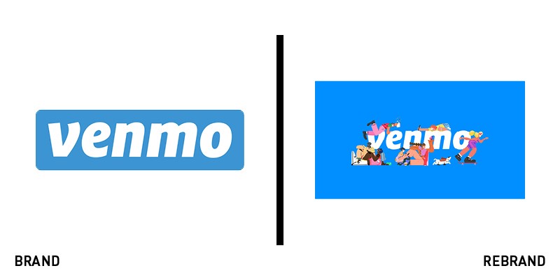
Venmo
American money transfer app Venmo has revolutionised personal banking – and flatsharing – through its easy transfers and straightforward user experience. But, facing competition from challenger banks and the need to present itself as a lifestyle brand, not just a financial services company, Venmo needed to refresh its approach. Working with London and Los Angeles-based agency Koto, Venmo has focused on its users and their activities themselves, rather than on its own products. Koto writes, “Venmo’s users have made it what it is. That’s why we’ve evolved the brand to celebrate the story behind a payment.” Visually, this translates to a vibrant, cartoon-led series of illustrations, social video, animation and in-app visual expressions. Koto worked with Vancouver-based illustrator Sebastian Curi to craft a world completely Venmo’s own. The characters, images and interactions help position the brand visually where it already sits culturally, at the heart of people’s friendships and daily lives.


