#TransformTuesday: 2 July
Every week, Transform examines recent rebrands and updated visual identities. This week's picks are below. For more from #TransformTuesday, follow @Transformsays
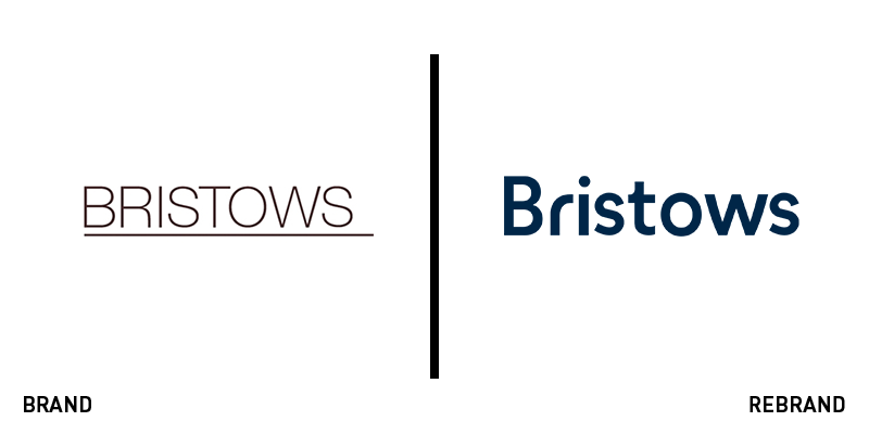
Bristows
With a previous brand that didn’t stand out from the large crowd of legal experts vying for attention and airspace, Bristows turned to London-based consultancy Frank, Bright & Abel to update its brand and website. The firm’s site was simple in structure and relied on clip art and uninspiring imagery to communicate. A bland structure and colour palette didn’t help. The new approach sees a fresh wordmark introduced, using a modern, friendly typeface. The site has been reimagined with ownable illustrations and highlighted text that allows key messages to stand out. The illustrations evoke the feeling of American football commentary, with signposting drawings communicating ideas and processes. Doing this through imagery, rather than commentary, is a more effective use of space on the new site and brings the space to life in a more characteristic way. The brand’s thought leadership, a key aspect for any firm, is refreshed visually with a more engaging user experience.
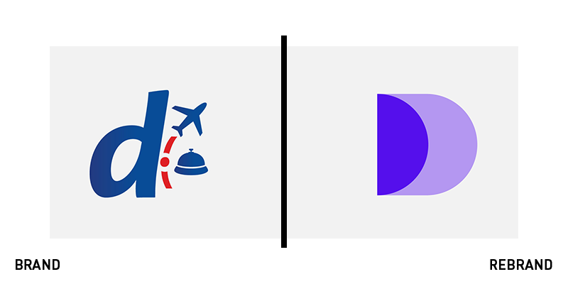
Despegar
With a challenging travel market posing brand quandaries for agents, both online and off, Latin America’s major travel provider Despegar worked with Saffron on a new brand. Operating across 21 countries, the company is one of the most well-known in Latin America, but with increasing competition from juggernauts like Google and Expedia, Despegar reinvented itself to differentiate its brand. Saffron writes, “The key to repositioning Despegar was to understand the relationship customers have with travel.” To do that, it undertook customer research, finding that emotions drove travel decisions, not cost. Thus the brand was built on experience and the motivations behind travel – not the practicalities of booking. Saffron simplified the user journey online and introduced an app to maintain an always-on brand presence. Visually, the brand is animated and ever-changing, but based on a clear D-shaped device and a line device that emphasises the forward motion and smooth experience offered by Despegar.
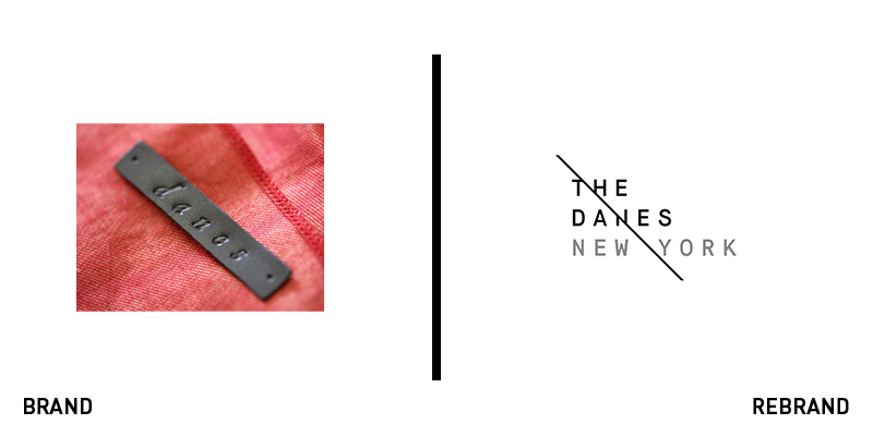
The Danes New York
Transforming a fashion house from a one-store icon with a signature style into a leading luxury brand required a more comprehensive brand and strategy. The Danes New York worked with Indianapolis-based creative agency Young & Laramore to introduce a new identity that unites its style with its character. Using designer Robert Danes’ bias cut designs as inspiration, the agency introduced a brand on the bias. The wordmark is slashed in two, a visual device that extends across its use of imagery and web design. The agency worked with Cannon Media Group throughout the creative process to select models, photographers, videographers and editors that could support the launch of the brand’s new lookbook. “This branding assignment allowed us a devotion to detail that we don’t often get with larger brands. We worked hard to capture the romance and the discipline that Robert puts into his pieces. Working with a client who is a creative and in collaboration with Cannon has been a dream for our team. We can’t wait to see where the brand goes from here,” says Carolyn Hadlock, executive creative director at Young & Laramore.
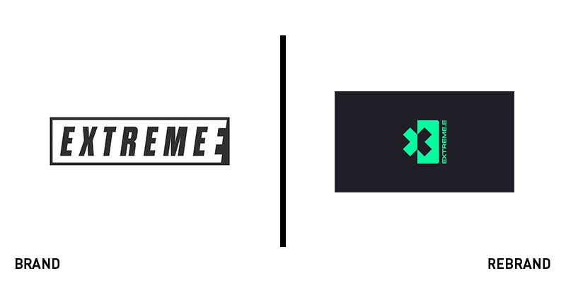
Extreme E
Formula E has made a big impact in the world of auto racing by taking the tried and tested formula of F1 and switching the electrics on. An all electric racing league, it has been responsible for city centre racing and innovation in electric vehicle technology. Following its success is the proposed Extreme E league, which will host its inaugural championship in 2021. It was conceived of as an electric vehicle circuit racing in remote and challenging landscapes around the world. Formula E turned to London-based consultancy Interstate Creative Partners to develop a brand that would bring together the league itself and the landscapes in which it will operate. The core visual device is an X symbol that unites the challenge the environment is facing with the brand’s purpose. It uses a black and green colour palette to underscore the threats to the climate and deploys images of affected landscapes on a transparent version of the logo. The overall effect is iconic, exciting yet ultimate arresting, due to the stark imagery chosen and the overlaying effect on the wordmark.
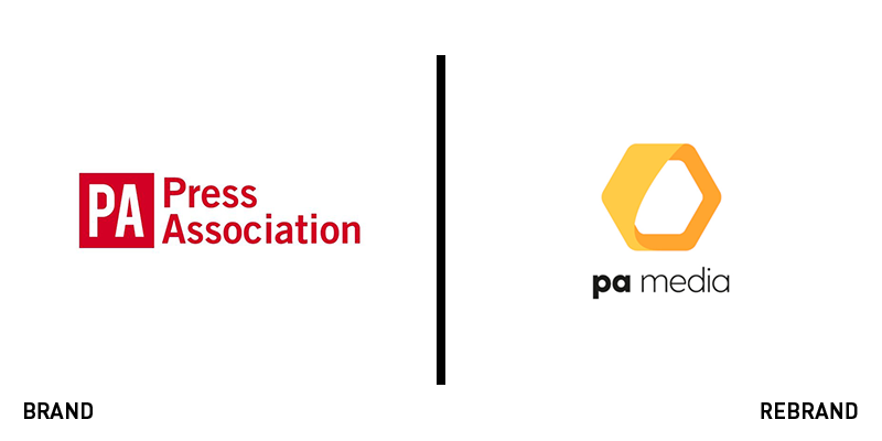
PA Media
For 151 year-old news agency, the Press Association, an ageing brand could no longer represent the breadth of the organisation’s operations. It introduced a new name and brand as part of a wider shift throughout the company and its parent brand. PA Group became the PA Media Group, while the Press Association has become PA Media. Also introduced are PA Images and PA Training. The refreshed visual identity uses a hexagon device alongside a wordmark jointly rendered in bold and regular type. This offers a clear, consistent link across the company’s operations and different brands, tying them together visually and verbally. It’s a neat solution that chief exec of the PA Media Group, Clive Marshall, says is more amenable to organic growth and growth by acquisition. “Having a distinct umbrella brand enables us to better showcase the range of specialisms within the PA Media Group as we target a broader range of customers,” he says. The hexagon-shaped honeycomb device helps the organisation along its digital journey. Head of marketing Marc Koskela, says, “The clean design works well in a range of digital environments and better reflects the modern, dynamic business that we are.”
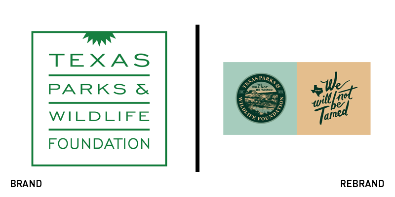
Texas Parks & Wildlife
While the environment is top of mind for younger generations when it comes to employment and consumption decisions, state and national parks are more often visited by older people than young. That was true of the Texas Parks and Wildlife Foundation, which wanted to reinvigorate its relevance to a more diverse audience. Working with Austin, Texas-design agency Guerilla Suit and brand strategists Big Sky, the organisation introduced a new strapline putting forward an impactful ethos: ‘We will not be tamed.’ “Now Texans are already an inherently wild people at heart. The natural vastness of the state reflects a vastness of spirit - take that away and you don’t have Texas or Texans. We knew the character of our state’s people would play a role in where we landed,” says Jennifer Billiot, brand strategist at Big Sky. The visuals are arresting and made for social, but the strategy shines in that it focuses on the barriers to entry for young people into natural spaces and their simultaneous desire to focus on authentic, sustainable and aspirational experiences. The ‘We will not be tamed’ strategy was designed to sit alongside the other cultural touchpoints – like ‘Keep Austin Weird’ – that define the Texan cultural landscape.
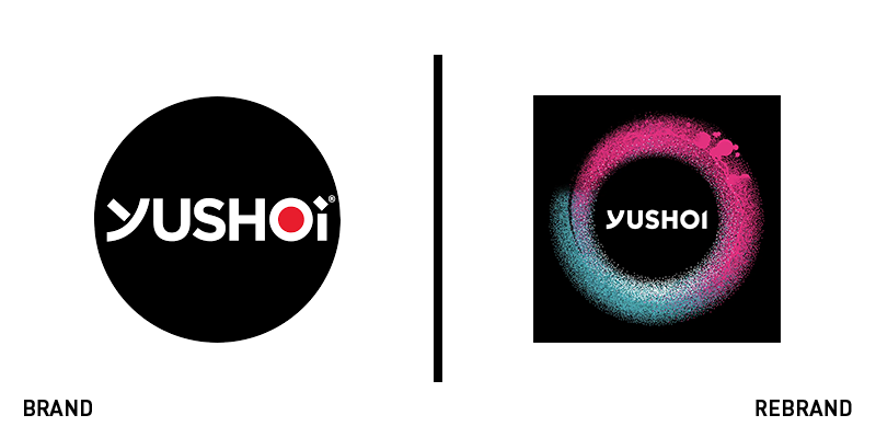
Yushoi
The ‘better for you’ category of snack food is undergoing a boom at the moment. New brands are challenging the existing players within the category and in traditional snacking while existing brands are reinventing themselves to improve cut-through in a more competitive environment. That’s true of Japanese-inspired oven baked pea snack brand Yushoi. Not a newcomer to the UK market, Yushoi has made waves with its flavour profiles and convenience. Now, it has turned to design consultancy Elmwood to introduce a high-impact brand that can pave the way for new products. Elmwood crafted an identity that uses almost-neon colours on a black background to more clearly identify flavours and products, allowing for an expansion of the brand architecture. With photography by Angus McDonald, the new packs are vibrant and more modern. Alex Halfpenny, design director at Elmwood, says, “From start to finish, the job was an absolute feast for the senses, with a fantastic client, who was not only genuinely passionate about their product and brand, but were open to new and brave ideas and thinking. This empowered the team to make some truly bold design decisions and as a result have managed to transform the presence on shelf, while retaining the spirit of Yushoi. It’s easily one of the favourite projects I’ve ever worked on, and everyone involved should be proud of the results.”


