#TransformTuesday: 2 April
Every week, Transform examines recent rebrands and updated visual identities. This week's picks are below. For more from #TransformTuesday, follow @Transformsays
AG Asia
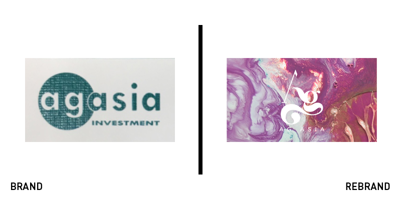
AG Asia is an investment and asset management business for high net worth individuals. With the desire for a brand to reflect its own ambitious approach and adaptable nature, AG Asia turned to London-based BrandOpus for its new brand. Replacing a little-used logo, the fresh take on the visual identity is a swirl of colour and motion. BrandOpus took inspiration from the AG Asia name, associating the monogram with the elemental abbreviation for silver. Using the fluidity of liquid silver, the brand is built on shifting patterns of nature-inspired colour palettes. John Ramskill, executive creative director of BrandOpus says, “During the early stages of the project we came across an interesting story about a Bolivian man whose campfire brought up liquid silver from the earth revealing the world’s richest silver deposit hidden beneath. Using this story as inspiration, we crafted the identity and supporting motion imagery to symbolise a mountain with rivers of silver running down its face, reflecting the agility within AG Asia.”
Alexandra Palace
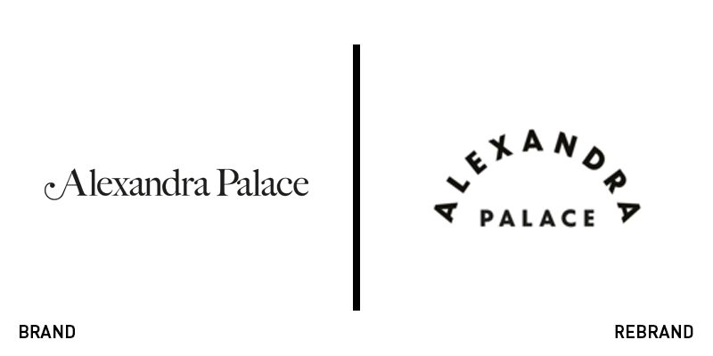
Built in 1875 at the height of the Victorian era as the north London ‘people’s palace’ was a tribute to the Victorians’ approach to recreation, education and entertainment. The counterpart to south London’s Crystal Palace, Alexandra Palace stands proudly atop its hill just north of Wood Green. But, its logo inspired Victorian heritage was not enough to embrace the new era of programming featured on the palace’s grounds. With festival celebrations, street food fairs, conventions, music performances, an ice rink and a leisure park, Alexandra Palace had more to offer than its brand could accommodate. It turned to London-based brand agency Lovers for a new approach. The resulting visual identity uses a similar variety of assets. The new logo is inspired by the palace’s dome and green surrounds. But its monogram is Victorian in nature, offering a shorter, simpler icon to use across digital and signage. The brand voice is loud, but classic, using quirky heritage-based phrasing alongside modern imagery in marketing applications. It’s a lot to take in visually in one place, but it’s a well-rendered solution for a brand that will be appearing across countless assets throughout London and beyond.
Camus
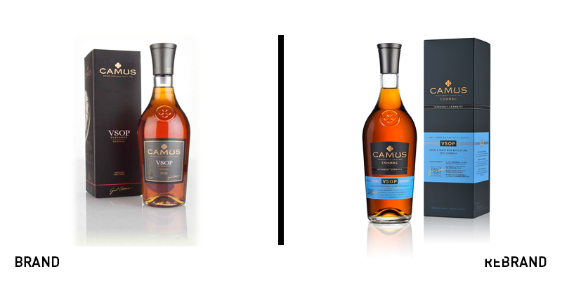
For fifth-generation family-owned cognac producer Camus, approaching its brand required an understanding of the spirit of cognac. The new brand, developed with London-based Sedley Place, disrupts traditional codes of Cognac packaging, by introducing some educational elements onto the pack. Instead of assuming consumers already know enough about cognac to make a purchasing decision, the new Camus packaging uses subtle labelling on the tasting notes, heritage and flavour profiles of each of the distiller’s cognacs. Giles Calver, planning director at Sedley Place, says, “The new Camus packaging is a differentiated approach to a category not known for design innovation. It challenges the norms of information brevity, and a presumption of consumer knowledge, and presents the Camus story in an engaging and revelatory way.” The update is also visually rich with a distinctive sky blue labelling system.
Colorado
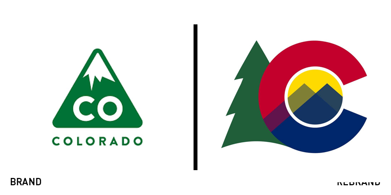
Colorado is a state of inconsistencies. Ridged with mountains, the square western state is also home to tornado-stricken plains, arid painted deserts to the south and numerous foothill-based microclimates. It is also home to an influx of new residents, drawn by the state’s outdoor lifestyle and liberal politics, but remains home to longstanding farming and ranching communities. It is also home to some of the nation’s most popular sports teams and universities. Representing these many identities in one symbol required a considered approach. Late last month, Colorado governor Jared Polis unveiled a new logo for the state of Colorado. The new brand draws inspiration from the iconic 54 year-old state flag, which features a red and gold ‘C.’ Using that icon, the new state brand introduces peaked shapes in varying shades of blue and an evergreen tree alongside it. This replaces the 2013 rebrand which focused only on the state’s mountains. Polis said in a press conference, “[It] better reflects our whole state – really is consistent with our goal of having a Colorado for all.” To avoid any cost to the taxpayer, the rebrand was carried out internally and will roll out over the coming years.
Manischewitz
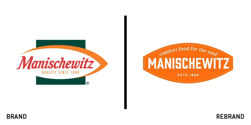
Posting updated packaging onto its Facebook page on 27 March, Manischewitz proclaimed, ‘New look. Same schtick.’ The kosher food giant is raring to go for the Passover period with updated packaging and the first major campaign for its new logo, which it has been rolling out since December. The update works best as a logo. The new icon retains the brand’s iconic orange but eschews the swoopy, asymmetrical shape of old. The new logo boldly proclaims, ‘Comfort food for the soul’ and deploys an orange oval with the white, all-caps Manischewitz wordmark on top. The brand has rolled out an updated website and packaging and is using more colourful, graphic-driven imagery across social media. The new packaging shines when the orange colour takes pride of place, as in the Tam Tams box or pasta packaging. The new brand for the 130 year-old company replaces a 2009 update that brought in curved lines and realistic imagery.
MoneySuperMarket
Money has been loved and reviled since biblical times, and beyond. In the modern era, it is shaped by access to financial tools on digital platforms. Recognising this, and the fact that money induces stress, MoneySuperMarket has revealed a new brand grounded in the notion of introducing a feeling of calm control for its users with regards to their finances. It worked with Engine to update its brand with that ethos in mind. The full rebrand includes a new sonic brand, verbal identity and web design. The new creative platform, ‘Money Calm’ inspires MoneySuperMarket’s use of imagery and the approach to communications. The brand says this is the first time the brand has been approached with regards to supporting the business’ strategy.

