#TransformTuesday: 19 March
Every week, Transform examines recent rebrands and updated visual identities. This week's picks are below. For more from #TransformTuesday, follow @Transformsays
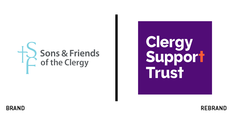
Clergy Support Trust
The Anglican Church has undergone a period of change, leading to more women in leadership positions within the faith and broader audiences generally. For a charity providing services and support to members of the clergy and their families, the brand had to reflect this modern outlook. The Sons & Friends of the Clergy, was facing misperceptions among its target audience and recognised the need for a change. It worked with Birmingham-based IE Brand to understand the needs of stakeholders and craft a brand that would be more inclusive and accessible. The new name, Clergy Support Trust, achieves that, with the support of a fresh, exciting purple and orange visual identity. The new brand has seen an updated tone of voice and has introduced new imagery to reinforce the message of support for all.
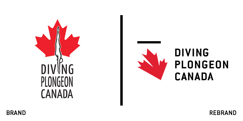
Diving Plongeon Canada
Canada’s national sports teams ascribe to a similar style of brand design, often featuring a maple leaf and a red, white and black colour palette. For Diving Plongeon Canada, its existing brand followed this format, but lacked the inspirational momentum the sport required to represent the team’s spirit. Working with Ottawa-based Godzspeed, the organisation unveiled a new brand and strapline, ‘We fly,’ with a logo inspired by a diving peregrine falcon. “The peregrine falcon is well known for its hunting stoop or, in other words, its high-speed dive. It is small and mighty. It is resourceful, powerful, impressive and courageous. All of those characteristics describe the heart and soul of the federation and its members,” says Thomas Cumberbatch, CEO and creative director at Godzspeed. The rebrand was unveiled on 21 February for the start of the international diving season.
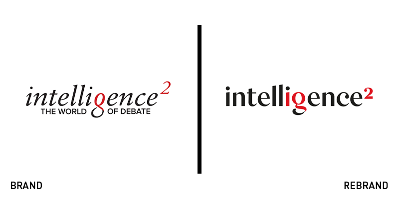
Intelligence Squared
Intelligence Squared is a media company that inspires intelligent debate on some of the most pressing issues of the day. With a growing reputation, particularly at the top levels of government and business, the organisation recognised the need for a brand overhaul. It worked with Studio Output, a London-based brand agency, on a user experience and content strategy for its website that improved the platform’s intuitiveness. The social-friendly new brand is classic, but colourful and ensures the use of high quality imagery, rife with personality. The elegant new wordmark and short logo were inspired by high-end editorial design, intending to infuse the brand with gravitas and authority.
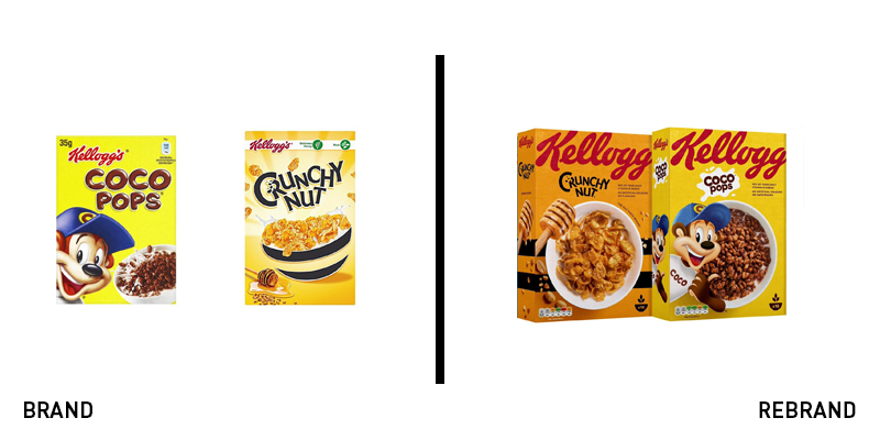
Kellogg's
The traffic light system for packaging is a unique quirk of European supermarkets. For Kellogg’s, its cereal packs needed an update to achieve better standout on shelf. Examining the brand offered the opportune moment for adding the traffic light nutritional guidance to the front of the pack. The design work was carried out by Landor which eliminated the unnecessary and busy elements from the boxes, opting for a central image – the cereal – with only a single additional icon. The Froot Loops pack, for example, features only the brand’s iconic red, a colourful bowl of cereal and mascot Toucan Sam, alongside the name of the cereal. The new system is more consistent across the Kellogg’s range and offers almost a retro cool to the packs that should enable them to achieve more standout on shelves. The Kellogg’s wordmark itself wraps around the top of the pack, in full bleed.
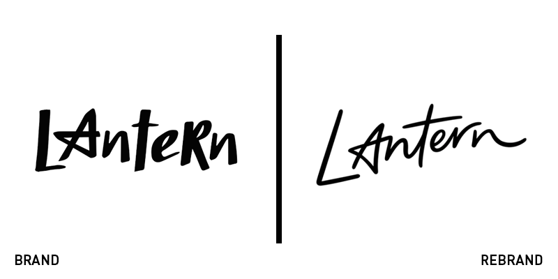
Lantern
British brand agency focusing on place branding, Lantern, has examined its own brand. It started by examining its proposals and documentation and wound up reexamining its entire brand. “Despite the hard work and focus on how our clients look and talk, one thing that hadn’t changed or grown with us is our own branding. As soon as the loose thread of our new business collateral was pulled, it’s no surprise that the rest of the branding unravelled and suddenly needed updating. Up until that point, we just couldn’t see it,” the agency writes. The brand, it says, had become ‘part of the furniture.’ The solution is a monochrome visual identity that retains Lantern’s signature star-shaped A, but introduces a hand-drawn feel to the logo. The website has been simplified, featuring only the black and white colour palette and impactful client imagery.
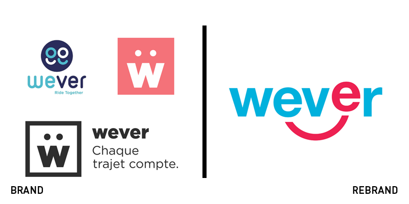
Wever
Mobility startup Wever had introduced no less than three logos in only four years. The brand wandering was doing the carpooling app no favours in terms of brand recognition, so it turned to French brand agency BrandSilver to craft a brand that would facilitate long-term growth. The result is a colour palette inspired by the French flag, but with a more professional design than the previous logos. “We have gone from the proof of concept to a first industrialisation. This is the moment when a clear brand universe takes a decisive dimension in the growth strategy of the company” says Thomas Cote, CEO of Wever. The new strapline, ‘Where the movers are,’ helps position the company as the aggregator of mobility solutions in urban areas. The updated approach also has a distinctive smile device that infuses the brand with personality and can be used to expand the brand architecture and grab attention on a crowded mobile screen.


