#TransformTuesday: 17 September
Every week, Transform examines recent rebrands and updated visual identities. This week’s picks are below. For more from #TransformTuesday, follow @Transformsays
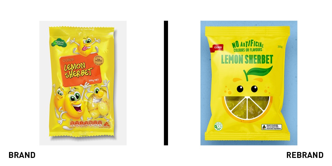
Coles
After conducting consumer research, Australian supermarket Coles found that customers are increasingly looking for healthier choices with less sugar and preservatives. With its own brand range of products offering healthy confectionery choices on the shelves, the company turned to Australian creative agency Hulsbosch to revolutionise the brand and elevate it with stronger design visuals. The result is a colourful, coherent range of confectionery playing with bright shapes and happy faces, to stimulate a positive emotional response in consumers and catch their attention. From sharks to snakes and cartoony milk bottles, Coles’ own brand features a consistent range of colourful products with a common design style, resulting in a recognisable and confident new brand.
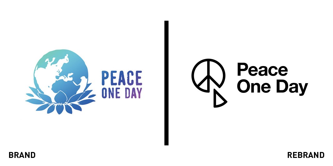
Peace One Day
Committed to uniting the globe around messages of peace and hope throughout the world, UK-based non-profit organisation Peace One Day works to institutionalise the annual Peace Day on 21 September, to inspire hundreds of organisations in carrying out life-saving activities in areas of conflict. To celebrate its 20th anniversary, the organisation needed a new visual identity to introduce ahead of this year’s Peace Day. In partnership with brand consultancy Interbrand, Peace One Day has unveiled its new look, with a modern, minimalistic logo reimagining the iconic peace symbol. The logo removes one slice from the original motif, showing that peace can be achieved with small steps, one piece at a time. It fosters action and movement, positioning Peace One Day as a recognisable brand to support its world peace ambitions.
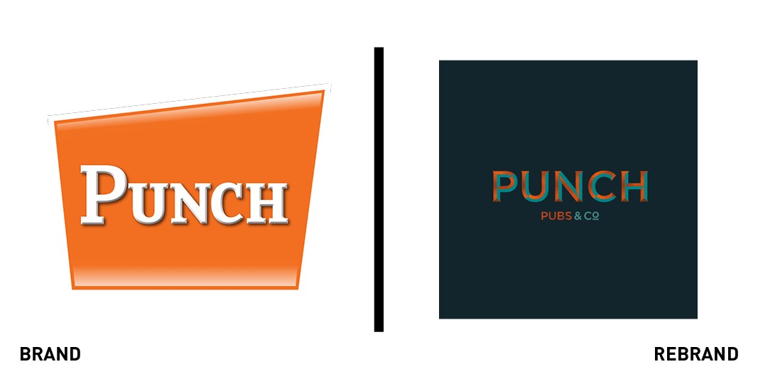
Punch Taverns
With more than 1,300 pubs scattered across the UK, Punch Taverns needed to revolutionise its look to drive additional growth and appeal to younger audiences. Turning to BrandOpus for help, the company has announced a refreshed visual identity, brand world and narrative, introducing the pineapple as a visual symbol of welcoming hospitality. “Having delved into its historical associations with hospitality, we were struck by the prevalence of pineapples hiding in plain sight all around us,” BrandOpus’ executive creative director John Ramskill says. “This tradition of conveying a warm welcome makes it the perfect symbol for Punch’s ambition to put outstanding hospitality at the heart of their business.” The new brand suggests warmth and emotional connection, with a logo designed to evoke traditional pub signs with bronze details and dark aqua shades. Punch’s new narrative recalls familiarity and connection, with a modern feel emphasising the brand’s core values.
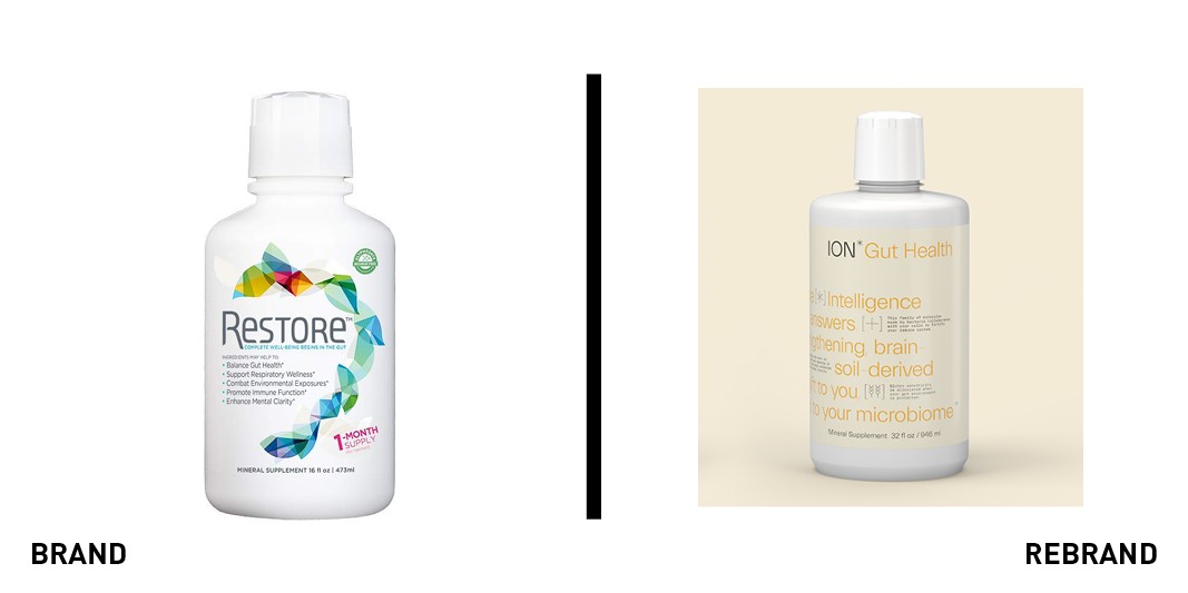
Seraphic Group
Committed to supporting the natural cycle of human health and ecology, the Seraphic Group offers a wide range of products in line with its vision. As part of a broader brand positioning strategy, the group has partnered with design studio Accept & Proceed to relaunch Ion Biome, one of the company's health supplements, with refreshed packaging. The new design echoes the brand’s aim to balance the small ecosystem of the human biome in the wider world, and features both micro and macro storytelling on the packaging to hook the reader in with increasing levels of information. The packaging alternates text and symbols with different weights and shapes, playing with contrast to attract prospective customers.
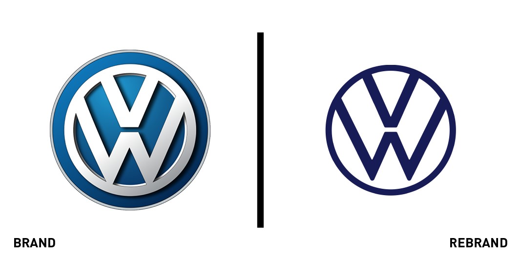
Volkswagen
After the emissions scandal in 2015, Volkswagen had lost both the support of its loyal customers and the one of its shareholders, and was left with a significant brand crisis to face. To mark a new era in the company with the advent of electrical vehicles, Volkswagen has rebranded with a flat two-dimensional logo, flexible and minimalistic, against a blue background. The new logo drops the rendered chromium of the previous version and plays with unbalance, alternating the bold lines of the brand’s lettering with a thinner circle outline. By retaining the stacked ‘VW’ letters, Volkswagen’s refreshed face is loyal to the past, yet different enough to mark a new beginning for the brand. In the near future, the logo will be retro-illuminated in dealerships, on Volkswagen vehicles and across other company touchpoints.


