#TransformTuesday: 17 December
Here is this week's selection of rebrands from around the world, from British haircare to international marine engineers. For more from #TransformTuesday, follow @Transformsays
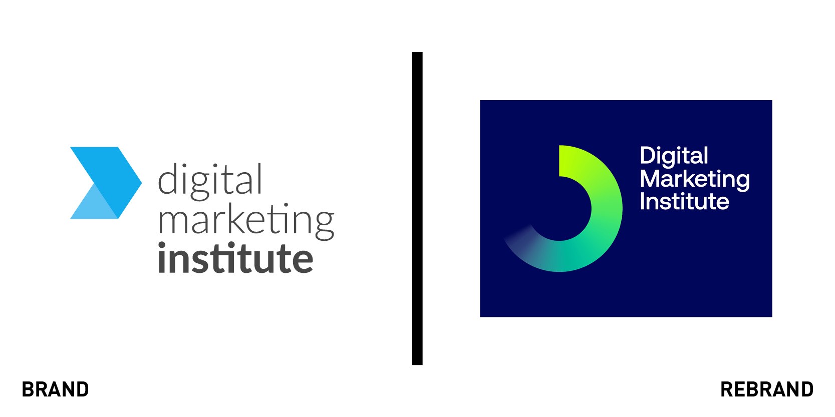
DMI
The Digital Marketing Institute (DMI), which specialises in digital marketing learning and certification, has had a brand overhaul that it hopes will serve to invite people to ‘get in the game’ and stay relevant. Venturethree developed the brand strategy and positioning, internal brand strategy, visual expression and tone of voice. The new brand has been rolled out across online and print platforms in Europe and the US. According to the World Economic Forum, by 2022, more than half of all employees will need new digital skills, and with this in mind, the DMI wanted to reinforce its authority among increasing competition with a fresh and inviting new look.DMI global brand director John Hurley says, “Marketers are energised by new thinking, tools and creativity. But people working in marketing today are also under enormous pressure to learn new digital skills and stay relevant. With a progressive learning platform, robust certifications, a large alumni community and strong industry links, we want to make digital marketing accessible to everyone.”
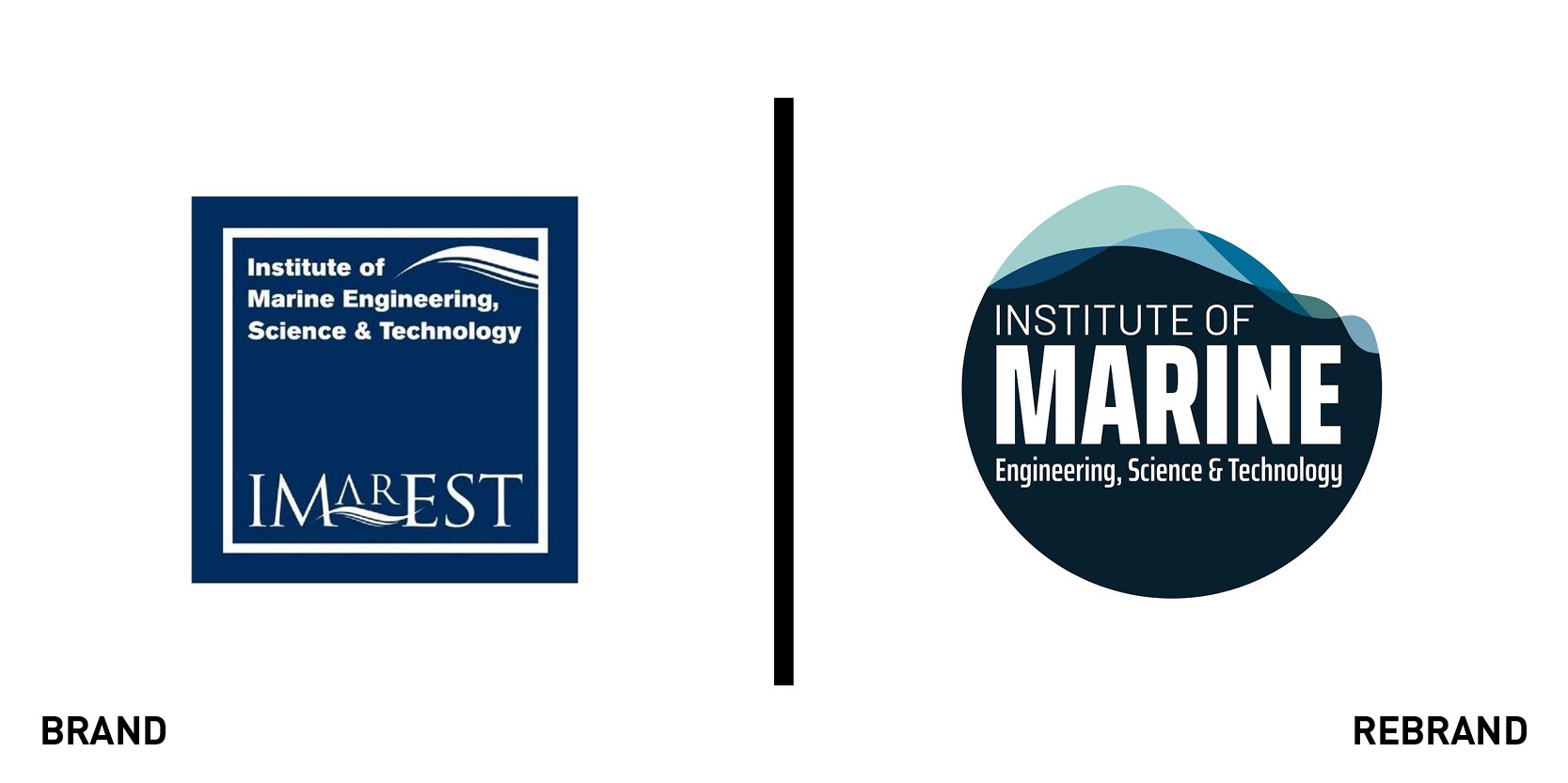
Imarest
The Institute of Marine Engineering, Science & Technology (Imarest) has updated its branding to emphasise its purpose as the global home for all marine professionals. The new logo uses rounded shapes and varying shades of blue to represent the ocean, with clear emphasis on the word ‘marine.’ Imarest hopes that the refreshed branding will appeal to a younger audience, as it seeks to attract the next generation into its membership and inspire them to join a marine profession. It says the updated logo echoes its ambitions to create a positive future for the institute, the oceans and the planet. The institute's rebrand annoucement says, "We are delighted to announce that we have updated the institute’s brand to reflect our purpose as the global home for all marine professionals, as well as mirroring our vision for the planet and its oceans. You will see that this new branding emphasises 'marine' and uses rounded shapes, greens and blues to evoke our hope for a sustainable Earth."
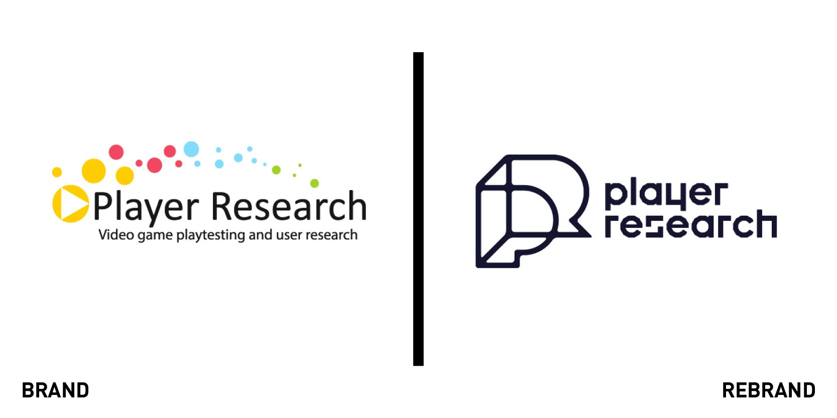
Player Research
Games user research specialist Player Research has updated its brand in a bid to lead the charge in what is a new market category. It wanted to professionalise its look and feel without losing sight of its collegiate culture and becoming too 'corporate.' Design agency UnitedUs created a new identity that is designed to be both playful and technical. The PR monogram can stretch and change shape, and the concept of play was taken to its simplest expression with the use of balls, which are represented through the Player Research brand. Bob Tilford, user researcher at Player Research, says, "It was a pleasure to work with UnitedUs. They went deep into understanding who we are, what we do, and where we're going, then used that insight to provide us with a brand we're exceptionally proud of."
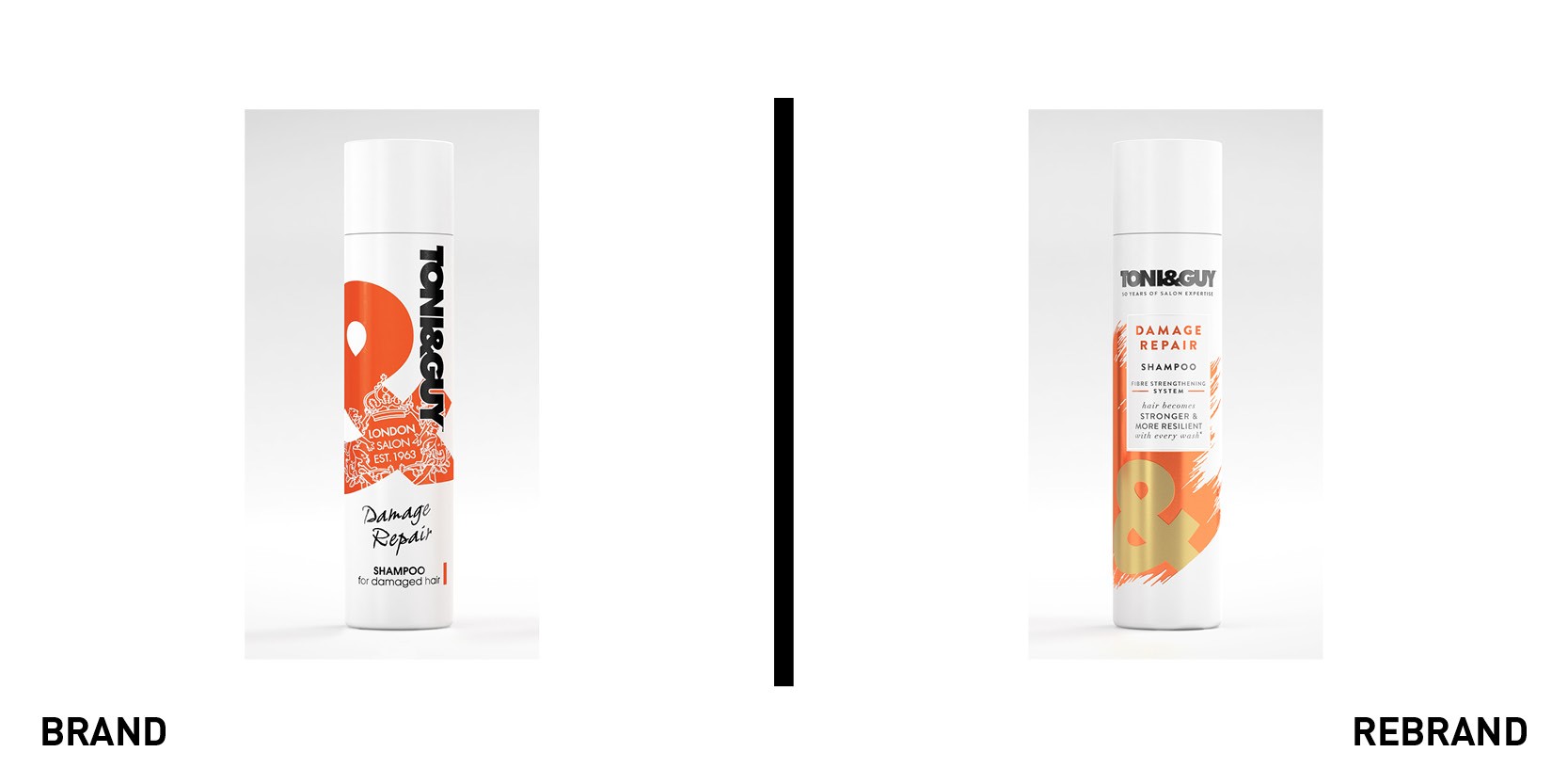
Toni & Guy
Styling products brand Toni & Guy has had its style refreshed with a premium design for its retail products. Parent company Unilever enlisted design agency PB Creative to create the new branding, which will roll out across Toni & Guy’s wash & care and styling ranges. It was designed to appeal to consumers who relate closely to the brand’s salon heritage and want reassurance that they are purchasing a genuine salon brand product. Unilever wanted a clear identity for Toni & Guy on the shelves, in an increasingly competitive category. PB Creative retained the ampersand on the new packaging, with brush strokes in contrasting colours and gold for different variants in the range. Lauren Brooking, brand innovation manager at Unilever, says, “With a better understanding of the Toni & Guy target audience, it was clear that we needed to develop a more premium and aspirational expression for the brand. PB Creative has created stylish new pack designs that reinforce the brand’s heritage and appeal to fashion-loving Toni & Guy consumers across the UK.”
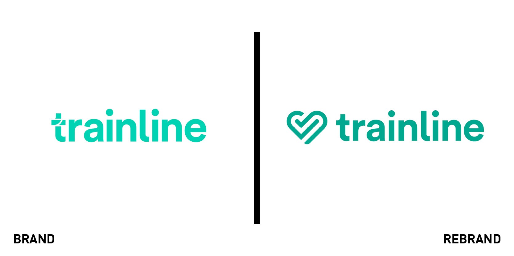
Trainline
European train and coach travel platform Trainline has revamped its logo, which it has rolled out across its website and mobile app. The updated version is a simple green symbol combining a heart, interlinking journeys and a tick for positivity, which Trainline says is more human and reflective of the business today. It also gives a nod to Trainline’s aim of encouraging people to make more environmentally sustainable travel choices. The company sells train and coach tickets to travellers worldwide, bringing together routes, fares and timetables from operators throughout Europe and Asia, with real time travel information. Trainline's rebrand announcement says, "Our aim is simple: to make train and coach travel easier. We care about encouraging people to make more environmentally sustainable travel choices. Simply put, we’re a business with heart and we want our logo to reflect this."


