#TransformTuesday: 16 April
Every week, Transform examines recent rebrands and updated visual identities. This week's picks are below. For more from #TransformTuesday, follow @Transformsays
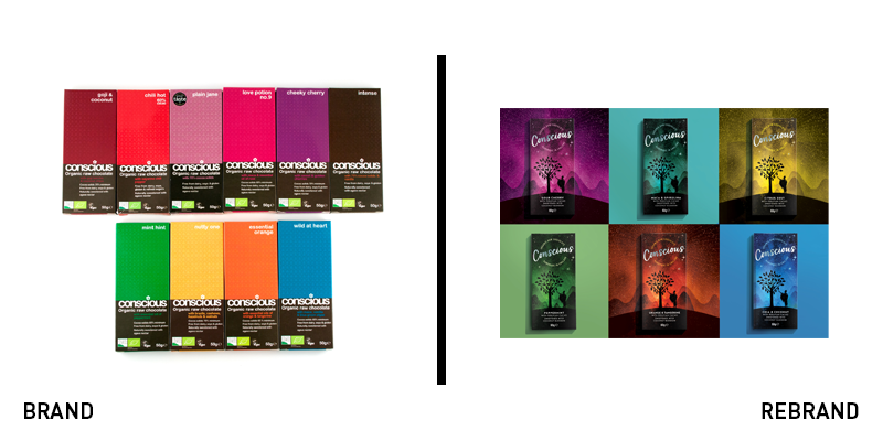
Conscious Chocolates
Though it has led the way in the raw, organic and vegan chocolate movement, Conscious Chocolates’ branding was not doing enough to compete against new players in the market. It turned to Bath-based the Space Creative to examine its brand and packaging and achieve better standout on shelf. The result is out of this world. With a star-studded background, the new logo is rendered in an elegant, cool script typeface in metallic silver. The packs draw inspiration from the concept of harvesting the cacao beans, which is rendered in silhouette form on each package. David Thomson, creative director at the Space Creative says, “We created dreamlike illustrations of a cacao harvester combined with a magical misty mountain backdrop under a canopy of stars to ensure stand out against the other raw chocolate brands on the market.” The new look retains the brand’s method of product differentiation, using a different colour pack for each product. The premium new look helps the company reflect the quality nature of its ingredients, as well.
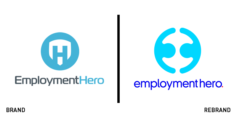
Employment Hero
Australian HR solutions provider for SMEs, Employment Hero, had outgrown its logo. Its earliest brand, introduced in 2014, is a bit on the nose, with a hero-esque shield icon akin to Superman’s signifier. It updated that to a softer edition in 2016, but couldn’t quite ditch the shield. Now, it has reconsidered its brand from top to bottom. Using a bright blue colour palette, all lower-case font and a new concept for its brand icon, it feels like a brand for maybe the first time. “We wanted to keep part of our heritage with the E and the H still present but needed something that better represented the collective power we were trying to harness,” says CMO Cat Prestipino.” The company worked with the One Centre, a Sydney-based creative agency, to update its brand. The new strategy will allow the company to expand its brand and positioning through a more comprehensive approach to its brand and visual identity.
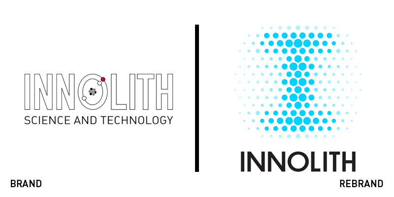
Innolith
A Swiss brand with the dream of making the world a more energetic place, Innolith has pursued developments in battery technology for the past 15 years. Yet, an engineering-focused logo – and not much else in the way of branding – wasn’t serving its needs in terms of brand awareness and expansion. Working with British brand agency Kimpton Creative, Innolith has introduced a new brand focusing on the electric grid and rechargeable nature of its products. The logo, which works well in animation format, is formed of a pattern of gridded dots. That pattern can be expanded and developed into a versatile visual device that can be used across the brand’s touchpoints and to communicate its different messages. The brand proposition, ‘Keeping the lights on around the world,’ is also reflected in this new, glowing approach.
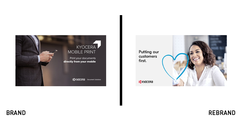
Kyocera Document Solutions
This month, Kyocera Document Solutions has introduced a global rebrand that focuses on the human connections it forges through its work. Jose Maria Estebanez, senior manager customer experience and technology centre of Kyocera Document Solutions Europe, says, “It will always be people who will enable customers to realise our vision of putting knowledge to work. With this in mind, we will display ourselves as a human focused brand by adopting visual designs with a human touch.” The new approach focuses on the brand’s visual identity, rather than its logo, introducing a handwritten style, a consistent, bold colour palette and a new iconographic system. The result is a more personal, characterful approach than its previous visual strategy of integrating the human and the machine.
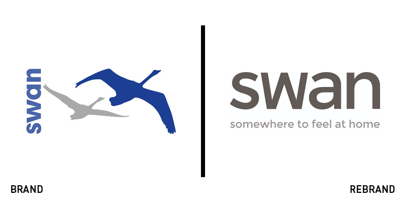
Swan Housing
A 25 year-old housing association has been tasked with a £490m housing grant to develop 10,000 affordable homes in east London and Essex by 2027. As a result, Swan Housing Association has introduced an updated brand and positioning to support this development. The positioning, ‘Somewhere to feel at home,’ reflects the organisation’s objective of crafting quality housing stock for its communities. The visual identity eliminates the brand’s swan logo in favour of a typographic wordmark. The new brand will roll out across the intranet, website, resident’s portal and physical touchpoints over the next few months. Chief executive John Synnuck says, “We really wanted to make it clear that we aren’t just about bricks and mortar, it’s not about numbers of houses and apartments for Swan, as a housing association our aim is to create homes and communities where residents can feel at home, which our brand fully reflects.”
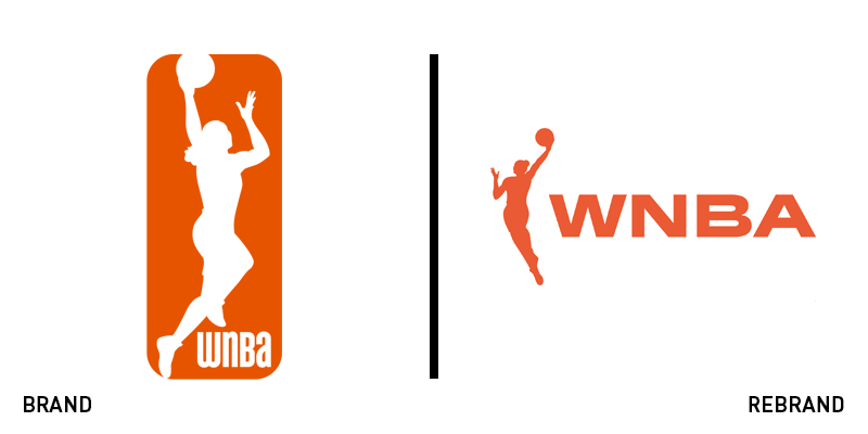
WNBA
New York-based brand agency Sylvain Labs has worked with the WNBA on its first rebrand since 2013. The popular women’s arm of America’s professional basketball league has always retained a connection with the NBA, the men’s league, through its brand. But, for the first time, the league is stepping out on its own. The previous brand used an all-orange logo with a white silhouette that echoed the men’s brand in format, shape and orientation. The wordmark was modernist and distinctive, though. Now, its new brand features a bolder orange, a simpler wordmark and a revamped icon. The new icon unboxes the silhouette for the first time, offering a strong, dunking icon alongside the wordmark. The rebrand will correspond with a shift in messaging to better communicate with young women and girls.


