#TransformTuesday: 15 October
From blue tulips to breweries and breasts, here’s our pick of the latest rebrands. For more from #TransformTuesday, follow @Transformsays.
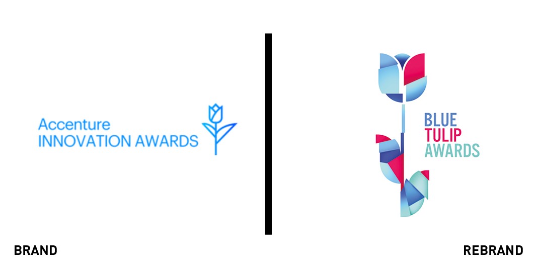
Accenture tasked creative content agency Ambassadors with designing a new identity for its innovation awards under the new name, the Blue Tulip Awards. Different designs were created to reflect the eight innovation themes the scheme covers. The new look was designed to communicate innovation visually, to counterbalance the absence of the Accenture innovation awards reference in the new brand, Ambassadors stated.
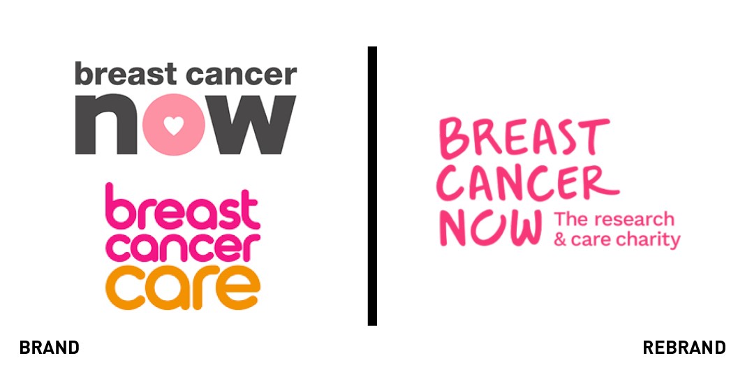
Breast Cancer Now and Breast Cancer Care, which merged in April, hired Wolff Olins to devise a unified identity in time for Breast Cancer Awareness month in October. The resulting brand keeps the Breast Cancer Now name to highlight the urgency of fighting breast cancer, Wolff Olins said. The name also supports the charity’s vision to guarantee welfare and support by 2050 to everyone diagnosed with breast cancer, according to the agency. The colour palette of pink and purple shades was chosen to link to the legacy brands, while the handwritten typeface gives the charity a more personal presence, it added.
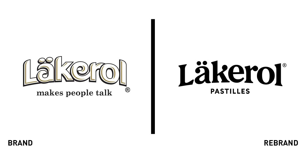
Swedish pastille brand Läkerol commissioned design agency Nord Id to rework its logo. The new logo is inspired by the history of Läkerol’s wordmarks, Nord Id stated. The identity retains the legacy arc of the typeface and employs a sans-serif font to give the brand a “humble, yet distinguished look,” according to the agency. The full range of visuals includes a redesigned colour palette for Läkerol’s packaging as well, with each flavour matched to a specific colour.
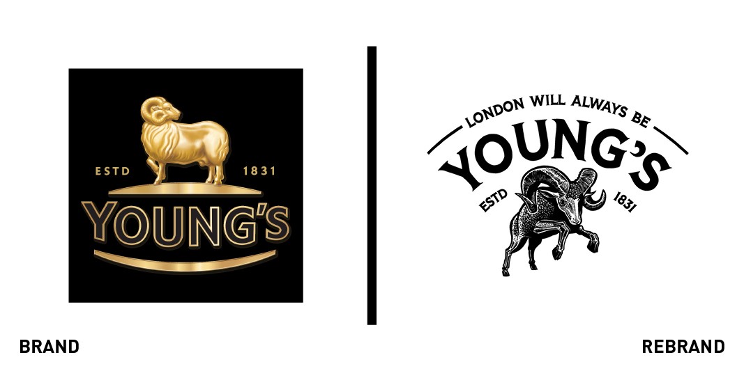
UK brewery Young’s tasked design agency Kingdom & Sparrow with creating a new visual identity to appeal to a new generation of drinkers. The new identity was designed to feel dynamic and modern with a redesigned hand-drawn ram, according to Kingdom & Sparrow. The company’s identity includes a palette based on primary colours and a typeface with legacy visual cues, which draw inspiration from characteristic London pubs.
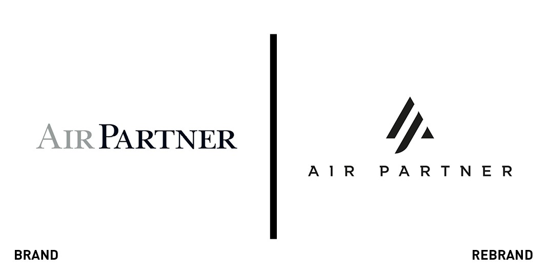
Air Partner engaged branding agency StormBrands to create a new identity to unify its range of services. The creative concept was designed to modernise Air Partner while celebrating its heritage, the agency said. The triangles unite the letters A and P and reference birds in formation to evoke shared customer focus across the company’s services, according to StormBrands.
For more from Transform magazine, sign up for the Transform newsletter here and follow us on Twitter @Transformsays.


