#TransformTuesday: 12 February

Every week, Transform examines recent rebrands and updated visual identities. This week's picks are below. For more from #TransformTuesday, follow @Transformsays
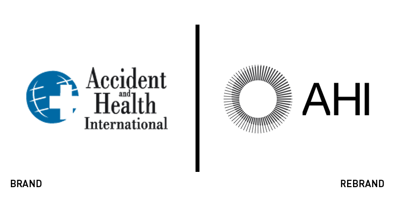
Accident Health International
Insurance underwriting doesn’t necessarily lead to the sexiest of brands. But, Sydney-based agency M35, didn’t pay any credence to that in its work with Accident Health International. The previous brand was little more than a logo, and one that featured a blue clip art world with a white medical cross emblazoned across it. The look was completed by alternating sizes of a serif typeface. The overall impression was underwhelming. But, M35’s approach united the global aspect of the company with its positioning of ‘protecting what matters most.’ The new logo is a monochrome circular icon with the simple wordmark reading AHI in a unique, cut-off typeface. The new approach simplifies the company’s assets through the iconic approach to logo design.
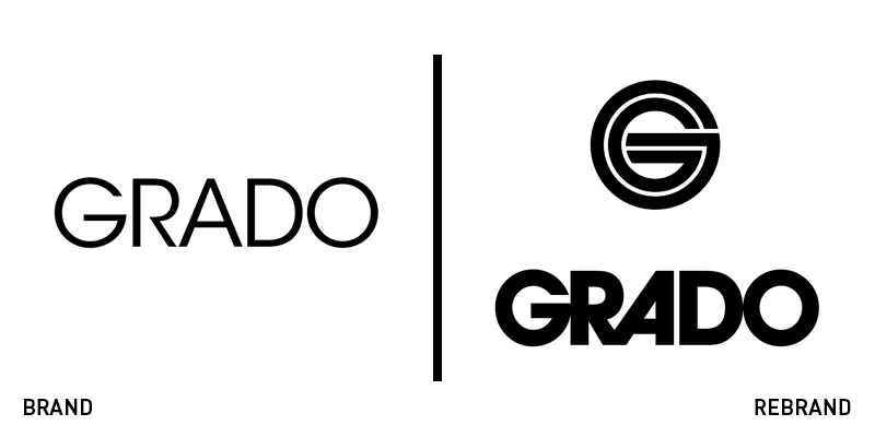
Grado Labs
Family-owned Brooklyn audio manufacturer Grado has all authority in the headphones and audio equipment space. But its brand was minimal, simply comprised of a wordmark and little else. It turned to New York brand agency High Tide to craft a recognisable new brand geared toward modern audio consumption. The agency turned to Grado’s rich, 1960s-esque existing brand assets, but amplified them for a modern consumer. The logo was emboldened and a G icon has been developed in a shape that echoes the company’s headphone design. The result is simple, clean and fresh with a retro feel. Its an approach that will see Grado embrace its heritage while still maintaining its relevance in future years.
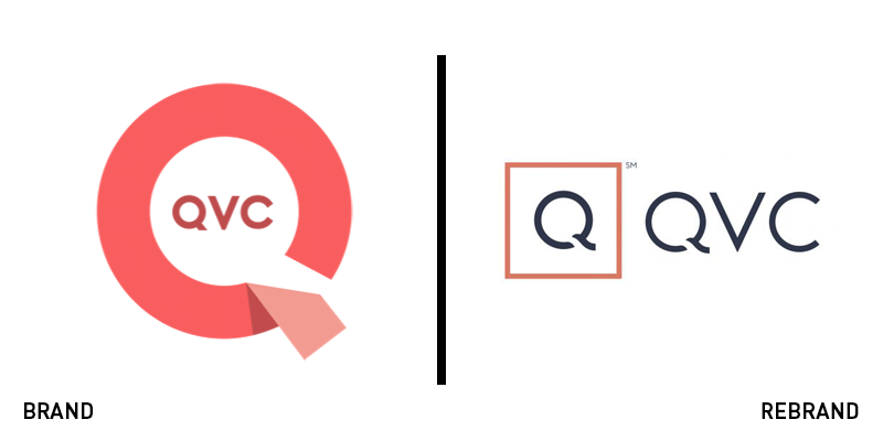
QVC
Everyone’s favourite home shopping giant has had to contend with some pretty hefty changes recently. The internet retail explosion could have effectively decimated QVC’s business model. But, its ability to adapt to the changing shopping landscape has allowed it to thrive. Now, it is unveiling a new logo and brand to support its growing digital presence. The new brand – developed in part by US marketing agency Moxie – is essentially designed for the app. The wordmark is familiar, but the new logo depicts a Q in a red square, exemplifying the many screens through which QVC’s customers interact with its brand. Changes have extended across QVC’s video style, its tone of voice and its use of imagery to create a more user-friendly, digital-first brand. “Consumers have embraced QVC as a leading digital destination for product discovery and inspirational shopping, and our new brand identity and video app reflect this reality,” says Mary Campbell, chief merchandising officer for Qurate Retail Group, and chief commerce officer at QVC US.
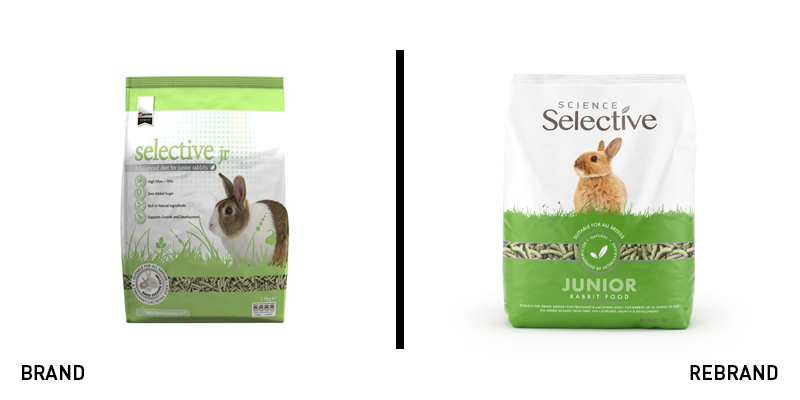
Supreme Petfoods
Pet food has come a long way from tins of meat and bags of kibble. Pet health and wellness is being catered for in a more tailored way, leading possibly to fragmented brands straining to meet all the varying needs of modern pet owners. Supreme Petfoods found that its brand was doing just that. To better align the brand behind its positioning and ensure better standout on shelf, the company partnered with design agency Cowan London to unveil a new brand architecture. One of the biggest findings from the agency’s research was that consumers referred to the brand as ‘Science Selective,’ despite the word ‘science’ being missing from the old packaging. Cowan changed that, essentially renaming the brand in the process. It also modernised the packs and improved the colour palette, leading to a clearer brand architecture and on-shelf differentiation.
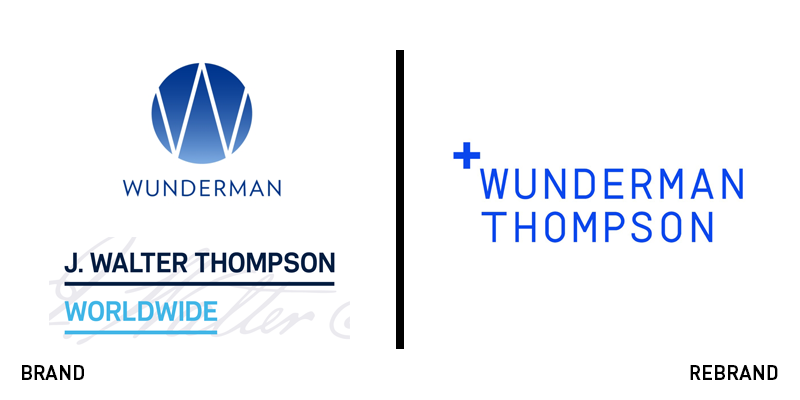
Wunderman Thompson
Late last year, WPP unveiled a new brand designed around collaboration. It set the tone for its family of companies by illustrating a visual identity that featured many moving parts working together. But the rebrand also signalled a shift in strategy, indicating that mergers like that of Superunion, would be more common in the coming years. Thus Wunderman Thompson has been created from the J Walter Thompson and Wunderman teams. The heritage brands have had to contend with history when integrating their two visual identities. The new brand, developed by Landor, a new icon, the plus sign and uses an electric blue that falls somewhere on the gradient between the two companies’ previous logos uses of blue. The new positioning for the merged company is ‘A creative, data and technology agency.’ The brand uses exciting imagery in loud, rich colours to indicate creative energy.


