#TransformTuesday: 11 June
Every week, Transform examines recent rebrands and updated visual identities. This week's picks are below. For more from #TransformTuesday, follow @Transformsays

Cannon & Cannon
Despite a nationwide love of cured meats, British-made charcuterie is a category only recently being developed. Cannon & Cannon, a brand that was born out of the farmer’s market and artisan food scene, had outgrown its original branding as it expanded its business. Working with Bath-based agency the Space Creative, the company has introduced a flexible and distinctive new brand. Avoiding traditional packaging cues, the new identity and packaging blends illustration with provenance in a modern, friendly design. David Thomson, creative director of the Space Creative says, “We immediately decided to steer away from traditional charcuterie packaging which typically uses reds and pinks along with images of pigs. Cannon & Cannon’s offering is original and quirky and we wanted striking pack designs that would echo that.” The packs offer an instantly classic feel while the logo itself uses a butcher block as a background, retaining a sense of the brand’s Borough Market origins. Though the previous branding’s little piggy is no longer, the new approach will support the brand as it expands beyond its traditional audience.
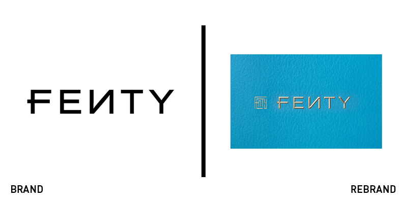
Fenty
While the Fenty Beauty logo (seen above) will remain unchanged, the Fenty brand is launching a new line to support a collaboration with LVMH. The fashion house brand (above right) was developed by London-based Commission Studio. The designers retained the key element of the well-known beauty brand – its backwards N. They worked closely with Rihanna to craft a luxe, social-ready fashion brand and website. The logo is a maze of all the letters in the brand name, echoing the complexity of Rihanna’s character, according to the studio. Various applications were developed using outlines and solid letters for use across different brand touchpoints. The brand was also specifically tailored to Rihanna’s character through the use of colour, the design studio says. Blending a cerulean blue with gold lettering helps the brand stand out from a largely monochrome brand portfolio within the LVMH group.
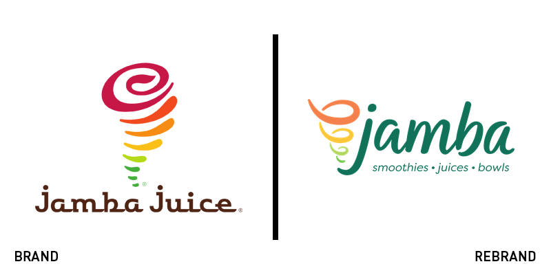
Jamba
One of the companies that revolutionised healthy on-the-go snacking, Jamba Juice has announced its first major brand change by dropping the ‘juice.’ The name officially changed on 6 June, with packaging and in-store signage to roll out throughout the summer. The Jamba rebrand supports a change in positioning away from just juices to a wider range of food options, juices and smoothies. The brand update will also extend to the in-store environment, with new layouts, store designs and branding to be implemented across the brand’s portfolio. The logo itself retains the iconic whirl device, but updates its colour palette, while simplifying its geometry. The wordmark is similarly updated, ridding the brand of its outdated typeface, but retaining its all-lowercase style. The new strapline ‘smoothies, juices, bowls’ is introduced into the wordmark, reflecting the repositioning. The rebrand press release says, “The new logo and whirl is a modern interpretation of our classic Jamba logo and features clean, handwritten script, new emerald green brand colour and our evolved ‘Whirl’ that draws from the beautiful hues of the fruits and vegetables we use every day.”
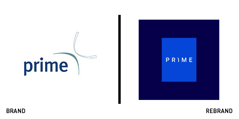
Prime
Property developer in the UK’s health and care sector Prime teamed up with Brighton-based brand agency UnitedUs on a new visual identity and brand strategy. The strategy is centred around the need to provide excellent care unhindered by the space in which it is delivered. Luke Taylor, co-founder and creative director of UnitedUs says, “The new brand better reflects the incredible work Prime are doing at the forefront of the UK’s health and care landscape; transforming some of our vital health infrastructure and public service spaces so that our healthcare providers can deliver big change.” With a striking choice of vivid blue and an ownable wordmark, the new brand will help the developer in terms of its brand awareness. The updated website offers a clear user experience with a creative spot-colour treatment using the brand’s signature blue. The logo’s rectangular device is also deployed across the site as a pilcrow and navigational device, adding personality to the website.
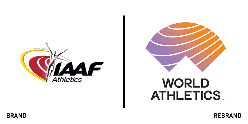
World Athletics
The IAAF is the world’s governing body for athletics and while iconic within the sport, its acronym has remained fairly impenetrable to outsiders. For that reason, it announced on Sunday that it would be rebranding to the clearer World Athletics and introducing an updated brand. The organisation stated in a press release, “The new name, ‘World Athletics,’ builds upon the organisation's restructuring and governance reform agenda of the past four years to represent a modern, more creative and positive face for the sport.” World Athletics president Sebastian Coe added that he hopes the new brand will inspire young people to take up athletics while also preparing the organisation for a digital future. “The IAAF name has been in existence for over 100 years, but it has little understanding or relevance to those outside of athletics,” added CEO Jon Ridgeon in a damning review of the previous brand. The new logo itself is a breath of fresh air for the organisation as it eliminates the many devices in the IAAF logo, distilling it down to a simple World Athletics wordmark and a track-shaped device that both represents the ‘W’ in ‘world’ and the lines on an athletics track. The logo is used in smart applications that insert a thriving energy into the brand. The rebrand will roll out after the World Athletics Championship in Doha this October.


