Spotlight on Greater Anglia
With the upcoming launch of a major infrastructural change, Greater Anglia needed the support of a new brand and communications strategy. Its rebrand introduces a brand character, a range of flexible assets and a clearer messaging platform for users. Brittany Golob reports
There’s a kind of magic that occurs when everything about a rebrand just works. That’s the feeling the joint creative partners at London-based creative agency Atomic had when they crafted the strapline for Greater Anglia’s new brand. It’s the feeling the train company’s head of commercial development had when he saw the new brand character for the first time. And it’s the feeling the company’s employees get when they see the long-promised change in motion across the network.
The rebrand is rolling out now, slowly, and will do throughout the summer and beyond, but its roots run deep into the Greater Anglia franchise. Train operators function in an idiosyncratic system in Britain that requires potential operators to bid for a rail franchise – a region or set of rail – that they can run train services upon. The rail infrastructure itself is operated by the government-owned Network Rail. For Greater Anglia, owned by Dutch company Abellio, the East Anglia region had been home since 2012. However, rebidding for the franchise in 2016 offered a turning point for the company.
“The core component [of the bid] was we were going to be replacing every single train on the network with a new train; 169 trains are on order, which is over 1,000 vehicles. Nothing like this has been done in a UK franchise,” says Greater Anglia’s head of commercial development David Metherell. This bold proposition will be a £1.4bn investment in the franchise and comprise a logistical operation on a massive scale with new trains introduced across a franchise known for its aged rolling stock.
That commitment helped Abellio win the bid and extend its franchise until 2025. But it also offered the magical moment in which to examine the Greater Anglia brand.
“We knew that if the product was transforming, we also needed to transform our brand and marketing activity,” says Metherell. Since 2016, the company has laid the tracks for a successful communications function, building the team internally and bringing the right external partners on for support.
One of those partners is Atomic. Partnered together through a pitch process facilitated by an intermediary, it was an arranged marriage made in heaven. The decidedly non-train nerd creative duo of Atomic’s Dave Henderson and Guy Bradbury found the magic in the Greater Anglia brief, in the form of a brown hare.
The humble seeming brown hare is a symbol of rural England and calls East Anglia its last great home in the UK. It is Britain’s fastest-running land mammal with speeds up to 45 miles per hour. And, crucially, it wasn’t owned or aligned with other prominent UK brands, offering the opportunity for Greater Anglia to build a memorable, longstanding brand icon.
“They’re quite extraordinary creatures,” says Henderson. “They’re long and they’re quite confronting. They’re very personable, but they do have an edge. They are not rabbits. When I see one I always feel a bit magical. When they run, there’s something primal about it.” It was a good sign for Atomic following the pitch of the brand mascot that Metherell came to their second meeting having thoroughly researched the brown hare.
Bradbury adds that the Atomic duo was travelling to Norwich for a meeting and thought it’d be a good luck omen if they were to see a hare on the trip. They got on the train and then, “out the window, there was a hare,” he says. “And we thought, ‘It’s gotta be the hare then.’”
Beyond superstition, though, the hare has proved to be a seminal choice. The designers and company both keep finding new aspects of the icon that fit the needs of Greater Anglia. For one, the shape of the hare’s face, evokes the shape of the front of the train. “We wanted a brand character,” says Metherell. “The hare just makes sense for us and it’s of the region. It had this nice fit.” He added that the character will help build consistency across the company’s communications through the strength of its personality.
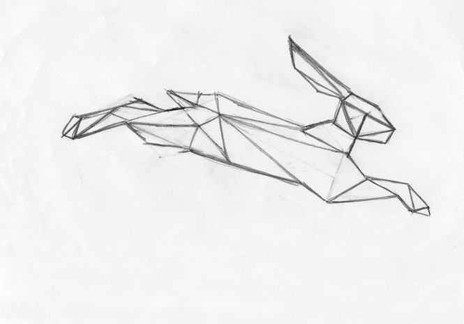
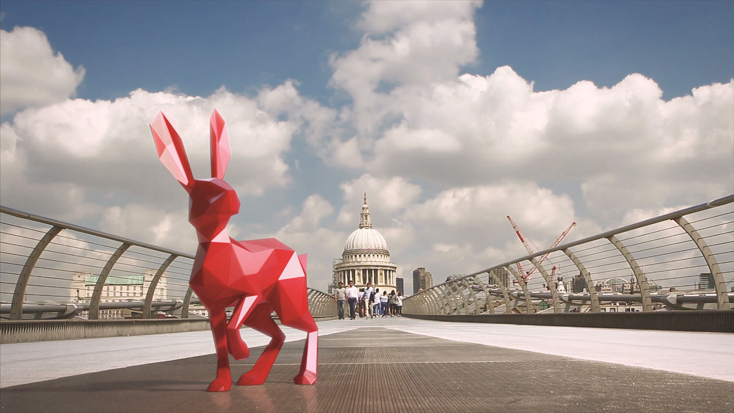
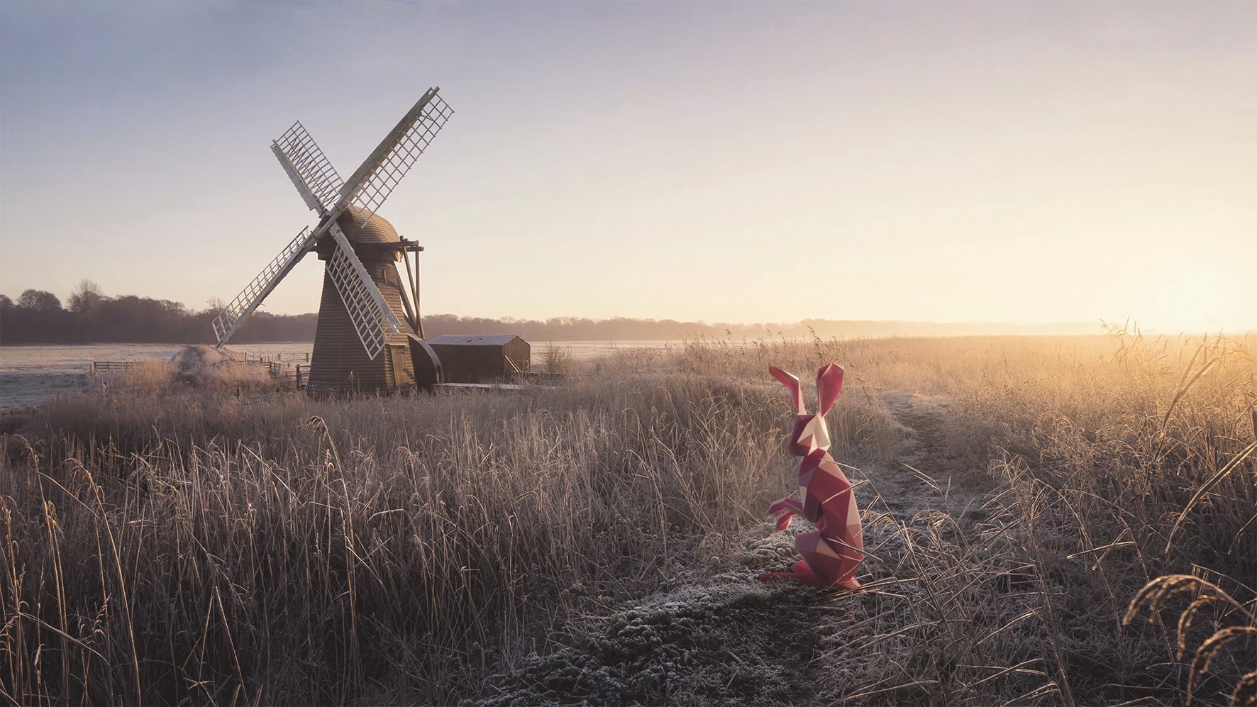
Developing that personality required a swift design process on Atomic’s part. The agency worked with film and animation studio Nexus to craft a model of the hare, eschewing fur in favour of a 3D effect that allows for flexibility across multiple touchpoint sizes, from web apps to large-scale implementations on the sides of trains.
The hare was then accompanied by a key design device, an inauspicious red line that is the key to the success of the brand. Part of Greater Anglia’s initial objective was to improve the consistency and salience of the brand across its many touchpoints and communications channels. Introducing a character was a straightforward way to achieve standout, awareness and greater loyalty. But, consistency was driven by the red line that – in practice – connects the elements of the brand’s communications.
The line links the hare to the classic Greater Anglia wordmark – which has not been updated in the rebrand – allowing for a single, unified logo bringing together three of the primary elements of the new brand. Atomic went one step further and aligned the wordmark so the two ‘Gs’ are sitting almost on the line, forming the wheels of an imaginary train, with the line positioned as the track.
The brand uses other touchpoints like the Doobie Brothers ‘Long Train Runnin’ – which has a similar rhythm to Daft Punk’s ‘Get Lucky’ and lyrics about a train journey – to create ownable, identifiable elements that build the brand’s footprint and versatility.
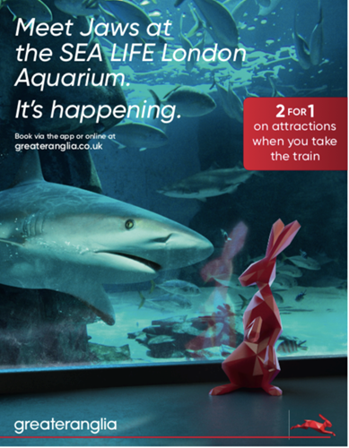
The biggest challenge, though, was in developing a new brand to support the introduction of a massive infrastructural investment, without having a single new train on the track. The brand, which is still in its soft launch period, could reference the change, which has been long expected by customers, but could not explicitly refer to it. “We can’t just say, ‘it’s here,’” says Henderson. “It’s a two-year rollout and the trains don’t come out until August.” For that reason, Atomic developed the strapline, ‘It’s happening.’ That lends the brand a sense of forward momentum and alludes to the upcoming change, without grounding the entire brand platform in it. “It sets up excitement, expectation,” Henderson adds.
Greater Anglia typically spends a large portion of its communications budget on TV advertising. But, with the timing issues around the introduction of the new trains, the company has reserved its big ad push for later in the summer. “The last thing we want to do is shout about all our new trains and then people turn up and they’re not available for another year. We’ve been careful about what we’ve been putting out there as a PR message. There wasn’t a lot of point spending a lot of paid media telling people about new trains when the new trains are not here,” says Metherell.
Metherell’s team has been working towards this moment for the past three years. The 2016 bid was built upon this investment and the company’s marketing function has been gearing up for the introduction of the new trains since Greater Anglia’s franchise was extended.
But, he adds, “We couldn’t over promise. These things do take time, they can’t all come in at once. But it’s a big transformation for the product. The tagline of ‘It’s happening’ worked both for the train transformation and for the regional inspiration, as well.” That inspirational element has been evident in early uses of the new brand. Campaigns have focused on cultural sights or destinations that, using the new brand, espouse the ‘It’s happening’ ethos. The rebrand will be fully launched around August with the introduction of a headline, 60-second TV spot discussing the franchise’s transformation.
This shift has been built alongside a change in the company’s tone of voice. The new messaging is personal, proactive and progressive – strong, ownable words for a transport company – which replace the somewhat more staid, predecessors ‘inclusive and honest.’ The tone of voice reflects the franchise’s ambition as well as the ambitious investment it is pursuing.
“In communications, nothing should slow you down. Everything should be helping you move forward in business, in leisure in life,” Bradbury says. “It’s happening. We had this notion that the communication should never slow you down or get in the way, they should always allow you to communicate in the way that makes good use of your time.” That concept was another building block of the Greater Anglia brand.
The new brand is working, so far, across Greater Anglia’s numerous channels. Its considerable radio presence has been supported by the continued use of the Doobie Brothers’ song while its sponsorship of the ITV weather in East Anglia is bolstered by the new brand. Idents on either side of the weather report show the hare leaping across regional scenes, exhibiting the power of its personality. Posters as part of the inspiration campaign show the hare interacting with cultural sites and symbols, with the ‘It’s happening’ line brought to life in combination with campaign messaging. Future imagery will focus on the benefits of the new trains, with the hare used in clever, characterful ways, stopping just shy of quirky, but still brings a sense of humanity to the rail brand.
“There is a lot of warmth in the brand and we can actually build a lot more personality around [the hare]. It does feel like it’s got legs, and it’s designed to have legs,” says Metherell. “This is not something we’re going to be changing in 12 months time. This is a longer term strategy for us.”
It’s even made changes to the trains themselves. Every new train that rolls off the production line at Bombardier and Stadler will be emblazoned with the logo, red line device and the hare itself.
And it’s been a hit internally as well. Greater Anglia’s annual management conference featured a 40-minute slot unveiling the new brand, to great effect. The hare has popped up on the enterprise social network as well, with employees creating their own hare designs and origami hares. Employees are embracing the new tone of voice, the positioning and the visual identity. New uniforms will be produced for employees as well, possibly incorporating the hare in some way.
But the big sign of its internal success has been an unprompted movement. “When colleagues see the new trains, they’ve developed this salute for when the train comes past,” Metherell says, holding his right hand up with the second and third fingers touching his thumb – making the face of the hare – and pointer and pinkie straight in the air, forming ears. The hare, then, come to life. For Henderson and Bradbury, that salute was a sign of the brand character’s success; a sign that things are working; a proof of the magic.
Peer review
Simon Manchipp, founder and executive strategic creative director, SomeOne
I love a mascot. And it’s a love that refuses to die. Be it the meerkats that have turned every zoo in the country into ads for an insurance comparison website. Or the beardy chap in a yellow jacket we got talking about death. Mascots rock, they don’t let you down, have affairs or get bad tattoos before falling out of a nightclub with their skirt around their ankles. They also have a great history in lifting the spirits (and profits) of brands worldwide.
And this little fella, I suspect, is no different. What a cutie. A shiny polygon hare. Leaping around and sniffing out good travel deals. Helping people make the jump to more far flung places. Missing the connection by a whisker? The puns can run and run (much like the hare) and the genius crew at Nexus [and Atomic} will make it look tremendous every time. It’s a good move – a smart marketing director – and stands out from the dearth of miserable functional graphics and poorly boshed out posters burning into a nations retina daily.
Big up the bunny. It’s brilliant.

