Playfulness meets elegance in Imogen Pullar Architecture’s brand


Melbourne-based architect Imogen Pullar was looking for a brand to reflect her playful personality. When she turned to Jac& for help, the design agency crafted a custom identity blending architecture and character, to give Pullar’s brand the energy to elevate her work.
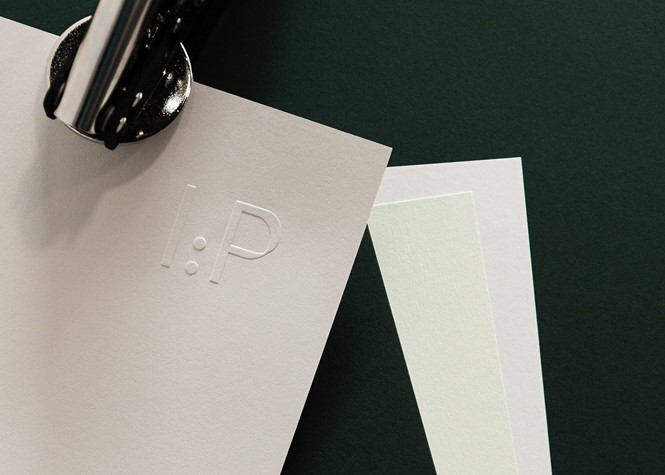
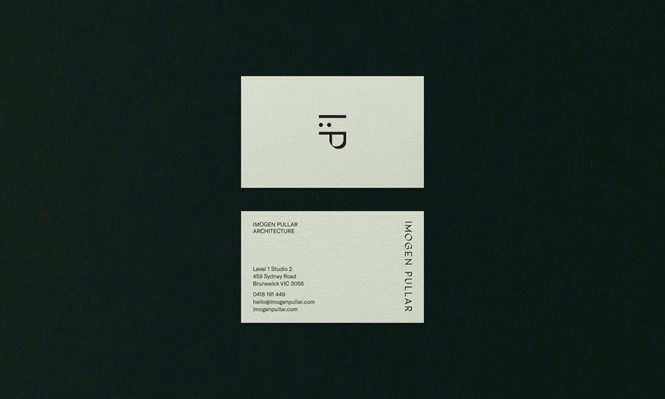
Pullar’s new custom typography conveys playfulness in careful colours and precise layouts. Through the use of a modern palette in shades of green and coral, the new brand strives for elegance and professionalism, yet takes a few licenses to show the lighthearted personality at the core of Pullar’s character. At convenience, the initials of her name can be turned into a smiley logo, which has been consistently applied across custom hats, business cards, stationery and an upcoming dedicated website.
The Australian architect’s new identity stands out for character, thanks to a bright and exuberant brand in plain contrast with its stern competitors. Whereas most architecture studios across Australia – such as Woods Bagot and Billard Leece – focus on sober and rigorous identities, Pullar’s gives a glimpse of the person beyond the brand, rendering her identity more approachable for prospective clients.
For more from Transform magazine, sign up for the Transform newsletter here and follow us on Twitter @Transformsays.


