Peer perspectives: Royal Botanic Garden
Sydney’s historic Royal Botanic Garden worked with agency Hulsbosch to unveil a punchy campaign to help build brand awareness for the site. New York-based consultancy C&G Partners’ Jonathan Alger shares his thoughts on the campaign, based on his firm’s experience in the branding of places and cultural sites
Project: Royal Botanic Garden Sydney brand campaign
by Hulsbosch
Reviewer: Jonathan Alger, managing partner, C&G Partners
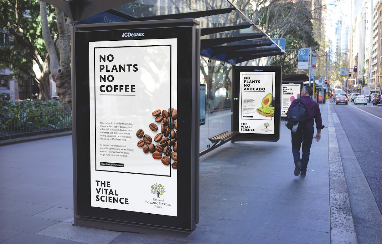
Campaign and identity: The brand campaign for the Royal Botanic Garden Sydney is eye-catching and curiosity-inspiring, with its high-contrast, stripped-down warnings about the existential urgency of plants. It also does a good job of working around the garden’s existing brand identity, which is more classic than confrontational – though in the end, a visit to the garden’s home page confirms that it doesn’t change that legacy identity.
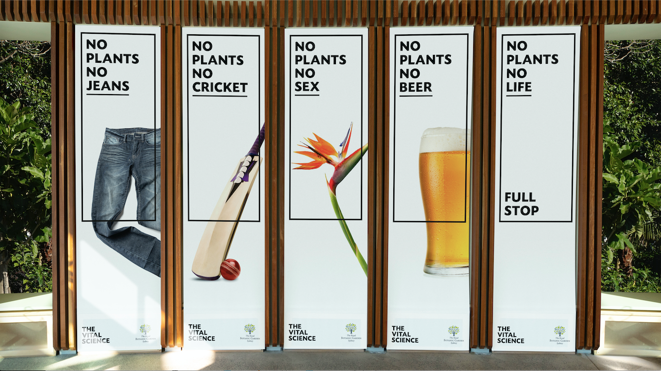
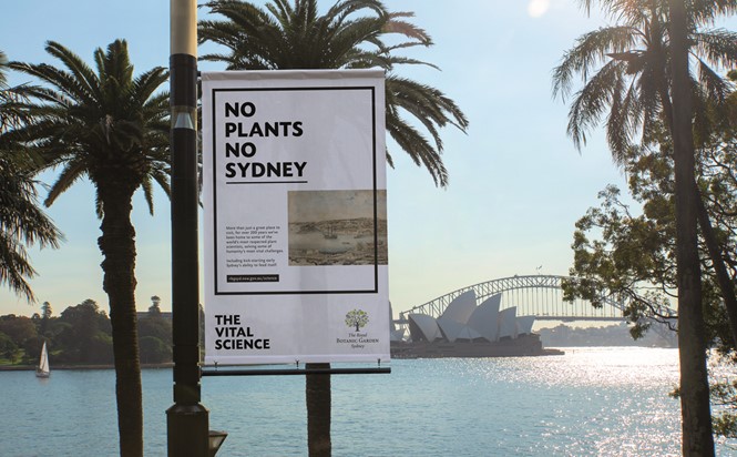
The visual language: This is perhaps a bit generic but certainly clear, and it may remind the viewer of a more stylish version of the warning label on a cigarette carton. In that sense, this campaign sort of functions like a health warning for the planet, and that’s not a bad thing.
From afar: It seems that the campaign appears mostly in the garden itself, despite the alluring images of posters on city streets that are shown as documentation for the project. Who is this for? And does it work? Is this a campaign to get visitors to come to the garden, or one to change the minds of visitors already there? I’m not a Sydneysider myself (regrettably) so I don’t know the reputation or experience of the garden firsthand. I would guess that a broadly seen version of this campaign might draw new visitors simply because of its visibility, but not because of its message, unless there is a local zeitgeist I don’t know about.
Changing minds: If the purpose is to change perception in the minds of existing constituents, I would bet this approach would do a smart job. Anyone already fond of plants would be presumably pleased to have it confirmed that they are indeed vital. Members and donors might be excited to renew or double-down, knowing that the stakes are even higher, and they can feel good about helping with such lofty goals. I know I would.
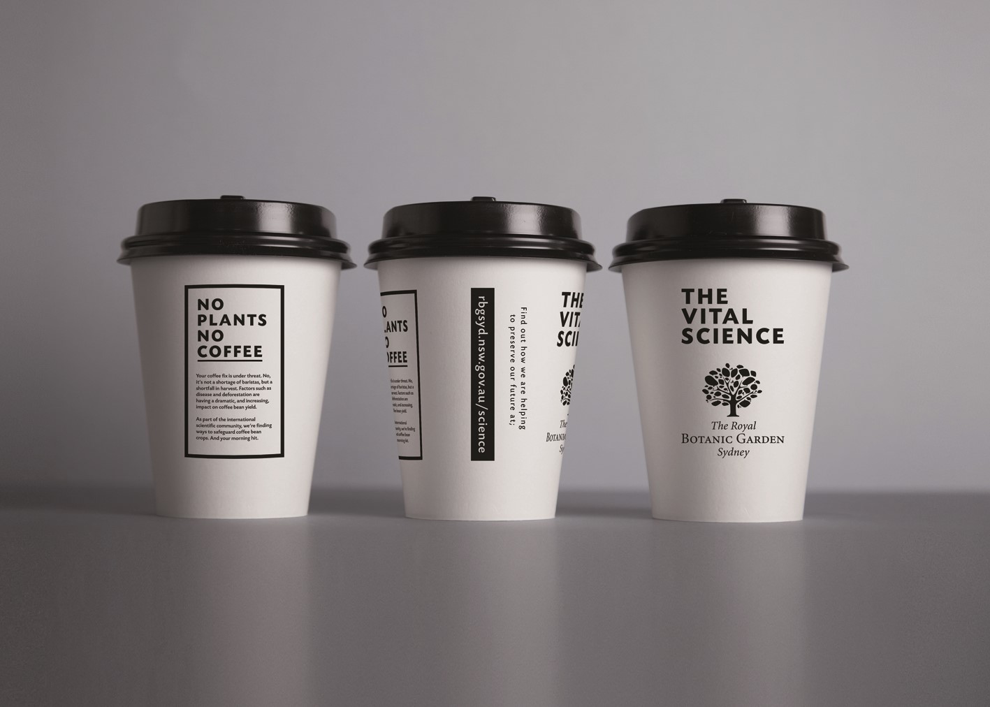
On a granular creative level: There aren’t that many visual parts of this campaign to critique, which might be one of its strengths. I can’t argue with black and white, and the line ‘The Vital Science’ is powerful. The typography could have been more thoughtfully chosen, and some of the taglines work better than others. ‘No Plants No Cure,’ ‘... No Life,’ and, ‘... No Sydney’ seem fresh, urgent and worthy. But I am not much moved by “No Plants No Sex”, unless I am awkwardly missing something. And ‘No Plants No Avocados’ seems akin to ‘No Plants No Plants,’ which I’m not sure needed to be said on a poster. Finally, I can’t tell if they were actually produced or not, but putting messages on water bottles and chocolate – about plants giving us water and chocolate – seem like smart ideas. I hope those get made.
In the end: There is something about this campaign that does seem to make everyone realise that they are plant lovers, sort of like a ‘Got Milk?’ reboot for the horticultural set. It worked on me.