Paris Catacombs rebrand brings skulls and crossbones to the surface
Paris introduces a brand for its underground ossuaries, showing creative use of negative space.
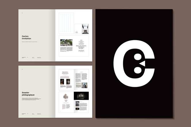
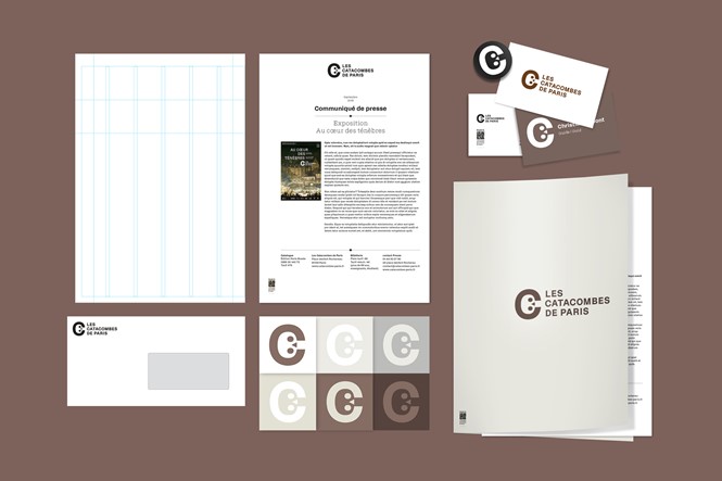
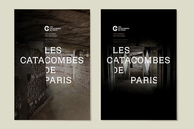
With a project conceived by French design agency Mo-To, the Paris Catacombs have announced a new brand to build an identity for the town ossuaries. The project includes a logo, a custom type family, and several applications on stationery, pamphlets and posters.
The logo represents a minimalist skull enclosed within a ‘C’ monogram. The skull, highlighted inside the letter, is a well-crafted example of negative space design, although its features risk appearing childish and in contrast with the nature of the place they stand for.
The custom type family, on the other hand, may be more grounded in what the catacombs represent. Its design winks at the underground passages, with several structural details borrowed from the lapidary inscriptions across the ossuaries themselves.
It isn’t common for catacombs to have associated brands. The catacombs of Paris have introduced a new design identity where none was present, a confident move which is sure to add value to such a famous and popular touristic site.
For more from Transform magazine, sign up for the Transform newsletter here and follow us on Twitter @Transformsays.


