Opinion: Ooh la la, the Paris 2024 logo needs to be taken seriously
Alex Moulton mulls over whether the controversial marque can silence its critics
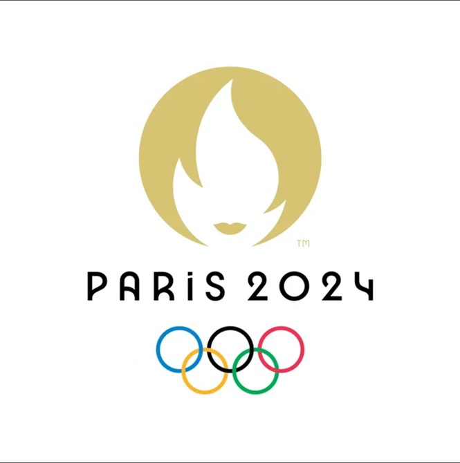
At first glance the Paris 2024 logo is simple, clean, and emotive. And if ever there was a reason to create a classic flame-shaped logo, the Olympic Games is absolutely it. But after a deeper look, confusion sets in. What exactly is this logo trying to communicate? Is it an effective rallying point for a global event? Is the design system robust enough to support all the needs that will inevitably come up in messaging around the Games?
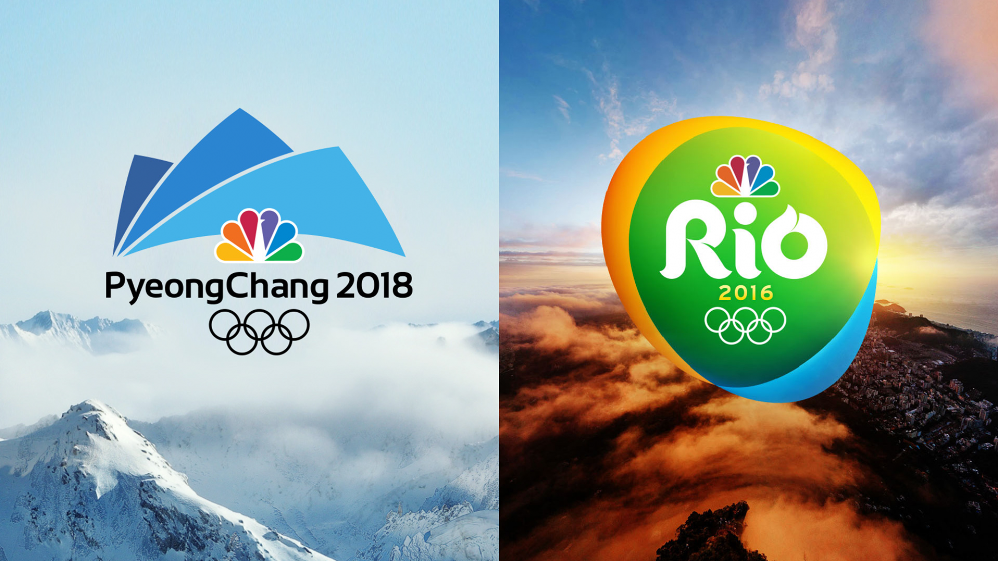
When creating the logos and identity systems for NBC’s coverage of the 2016 Rio De Janeiro and 2018 PyeongChang Olympic Games, we learned exactly how demanding this kind of brief can be.
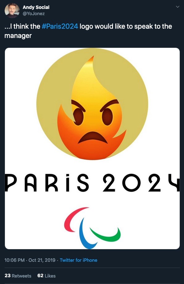
While we all get some laughs from all the Tinder, Friends, and “Can I speak to your manager?” memes on Twitter, it’s worth noting that most are not by designers who have worked on similarly scaled projects. It’s easy to be flippant about any new brand identity, but extremely difficult to create it.
All designers can attest to the challenges of creating a logo that balances clarity with memorability. Every day, we’re asked to create something that hasn’t been seen before or copied endlessly. Unfortunately, in this case the designers weren’t quite able to transcend this fundamental challenge.
The shape of the flame seems uninspired, bordering on generic. A quick search of “flame logo” reveals close matches of the flame on many stock graphic design websites. Creative Market sells one for $30. The base of the flame, aka the lips, is the only truly unique feature of the logo. But, as the internet trolls have pointed out, this feature detracts more than it adds meaning. It’s one thing to discover that an excellent logo contains a clever twist within its negative space. It’s a different thing when the negative space becomes the focal feature of the concept itself. This is especially tough if the concept can’t be read at first glance and must be explained in detail.
Onto the logo’s metaphorical gymnastics. All Olympic Games logos have historically incorporated meaningful elements of the location or host nation they’re taking place in, but rarely is the iconography nationalistic in nature.
By attributing the face within the flame to “Marianne,” a national symbol of the French Republic, the design seems to hint at a misstep in the briefing or creative process. Even with the connotation of liberty and reason that Marianne represents to the identity of France, it’s a leap to invoke an allegorical white woman to symbolize the people who will compete in the games. And the French Revolution is a strange metaphor to apply to the Olympics. Even after reading the official press statement, it’s hard to think this an appropriate choice for the international community’s premier competitive sporting event — one whose stated mission is to build a better world through sport.
However, the wordmark and typography used beneath our flaming heroine are a great choice. The Art Deco typeface clearly pays homage to the last time Paris hosted the Olympic Games in 1924, making it a beautiful and logical option.
It would be beneficial to see applications and examples of this logo in motion. The initial release shows a very simple animation, which could certainly be built upon to add additional character, symbolism, or emotion. The animation could also shift more focus to the flame itself, allowing it to more clearly represent the tradition of the Olympic Games.
It’s important to acknowledge the fundamental challenges inherent in briefs such as this. Any designer who’s worked on the Olympics knows, when the stakes are high the opinions from stakeholders are often conflicting and near-impossible to focus into a final coherent design system.
As the brand campaign continues, it would be great to see more credibility brought to the identity, which will also assuage its many social media critics. Imagine a campaign that pairs the logo with powerful statements from star athletes to underscore some of the more universal themes that Marianne can represent. And if the backlash continues, why not embrace it fully as a social activation by engaging fans to share all the ways the logo can come to life, from absurd interpretations to inspiring stories of heroism?
After all, this is a golden opportunity to bring the world together in the spirit of competition.
Alex Moulton, chief creative officer, Trollbäck+Company.