Halifax’s rebrand builds on approachability and human contacts to refresh its identity
The bank’s new brand strategy tries to scrap the ‘stern institution’ approach, looking to humanise its identity for younger generations.
Halifax has released a renewed brand identity conceived by London-based design agency Rufus Leonard, in an attempt to refresh its brand and adapt it to the latest trends.
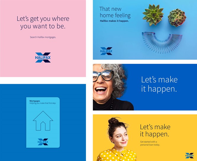
The new identity aims to ‘humanise’ Halifax to help it appear more ‘honest and democratic,’ and ultimately more approachable for prospective customers. The company’s refreshed logo still keeps the ‘X’ symbol, redesigned to be filled rather than host horizontal lines.
Halifax’s rebranded identity certainly makes an effort to help the company appear friendlier and more approachable. However, its new logo remains stern and institutional, which may repel younger generations. Yet, where the old brand was even more ‘aggressive’ and institutional, Rufus Leonard’s work has made the typeface slimmer and the design more colourful, trying to increase the company’s approachability starting from its main symbol.
The brand collateral also includes sample pamphlets and posters. Colourful and playful, they suggest trustworthiness and care, to appeal to new and existing customers.
Halifax’s rebrand is a noteworthy improvement over its previous identity but could have followed through even further in its execution. In a sea of brick and mortar and online banking options, it will be interesting to see how Halifax fairs in the coming quarters, past this brand relaunch.
For more from Transform magazine, sign up for the Transform newsletter here and follow us on Twitter @Transformsays.


