Focus: Birds and the bees

Communicating about sexual health and contraception planning in a human way required a new, consumer-facing brand for the FPA. It worked with IE Brand to launch Sexwise, a brand founded in conversation, colourful imagery and clear communications
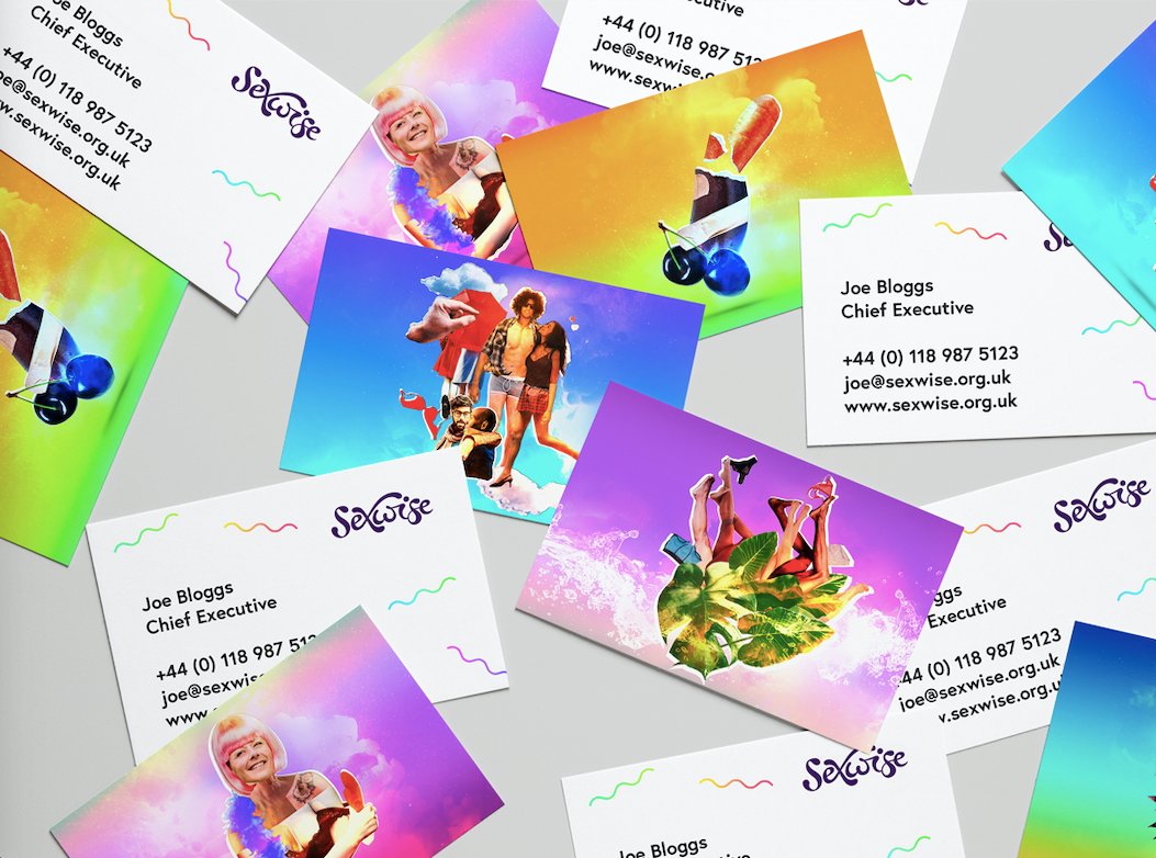
There are patterns of condoms and coils, collages of succulents and underpants, couples old and young, gay and straight. It’s not quite what would be expected from a charity once called the Family Planning Association (FPA).
But, the FPA had a bold strategy. It wanted to launch a consumer-facing brand that would address both the issues related to safe sex and STI prevention while also addressing the pleasurable side of sex. It wanted the brand to address an audience of all people of ‘reproductive age’ (roughly 16-50). It wanted the brand to be accessible to consumers, but also supported by the medical professionals who would be recommending it. It had to do all of this with authority and integrity while avoiding the condescending, clinical tone taken by others in the same space.
To achieve all of this, it turned to IE Brand, a Birmingham-based brand agency specialising in the charity, health and education sectors. The agency took to the task with gusto, determining the design strategy would be based in collage, allowing for fun and subtlety throughout the visual identity, but without shying away from an overt conversation about sexual health.
To get there, though, IE Brand had to carry out a good deal of research. With such a broad target audience and age range it had first to determine how it would target its communications. “It was all based on a lot of research,” says IE Brand’s creative director David Crichton. The agency spoke with people face-to-face, conducted surveys, did on-the-street polling and interviewed key stakeholders in the medical profession. The result of this was a clear sense the direction. “The research showed us that the more mature audiences were more tolerant to comms that skewed young, than the young adults were to branding that skewed older,” Crichton says. “That’s why it’s aimed squarely at Gen Z.”
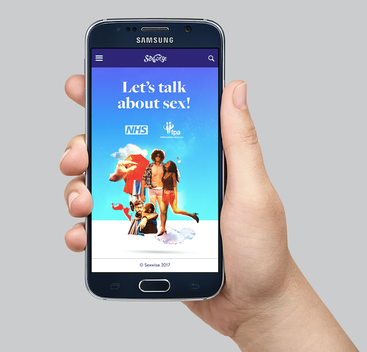
The new brand, called Sexwise, is decidedly young in tone. It has a vibrancy and life to it that addresses both the serious messaging the FPA needs to communicate as well as the pleasure and joy inherent in sex.
The FPA’s existing visual identity was clinical. It used few colours and limited photographs. It spoke in medical terms and used busy graphic devices. Sexwise is different. It is infused with bright colours and striking gradients. It uses somewhat tongue-in-cheek collages to create an energy around the conversation, while still maintaining a sense of subtlety necessary when considering it is to be used in advertising and throughout the healthcare sector. Cut-out images of broccoli and balloons, cacti and umbrellas complement the important messages being delivered through Sexwise’s resources.
Sexwise’s logo is similarly subtle, yet suggestive, with barely visible allusions to genitalia built into its hand-crafted wordmark.
The most important aspect for the FPA was the messaging itself. It had to be friendly and accessible, but still communicate about serious topics. The website also had to offer an authoritative voice to act as a respected, knowledgeable source about all things sexual, dissuading people from seeking out less-informed, more informal sources of information. “They want people to get the facts, rather than the myths,” says Crichton, “from somebody they can trust to tell the truth.”
IE Brand developed a messaging matrix that would guide Sexwise through its communications, ensuring the visual brand was supported by clear, but still human messaging. The matrix reads, “You’ll probably notice we write in short, punchy sentences. Like this. Because that’s how people speak, and our comms represent a dialogue between us and the reader.” It’s not just talk, either, the brand’s tone of voice is that of mates talking to each other. It builds trust between the reader and the brand, without being too preachy or trying too hard to be chummy.
One of the key elements was to ensure the language used was neither full of medical jargon nor cringe-inducing. Sexwise wanted to be straightforward and informative, but still relatable. An exemplary piece of the brand guidelines is: “As part of our drive to be sex positive and fun, we have to use appropriate language. If we talk about ‘intercourse,’ we’ll sound like we’re from the 1950s. If we talk about, ‘making love,’ we can expect our audiences to groan (and not in a good way!). If we start talking about ‘fucking,’ we’ll make people feel uncomfortable. And if we talk about ‘sexual wellbeing,’ we’ll sound like a tantric retreat. Instead, we take the middle ground, using words or phrases like ‘self love,’ ‘getting it on,’ or ‘getting yourself off’ – words that are fun, honest and straight talking, but aren’t going to embarrass anyone.”
Crichton says this tone of voice was developed to ensure the messaging addressed what makes sex fun, while acknowledging important messages about sexual health, “but without being x-rated and embarrassing people along the way.”
The results so far have proved it’s working. With referrals from over 500 websites between August and October 2018 – from medical professionals, consumer magazines and news publications, alike – the site is regularly reporting over 100,000 users per month.
But it’s early days still, with campaign ideas and further messaging still to be deployed as the Sexwise brand roots itself deeper into the conversation about sexual health and wellbeing.
For IE Brand, which is celebrating its 25th birthday this year, seeing Sexwise win the gold for the ‘Best visual identity from the healthcare and pharmaceuticals sector’ – wowing judges so much it overtook the eventual 2019 ‘Grand prix’ winner – was an achievement worthy of its anniversary. “We’re delighted to come away with the gold,” Crichton says. “We couldn’t be more proud.”