Five minutes with Amanda Jackson

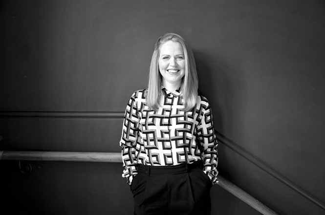
With experience in packaging and brand design in the free from category, Amanda Jackson shares her views on personality, taste and standout packaging
How did your work with Borough 22 begin and what were the key design elements for the brand?
With the Borough 22 rebrand what was really interesting was as part of the brief, Ryan [Panchoo] had said to me that this is a gluten free, vegan product, but in the hierarchy of information and what’s important, that’s actually the least priority. He was coming from a point of view that he sees it as more of a mainstream product that just happens to be vegan and gluten free. It was a donut range that could appeal to everyone. It was all about delicious food first. That’s what we really wanted to bring across in the look and feel of the rebrand. It was about food enjoyment and being able to enjoy this food, it was really inclusive for everyone.
Some of the things we did to make it a bit more mainstream and also to dial up the flavour on the packs were to introduce a window to hero the products. That was absolutely vital, because if you can see the products, it’s all about flavour appeal. Pattern was really important as well. We went for geometric patterns because they were derived from the logo, but they were also expressive of the flavours. The Borough 22 logo is very geometric and the Os are perfect donut rings. If you punch out the middle of that O, or the middle of a donut, you have a dot. And it was that dot that became part of our pattern and it was a really cohesive, unique, ownable visual language.
How did you balance traditional category cues with the free from brand story?
If I talk about donuts and cakes and bakery specifically as a category, mainstream cakes, the colour white is really important. That was one of the mainstream elements, however we’ve injected fun and personality and food enjoyment into this through the pattern and the logo and the energy that comes through and fun in the logo and the patterning. The range of quirky typefaces shows some of the fun and Ryan is really innovative and quite playful and experimental with his creations. That’s why the logo looks the way it does. The number 22 is inside a shape which has a bite out of it, which represents food enjoyment.
All of these things together help it develop a more vivid, distinctive personality. It’s that balance of playing into some of the mainstream category codes of bakery, but actually trying to talk about what’s unique about this brand and these products.
How is the free from category evolving in terms of design?
Free from food is no longer dull. It’s experimental and its delicious. I think we have to choose which rules we want to follow and which rules we want to break. But I think with a lot of the innovative products coming through, it lends itself to descriptive identities and personality-driven packaging. I think you can flex some of the rules. You can decide which ones you want to follow and which ones you want to break. Sometimes they can be rules that help you stand out. Sometimes you need to follow the rules to stand out.
Why is packaging design so vital in free from?
I think packaging is one of the most important touchpoints of a brand. Whether you’re in a supermarket aisle or you’re online, I think packaging is often the first time a consumer will come in to contact with your brand. The packaging as to work really hard. We’re seeing lots of bold packaging coming through. Bold can sometimes be through simplicity or through colour, through distinctiveness. It’s interesting the different arenas packaging has to play in. The shopping landscape has really shifted dramatically. People are more health-conscious nowadays; people are concerned about the environment and ethics. It’s all really influencing this boom in the free from sector.
How do you balance free from cues with mainstream brand personality on pack?
There are tactics that designers use to show distinctiveness. Sometimes distinctiveness can be represented through colours and patterns and imagery and it’s a combination of all those things together. It can be through fonts, it can be through straplines, it can be by being pared back, by being really bold. It can be a number of things; it depends on the category. It feels that there’s definitely more of a free rein at the minute.
When you’re free from, what consumers worry about is that it’s not as good as a mainstream or typical product. What’s been left out of this product that makes it not taste so good? The way brands and designers are persuading people is through enticing packaging. Things are designed to look delicious rather than green or healthy or morally correct.
What challenges are there in designing for the free from category?
I think it’s about pleasure with food. It’s about pleasure, taste and enjoyment. The packaging that’s coming through is quite fun. It’s quite tongue in cheek. I think when designers are working on packaging, they also have to think about how the visual identity will flex in a digital environment. Designers also have to think about Instagram and how food and how packaging and the ingredients and everything has to be good enough to share. That’s the way consumers are responding. That’s why we’re seeing a lot of this trend through colour because Instagram is really colourful and colour. Designers know that colour is a really powerful tool in dialling up flavour and taste. Packaging is so crucial to communicate the brand story.
Amanda Jackson is the owner of Jackdaw Design


