Focus: A is for Azerbaijan
Transforming how Azerbaijan was perceived as a tourist destination, and ultimately as a nation, was a task that Landor took one with creative energy, combining strategic insight with a simple idea to represent a complex country
Known for its Soviet history, for its oil reserves and sport, Azerbaijan was a destination without a clear identity. Its tourism brand lacked cohesion and it remained undiscovered by tourists outside of its regional neighbourhood.
The Azerbaijan Tourism Board (ATB) turned to Landor to examine its tourism brand and reinvigorate perceptions of the Caspian Sea nation. The brand consultancy team started with on-the-ground research, sending its team to cities, towns and rural communities across Azerbaijan for a 20-day tour, exploring the country and cementing its insights about what it had to offer. “No one really knew much about Azerbaijan,” Landor’s executive creative director for central and eastern Europe the Middle East and Africa, Shaun Loftman, says. “The biggest problem we had was the perception of what many thought it was: an ex-Soviet state, one of the ‘stans,’ oil and gas.
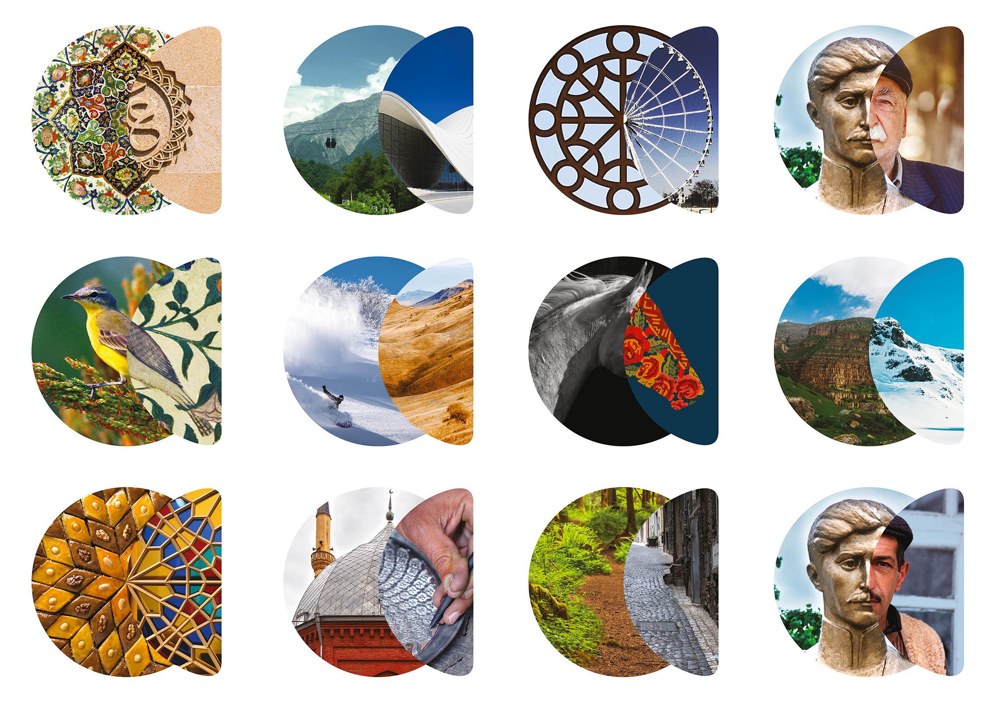
What Landor uncovered instead was something surprising. One of the nations on the Silk Road, Azerbaijan has a diverse heritage and a culture rich in food, religion, architecture, art and music. “Everything you might have imageined is twisted or contradicted,” Loftman says. That proposition led Landor to the development of the brand’s signature device, dubbed the ‘reveal lens.’
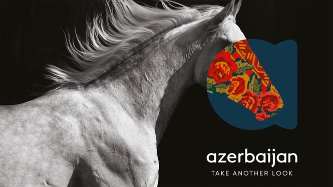
Formed into an ‘A,’ the symbol is comprised of two shapes layered on top of each other. The left-hand portion holds an expectation, something that is assumed, like ‘nature.’ The right-hand side, offers a moment of discovery, pairing nature with ‘craft.’ This reveal lens formed the basis of a new identity for Azerbaijan’s tourism board. “You look at the lens and it appears to be one thing, but actually it’s something else,” Loftman says. “That’s what Azerbaijan is, and that’s what we’re trying to tell the world.”
Landor coupled the reveal lens with a new brand positioning statement, ‘Take another look,’ emphasising the message of surprising, unexpected discoveries. The strapline translated directly into Russian, Azerbaijani and English, making it an elegant solution for three of the tourism board’s target audiences. The ease of use and clarity of these communications were especially effective.
The brand development was supported by the ATB, but it became a national brand when it turned the reveal lens into a national competition. “The response was phenomenal,” Loftman says. The national contents encouraged people to create their own versions of the reveal lens. The results were shared across social media, putting the country and its citizens firmly behind the new brand, while also crowdsourcing authentic ideas about Azerbaijani culture.
This movement helped support the official launch – in London, Delhi, Dubai, in Azerbaijan and beyond – which was the key turning point for the ATB. “For the period of launch, you need one really simple idea. You are almost trying to give people a shortcut to what they are about,” Loftman says. “The reveal lens achieved that. It’s beginning to become an icon already.”
He adds, “We went from destination branding to country branding very quickly. By defining what people should go there for, we encapsulated what the country stood for. It became a bigger project in many ways.”
Landor hadn’t set out to craft a brand for Azerbaijan as a country, yet with the widespread adoption of the ‘Take another look’ brand, and its success at launch in the tourism markets, it has become just that. It has created a consistent visual identity for a nation previously striving to find its personality. The reveal lens device combines seemingly contradictory ideas into a single brand element. It has become a national symbol, ensuring the brand’s support by the local audience and its key stakeholders.
“We went from destination branding to country branding very quickly. By defining what people should go there for, we encapsulated what the country stood for. It became a bigger project in many ways”
The sign-off proces was fairly simple for the ATB. The board presented the brand directly to Azerbaijan’s vice president, who approved it, putting the plans into motion. The next steps now are to widen the scope of the brand, encouraging merchandising options and tourism partner support. The ATB is also launching a new app, designed by Landor, to act as a companion for every visitor to Azerbaijan.
Judges were struck by the brand’s creativity and simplicity, offering a new side of a country they’d thought they knew. “This beautifully brings together the richness of Azerbaijan’s culture and craft with the simplicity of a modern design system to make a memorable and scalable brand,” one said. Another judge added that the “identity and device used to reveal the rich layers and offerings of the country is successful and provides scalability and joy.”
The ATB was in Dubai on the night of the Transform Awards MENA, purely by coincidence. The eventual success of the project, culminating in its selection as this year’s ‘Best overall visual identity’ winner left both Landor and the ATB in high spirits.
“It was a remarkable evening both for them and for us,” Loftman says. “We think Transform is doing such a great job, especially because there aren’t that many regional outlets for creativity. Supporting Transform is one of the things we believe in 100%.”
Landor won gold awards for Joali and other projects at this year's Transform Awards MENA