Waitrose packaging free from food allergies, full of flavour
The British free from category is becoming intensely competitive as supermarket own brands duke it out with prominent and upstart independent brands on limited shelf space. In the midst of that battle is the fact that, until recently, packaging was somewhat of an afterthought for free from ranges. On the own brand side, the range was often limited to a gluten free bread and a couple packs of biscuits. On the branded side, the product’s qualities were what the pack focused on more so than shelf appeal.
But that’s all changing. And supermarkets, always wise to what works on the shelf, are fighting back against the growing sector’s brand successes with own brand updates. Tesco, Sainsbury’s and Morrisons have all updated their ranges. Now it’s Waitrose & Partners’ turn.
Following a brand repositioning and new visual identity by Pentagram earlier this autumn, the upmarket retailer has carried its brand ethos through to the new range. The new visual identity, unveiled by brand agency Williams Murray Hamm (WMH) is clever, upscale and unique. It has a characteristic Waitrose touch, but it's the positioning that may help the range stand out.
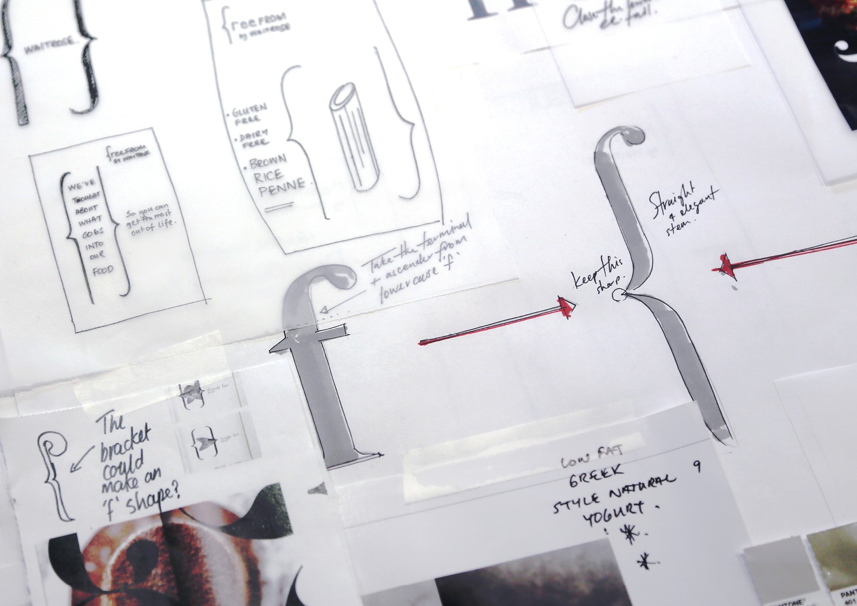
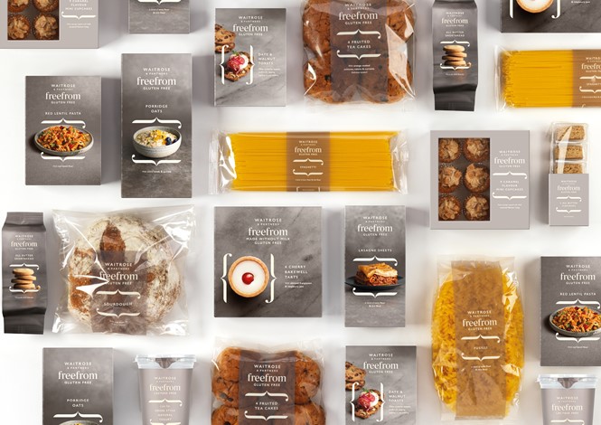
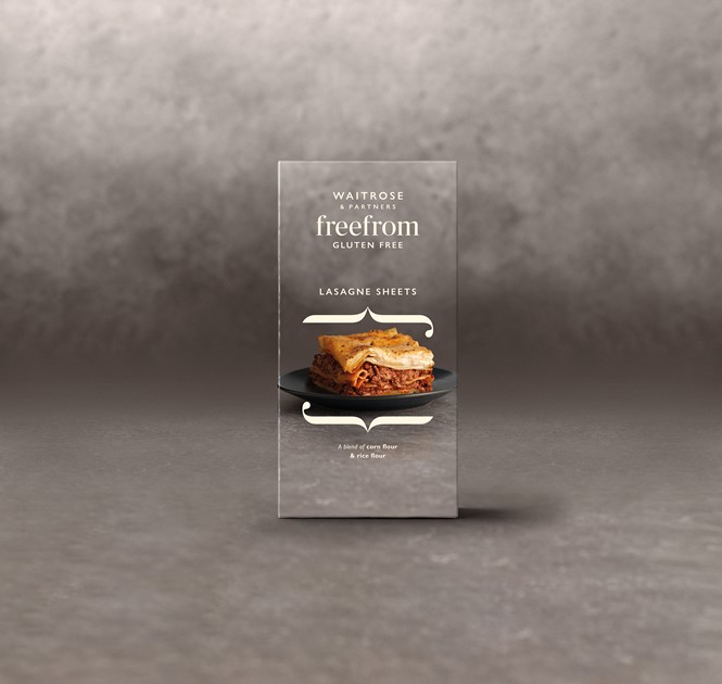
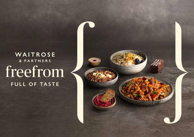
The agency took the ‘F’ from ‘free from’ and manipulated it into a set of brackets that act as the primary visual device. They’re elegant without being extravagant and help draw attention to different parts of the packaging.
Elen Ormson, health brand manager at Waitrose & Partners, says, “WMH fully understood our desire to make the new free from range an exciting, enticing choice for discerning shoppers. The design successfully emphasises the fact that the range is free from gluten or lactose while embodying quality, taste and deliciousness.”
The new range also offers a unique positioning. It focuses on taste, not ingredients. It seems to be a range of quality Waitrose products that just happen to suit different dietary requirements. This is somewhat exemplary in the category as most products focus on their ability to cater to different needs as a primary concern, while focusing on flavour latterly. Sainsbury’s own brand range takes this tack. It uses a uniform greenish colour across the whole range, while employing an easily identifiable coding system to help shoppers choose products based on lifestyle or need.
The quintessentially Waitrose positioning lends to an editorial imagery style as well. Photographer Jonathan Gregson’s rich, enticing images complement the natural greys, ivories and taupes of the pack design.
“We set out to create a visual identity that looked and behaved differently to the category more broadly, with a more positive, editorial approach. Reinforcing Waitrose & Partners’ position as a trusted expert in this growing category,” says Chris Ribet, lead designer at Williams Murray Hamm.
That said, the free from qualities are listed clearly on the front of the package.