Uber's brand is always on the move
In 2016, former Uber CEO Travis Kalanick took inspiration – or so the rumour goes – from hotel bathroom tiles and worked with in-house designers on a rebrand of the popular ride hailing app. The brand had two main iterations, one for riders and one for drivers, but were both based on a geometric pattern that did away with the rigid all caps wordmark of the past.
In the mere two years since, the company has had its fair share of PR issues to deal with on a global basis, not least of which was the resignation of Kalanick and the appointment of new CEO Dara Khosrowshahi, formerly of Expedia Group. Today, the company announced that it is introducing a new brand once again.
Working with Wolff Olins, Uber’s new brand is centred around a more flexible interpretation of transport – presumably paving the way for increased Uber helicopter, tuk tuk and bike services, and the like. The new approach starts simply, with a monochrome wordmark rendered in a somewhat formal sans serif typeface. It’s a bit cold in isolation, but in implementation, it has a strong professionalism, while still retaining Uber’s personality.
It also shows the strong association with Uber’s first brand never quite rubbed off. “One thing was clear: a truly iconic brand system would leverage the power of our name recognition. We also found an overwhelmingly positive association of our brand with the color black,” says Uber’s brand portal, adding that people wondered where the ‘U’ had gone. Resultingly, resurrecting the wordmark was one of the key objectives.
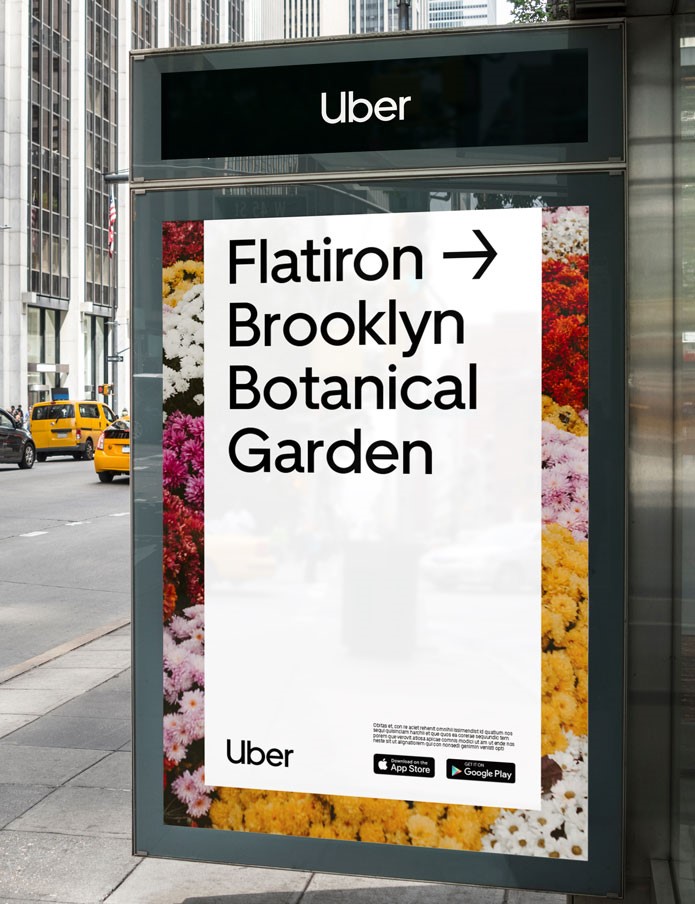
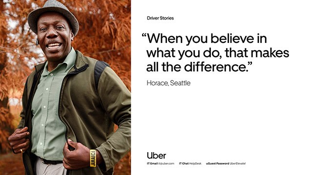
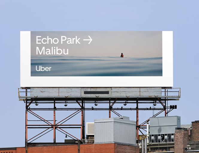
The system is expanded with place-based and transport-based photography depicting everything from a hot air balloon to a bicycle. The photography also helps increase the humanity of the brand, by focusing on individual drivers and their stories, something Uber has done successfully in its TV spots as well. Safety has also been a focus, as per the instruction of the new corporate leadership, identified by the use of blue throughout the visual identity. The type is a custom-designed font called Uber Move, crafted by the LA-based MCKL Type Foundry.
But, what really brings the brand to life is its use of the arrow icon, particularly as it appears in videos and gifs. Iconography, movement and some illustrations round out the system, providing a sense of forward momentum and constant action fitting with the brand’s purpose.