#TransformTuesday: 8 May

Every week, Transform examines recent rebrands and updated visual identities. This week's picks are below. For more from #TransformTuesday, follow @Transformsays
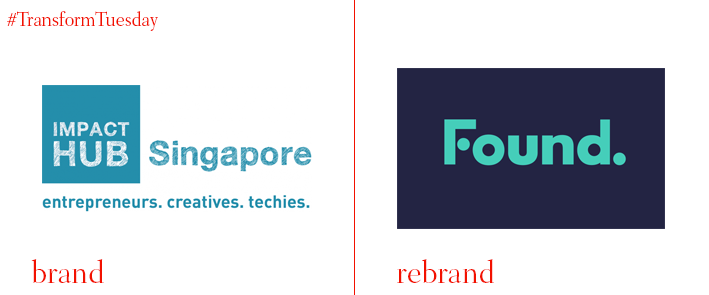
Found.
Singapore-based co-working space previously known as the Hub Singapore has introduced a new name and identity, developed by global agency Edenspiekermann, to foster a sense of belonging among a disparate workforce. The logo for Found., as the space is now known, is based on the idea of connecting two dots – lost and found, ying and yang – while the full stop after Found. reflects the end of a journey. Grace Sai, founder and CEO of Found., says, “It was important for us that our new brand reflected our ambition and vision in building the best network of innovation studios across the SEA region. It needed to capture the essence of being in the Found. community – of courage, collaboration and a fierce passion in creating change in the world.”
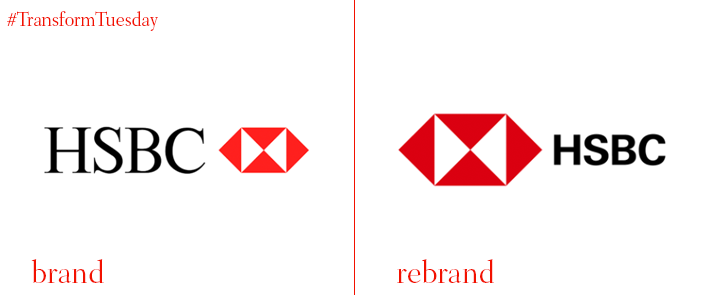
HSBC
Global bank HSBC has updated its logo using sans serif font and released an accompanying set of marketing visuals, alongside a larger, more prominent version of its iconic hexagon. Underpinned by the phrase ‘Together we thrive,’ the brand update follows the recent trend of global financial institutions becoming more digital-ready while addressing the need to display a wider purpose. “Our latest global marketing campaign explores how HSBC helps people prosper in the 21st century,” says the HSBC brand page. “HSBC’s iconic red and white hexagon plays a central role. It becomes a lens through which to look at the world, showing how the influence of the bank can help individuals, businesses and communities to grow and flourish.”
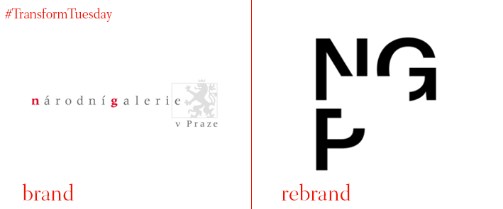
The National Gallery in Prague (Národní galerie v Praze)
Home to the largest collection of European art in the Czech Republic, the National Gallery in Prague (Národní galerie v Praze, in Czech) is a state-owned cultural institution with education at its heart. Opened in 1796, the gallery boasts a rich history across its nine buildings – a trait reflected in a new identity set to launch over autumn 2018. Following an invite-only competition launched by the National Gallery in Prague and design collaboration company CZECHDESIGN, the Prague-based Studio Najbrt was chosen. The gallery’s new identity reflects the open nature of the institution and aims to boost awareness of the National Gallery in Prague while encouraging new audiences to learn about historic and contemporary European art.
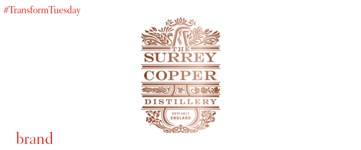
Surrey Copper Distillery
Drink brand design agency Nude Brand Creation has developed the name and identity for the Surrey Copper Distillery, a brewing company launched in June 2017 by former chief brewer at SABMiller PLC, Professor Katherine Smart and Dr Chris Smart, former head of brewing services for Campden BRI. Using design tropes that reflect the historic process of brewing and the distillery’s Surrey location, Nude Brand Creation emphasise the Italian-made copper which Surrey Copper Distillery uses throughout the brewing process. Tony Enoch, partner at Nude Brand Creation, say, “The identity and name needed to communicate this expertise and the cerebral nature of the venture [Katherine and Chris] are embarking on. So, we created a brand with substance that would flex across packaging design, the website and other collateral, but that also reflects their academic backgrounds and their bid to reinvigorate historic recipes.”
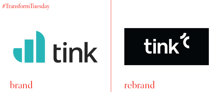
Tink
Swedish customer finance app Tink was launched in 2012 by CEO Daniel Kjellén and CTO Fredrik Hedberg, to allow customers to manage money across any bank or account. Tink has recently rebranded following a project led by international brand design agency Kurppa Hosk to better communicate the app’s function to its steadily growing audience. The new design will also ready the company for further expansion across Europe and comes at a time where Tink is enjoying new partnerships with global banks. Kurppa Hosk says, “The new visual identity goes beyond just a logotype and is more of a scheme composed of a number of core elements that come together to create a distinctive visual language that makes the Tink brand instantly recognisable and sets it apart from the rest of the fintech landscape.”
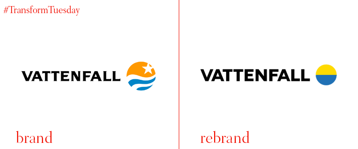
Vattenfall
With around 20,000 employees, Vattenfall is one of the largest energy suppliers in Europe. Having carried the same logo since 1992, from March 2018 the company began rolling out a new corporate visual identity developed by the Swedish office of the Nordic-based agency NORDDDB. Karin Lepasoon, head of communications at Vattenfall, says, "[We] want to project ourselves in a modern and clear way and build on our strengths. That's what our customers and the world around us expect of us. By becoming clearer, we expect to make a greater impact and thus use each krona spent on marketing more effectively in future. Another element in this streamlining process is that we are also reducing the number of our brands, currently as many as 25, and will now replace them with one single updated Vattenfall brand.”
For more from Transform magazine, follow us on Twitter @Transformsays


