#TransformTuesday: 30 October

Every week, Transform examines recent rebrands and updated visual identities. This week's picks are below. For more from #TransformTuesday, follow @Transformsays.
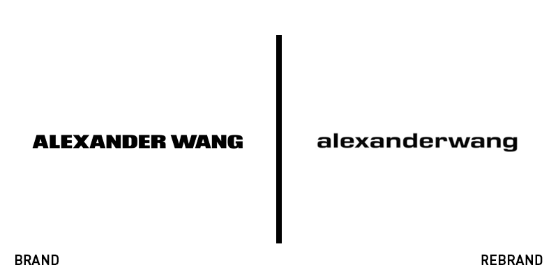
Alexander Wang
Following the steps of leading fashion brands such as Burberry and Celine, American haute couture firm Alexander Wang has updated its logo, marking the first time the company has undergone a rebrand since its establishment in 2005. Maintaining the minimalist and clean look the brand is known for, the new logo features the company’s wordmark written in a bold, lowercase font. By adopting a trend that has been dominating the brand typeface world, Alexander Wang manages to add a contemporary touch to the visual identity, without having to resort to any drastic changes. The new logo was revealed to the public in the context of the designer’s latest campaign, in collaboration with Japanese casual wear designer, manufacturer and retailer, Uniqlo.
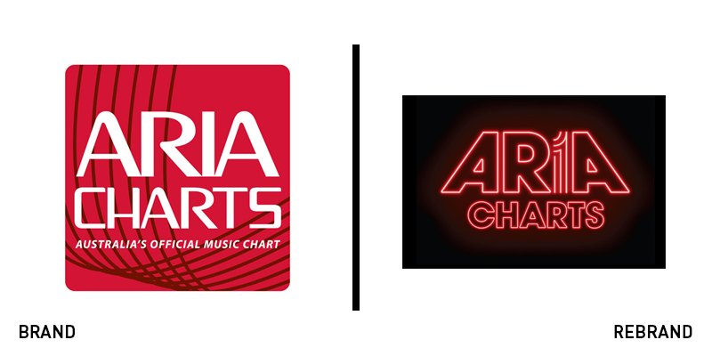
Aria Charts
Aria Charts, the Australian music sales charts, released weekly by the Australian Recording Industry Association,, have rebranded, revealing a new logo and overall visual identity alongside a new brand proposition. Aria Charts has changed its culture, turning its focus to rewarding streams from paid subscriptions more than those from ad-supported services or programmed platforms in an effort to measure streams in regard to their revenue and access. Aria’s CEO, Dan Rosen, says, “These changes ensure that the Aria Charts remain the most comprehensive and trusted charts in Australia." The new logo resembles a neon sign, with the word mark written in red in from of a black background, resulting in a fun, eye-catching and distinctive visual identity.
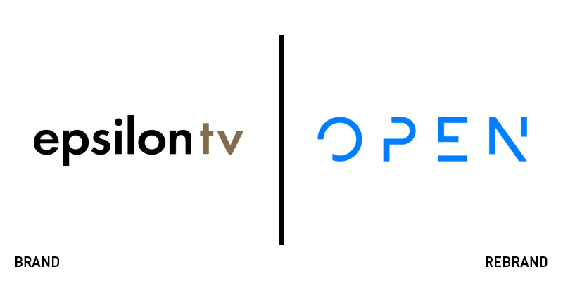
Open TV
Greek TV channel Epsilon has rebranded, changing its name, visual identity and positioning to enter the new era of Greek entertainment. Under a new name, but with the same owners and management, Open TV attempts to make a fresh start and become a leading figure in the suffering Greek TV industry. Leaving behind a tired and outdated logo that was reminiscent of past decades, despite its relatively young age, the brand has introduced a fresh new visual identity that offers optimum digital translation, with an abstract aesthetic and minimalistic design that manages to make the channel’ look modern and relevant.
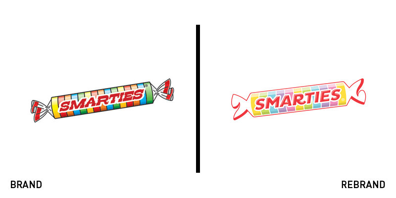
Smarties
US candy company, Smarties – separate from the British chocolate sweets of the same name – has unveiled a new logo designed by branding agency Pearlfisher, leaving behind the iconic and beloved logo that accompanied the brand for the last decade. Cautious of not alienating the loyal customers Pearlfisher undertook a year of research resulting in a new visual identity that has maintained some traditional elements, such as the red wordmark, while at the same time infusing modern ones, such as the introduction of a wider colour palette, updated typeface, roll design and silhouette, achieving a balance of old and new. Smarties’ co-president, Liz Dee, says “With our new logo, we leverage our authentic nostalgia with a present-day quality. The final composition was a clear winner because it successfully captured our beloved classic look and feel in a smart, modern way.”
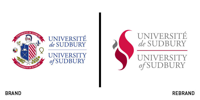
University of Sudbury
A Roman Catholic university in Sudbury, Ontario, the University of Sudbury, has revealed a new visual identity, including a new logo. The updated logo references the university’s strapline ‘A flame of glowing radiance’ with the illustration of a flame, which also serves as symbolism for the inner strength that every person possesses. The three flames represent the university’s three languages; English, French and Ojibway. The number three also indicates the layers of humanity, as well as the the Holy Trinity. Furthermore, the three different sizes celebrate the diversity within the university, while the negative space between the fames shape the letter ’S’ from Sudbury. The colour palette has gotten rid of the overused blue, and instead features two shades of red and a shade of grey, integrating the modern with the classic.


