#TransformTuesday: 3 July
Every week, Transform examines recent rebrands and updated visual identities. This week’s picks are below. For more from #TransformTuesday, follow @Transformsays
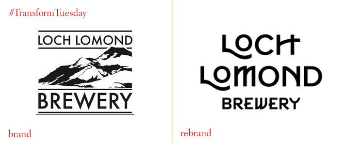
Loch Lomond Brewery
Glasgow-based drinks branding specialists Thirst Craft has rebranded the award-winning Loch Lomond Brewery, focusing on its two core ranges ‘Classic Range’ and ‘Craft Range.’ Keen to highlight the brewery’s commitment to trying innovative new recipes and interesting flavours, Third Craft nonetheless also wanted Loch Lomond Brewery’s new branding to reflect its strong Glaswegian heritage. Collaborating with illustrator Jack Daly, the new designs aim to take the drinker on a journey through the loch. There is also a slightly competitive element through the inclusion of a colour-code system and tasting notes included in each pack - focused on flavour, the rebrand encourages drinks to truly appreciate their beer choice.
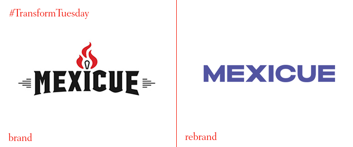
Mexicue
With a strong presence around New York City and Stamford, Connecticut, local restaurant chain Mexicue serves dishes inspired by Mexican and South American cooking. In an overhaul of its visual identity, which includes a new logo and associated marketing materials, Mexicue has shed its somewhat cliched all-American ‘real food’ image in favour of a bright, vibrant colour palette that reflects the flavours it serves. Carried out by New York-based creative agency High Tide, the rebrand also embraces two new typefaces - one representing the food’s Mexican origins, the other body affirming the restaurant’s heritage-inspired name.
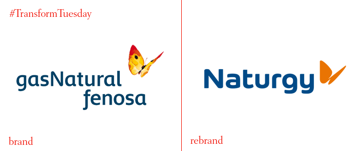
Naturgy
One of Spain’s largest energy companies, Gas Natural Fenosa, has announced an overhaul of its corporate strategy - including a rebrand, which sees the company henceforth be known as ‘Naturgy.’ The change is part of a wider drive towards ‘value creation,’ according to the company; Naturgy has also begun investing in sustainable energy sources, a key focus for many energy companies across Europe. “With Naturgy, we are building an international brand adapted to all the global markets where we operate and where we will operate,” says chairman, Francisco Reynés. “After all these years, we are lending fresh impetus to address new commitments, to be closer to our customers wherever they are and to seek out simple, environmentally-friendly solutions.”
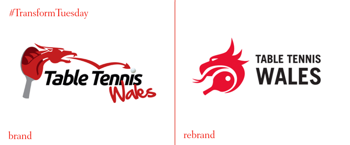
Table Tennis Wales
Table Tennis Wales, the national governing body for the sport in Wales, has released a new logo and visual identity following a rebrand project by London-based design and brand studio, Grafico. With the iconic Welsh dragon retained as a key element of the brand, the new identity is more flexible and can be applied in numerous ways - including across clothing and digital. Creating a more abstract logo sees the dragon and table tennis paddle better integrated, with a unified type choice that simplifies the brand offering.
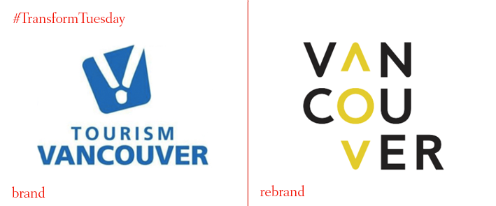
Vancouver Tourism
As the world becomes better connected, so the choice of holiday destinations becomes wider. One city that has recently rebranded to highlight its credentials for tourists is Vancouver, Canada, widely regarded as one of the country’s most diverse and welcoming places. Its core destination marketing arm, Tourism Vancouver, has released a new logo and accompanying marketing collateral to highlight the city as a key destination for travellers, business meetings and events. Carried out by travel marketing agency MMGY Global and advertising firm McCann Canada, the rebrand aims to create an impact on tourists that visit the city, and those considering a trip. The description accompanying the new visual identity says, “Vancouver’s destination brand is about perspectives. Vancouver is a multi-dimensional, ever-evolving destination that reflects and celebrates diverse viewpoints and variety in nature, culture, food and activity… The compass motif represents letting go and allowing the city to guide you. It represents exploration. Exploring the beauty in everything that surrounds you, as well as the beauty within yourself.”
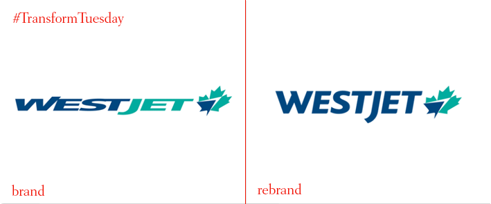
WestJet
Canada’s most well-known low-cost airline, WestJet, has unveiled a rebrand of its logo and livery as part of its rollout of a fleet of Dreamliner aircraft. Designed by London-based brand and design experience agency PriestmanGoode, the new plane interiors is adapted according to economy, premium economy and business class, including a changeable colour palette of alpine lake blue, aurora tones and earthy tones. Its updated logo and livery is the result of a project by Toronto-based Ove Brand Design, which updated the font to ‘Bliss’ and reimagined WestJet’s iconic maple leaf symbol. Ed Sims, WestJet president and CEO, says, “The updated livery is modern and dynamic while the interior is world-class, distinctly Canadian and uniquely WestJet. Both reflect WestJet’s transition from a regional airline in 1996 to a new era of connecting Canada with the world and bringing the world to Canada.”


