#TransformTuesday: 29 May

Every week, Transform examines recent rebrands and updated visual identities. This week's picks are below. For more from #TransformTuesday, follow @Transformsays
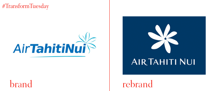
Air Tahiti Nui
With pristine waters and idyllic surrounds, Tahiti is a Pacific paradise; accessible only by flying or sailing a very long way from pretty much anywhere else. Air Tahiti Nui is the island territory’s flag bearer airline. With a renewed positioning in its 20th year, the airline enlisted Futurebrand to reimagine its livery and logo. The result is a shift in focus on the fleet’s most recognisable symbol, its ‘Tiare’ flower. The new approach also aligns the brand closer to the French Polynesian tourism board’s recent campaign for Tahiti, which used elegant typeface and design devices to focus on the people and places of Tahiti. Futurebrand writes, “The wordmark’s elements and the new Tiare symbol provide a fleeting glimpse of the culture, hospitality and service that you can expect from Air Tahiti Nui and the islands’ people.”

Centre for Public Christianity
Australian non-profit media brand, the Centre for Public Christianity, distributes content to the public and the media about the Christian faith. It recently worked with Sydney design agency For the People on a rebrand that dots the I’s and crosses the T’s. By transforming the traditional cross shape into a plus sign, and a longer vertical bar – effectively, positive and negative – the new identity is flexible and ripe for use across digital, gifs and social media. The refreshed branding is transparent and straightforward.
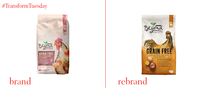
Purina Beyond
Pet food has changed due to the increased trend in healthy living. Healthy people want to buy good food – for themselves and their pets. Thus, Purina’s Beyond range has been redesigned by CBA to support its leading status in the natural pet food category. With brush-stroke illustrations, brighter colours, high-contrast designs and natural photography, the new packaging is primed for better differentiation. Will Burke, chief innovation officer at CBA, says, “Our approach to the redesign was to build on the elements that were already working well in conveying the quality of the natural ingredients, while creating a more standout and easy to navigate portfolio at shelf.”
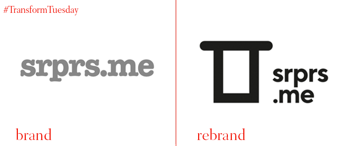
srprs.me
For some, a roulette board of fantastic experiences, for others, a scary leap into the unknown, mystery travel specialist srprs.me has undertaken a new journey with its brand. Working with Belgian agency Today, the brand focuses on a “magical open-mindedness and sense of wonder we all remember wistfully but too often let go of.” The identity had to be simultaneously trustworthy and fun, lending to a custom, but familiar typeface with rounded corners and a reassuring sans serif. Today also introduced a new graphic device to the logo, allowing the system much more flexibility than it previously had.
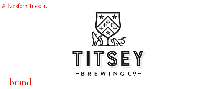
Titsey Brewing Co
A historic manor in the Surrey countryside, Titsey Place has recently launched its own microbrewery. With a three-beer collection including an IPA, a bitter and a hoppy pale ale, the packaging and naming strategy reflect the estate’s heritage. The brewery crest is influenced by the crests of the estate’s most prominent families – Gower and Gresham – and uses their emblems of the wolf and the grasshopper in beer names. Craig Vroom, owner of the Titsey Brewing Co, says, “When we began working with PB Creative all we had was the brand name. While we were keen to draw on the history of the Titsey Estate, we didn’t want our brand or beers to look old fashioned or dated.” PB Creative delivered with a surprisingly modern, graphic packaging scheme that uses colour and typography to differentiate the range.
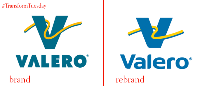
Valero
Texas-based fuel refining company Valero has announced a new design strategy for its forecourts, named Vanguard. The approach will be rolled out to all 7,400 convenience stores and gas pumps that use the Valero brand. With a strong presence in Mexico, and broader expansion taking place, the time was nigh for examining the Valero brand. Working with Atlanta-based design firm Anista Fairclough, the new visual identity retains Valero’s colour palette, but freshens up the tones for a more vivid look. The typeface is also friendlier, and the signature yellow squiggle/road device is smoothed out a bit.


