#TransformTuesday: 28 August
Every week, Transform examines recent rebrands and updated visual identities. This week's picks are below. For more from #TransformTuesday, follow @Transformsays
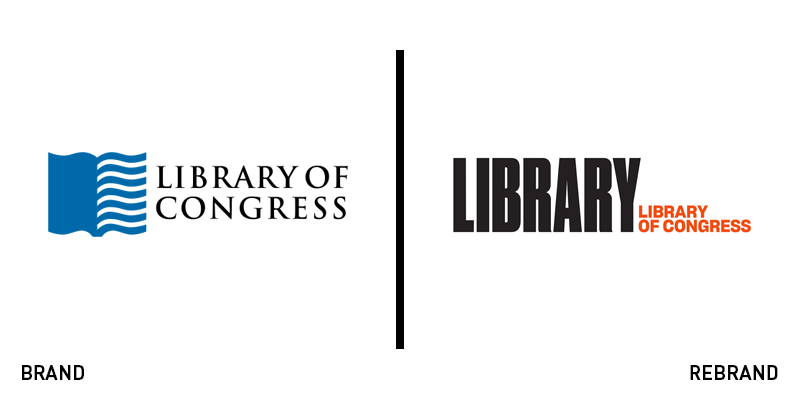
The Library of Congress
The Library of Congress in Washington DC is the world’s largest library. Spread across three buildings it houses over 32 million books and printed works. It is, as librarian of congress, Dr. Carla Hayden, states, “A treasure chest, filled with limitless information and services, ready to explore and amaze if you open it up.”
In an attempt to make the library more accessible to a wider audience, the Library of Congress appointed Pentagram to create a new visual identity, with a brief for something bold and contemporary that embodied the Library’s global scale.
While the full name was also set in Sharp Grotesk 20, Pentagram led with, and emphasised the word ‘Library’ in the much larger and heavier Druk Condensed Super. Additionally, the word is designed to be broken up with imagery hinting at the riches found within the library’s collection.
According to Pentragram the new identity acts as “an invitation for all to visit physically or virtually to take advantage of all the treasures within.”
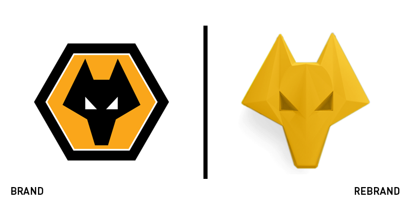
Wolverhampton Wonderers
The English Premier League (EPL) is the world’s wealthiest. Membership of its hallowed ranks provides a TV rights income alone of nearly £100m ($130m). In 2018, after a six year hiatus, Wolverhampton Wonderers (Wolves) rejoined the 20 clubs that make make up this lucrative league.
However, with a fan base still predominantly drawn from a fifty mile radius of its Molineux Stadium, Wolves needed to reach a wider audience to realise it’s global ambitions. It appointed brand agency SomeOne to better communicate the future and intentions of the club.
Changing a football club’s visual identity can be a controversial thing and SomeOne decided against altering the club’s iconic wolf marque. Instead, they used it as inspiration for a new 3D brand property and took the geometric cut outs of the wolf head to create two new typefaces, Wolves Display and Wolves Display Cut - bold and condensed fonts that add a reminder of the industrial heritage of Wolverhampton.
As SomeOne’s founder and strategic director, Gary Holt, commented “The strategy, values, and ethos encompasses everything the club stands for, from its heartland in the West Midlands to a global audience. It’s this combination of future and past, ambition and respect that made it so compelling, and such a driving force for the BrandWorld”.
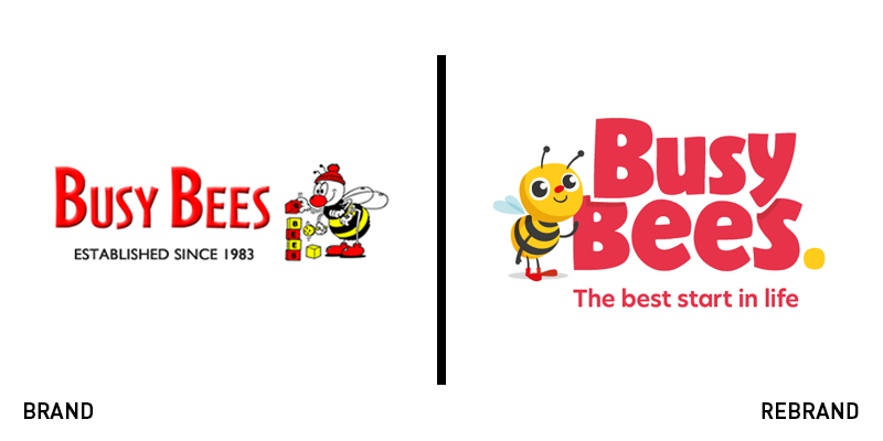
Busy Bees
Five years ago, Busy Bees was acquired by pension fund Ontario Teachers Pension Plan. It was already the UK’s largest childcare provider, but that acquisition has proved a catalyst for growth. It’s UK operations have expanded by over 50%, and it has launched in Malaysia, China and Canada and recently completed a buyout of the 30 strong Australian group, Foundation Early Learning. All with a logo conjured up in 1983.
Busy Bees appointed design agency Together, with a brief to evolve the visual identity and brand assets into something that could sit alongside other pre-school brands such as CBeebies, Mothercare and Pampers.
The rebrand includes a new logo, a custom typeface, illustration, colour and tone of voice. In addition to the visual identity, an audio brand has been developed and film and photography guidelines focus on details such as lighting and camera angles, directed to shoot from the height of the child.
The new brand will be rolled out during September.
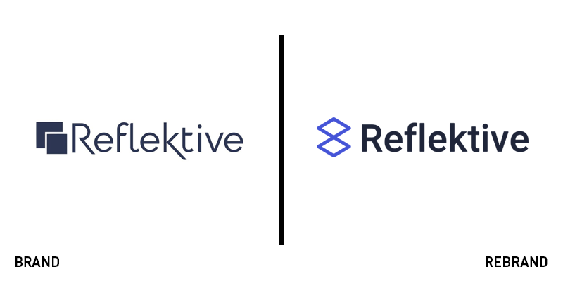
Reflektive
Having helped nearly 500 companies with their HR and performance management, employee feedback specialists Silicon Valley firm Reflektive needed a visual identity to reflect the services and ambition behind the company. Their previous logo relied on iconography that suggested a one-way communication flow of forms and sheets, whereas increasingly the organisation was stressing the key to their services and products was the relationship between employee and management.
Eschewing the services of a brand consultancy, Reflektive chose to make the brand journey an internal one, and developed ‘the Duo’, a logo designed to reflect the alignment of the manager-employee relationship and alluding to the value of people. The logo sits aside the word mark, and as Dani Fankhauser, Reflektive’s head of content, comments, “The three key traits that we hope to convey [with this design] are employee growth, employee-manager alignment, and connection. Additionally, we chose a bold shade of blue to represent the innovation we are enabling in organizations.“


