#TransformTuesday: 26 June
Every week, Transform examines recent rebrands and updated visual identities. This week’s picks are below. For more from #TransformTuesday, follow @Transformsays.
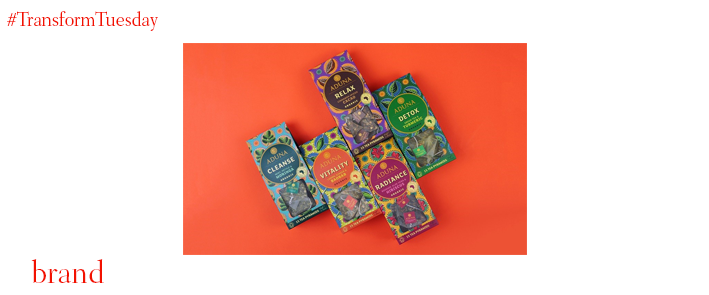
Aduna
Health food brand Aduna has appointed London-based packaging and branding agency Carter Wong for the launch of its new range of teas. This is not the first time the two companies collaborate, with Carter Wong introducing vibrant packaging across Aduna’s products in 2013. Now, to support the five new ‘Super-Teas’ Aduna has released using Moringa, Baobab and Cacao, Hibiscus and Turmeric, different lively patterns and colour palettes have been designed to distinguish each different flavour while maintaining a unifying look across the range. The patterns reflect the style of African fabrics, emphasising the authenticity of the brand and giving the products an eye-catching quality.
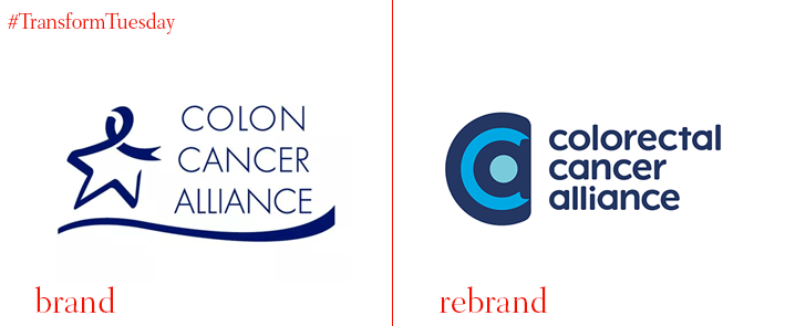
Colorectal Cancer Alliance
The largest and oldest colorectal cancer non-profit organisation in the US, the Colon Cancer Alliance, has rebranded, changing its name to Colorectal Cancer Alliance, along with its logo and visual identity. In the framework of the new visual identity, the organisation also launched a new, updated website. The rebrand’s main objectives are to increase the number of patients served, save more lives and invest money in research. The new logo has kept the same colour palette of dark blue, adding a lighter blue that breathes some life into the illustration. The font is bolder and curvier, displaying the organisation’s name in lowercase, while the outdated star has been swapped for a spiral-looking ‘C’, giving the brand a contemporary look.
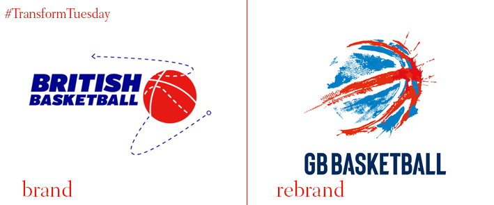
GB Basketball
Basketball’s governing body in Great Britain, GB Basketball, has revealed a new visual identity led by creative and digital agency Mr B & Friends, ahead of the Basketball World Cup. Along with photography and motion studio Shadowplay, the agency has designed a brand and graphic language that pays homage to the sport’s urban quality, reaching a broader audience. The rebrand was delivered as part of a value-in-kind sponsorship with GB Basketball. Lisa Wainwright, CEO of British Basketball, says, “The energy and impact chimes with our new vision and will help propel us to success as we target additional funding for the team going forward. We look forward to rolling this new brand identity out across all our assets in time, from team uniforms to website and digital.”
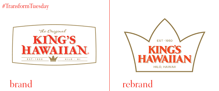
King’s Hawaiian
California-based family-owned and operated bakery, known chiefly for its Hawaiian bread, King’s Hawaiian, has partnered with NY-based design company Flood Creative to introduce a new identity to the over 60-year-old brand. While trying to present an updated public profile and expand its range of products, King’s Hawaiian had to also revamp its logo. The new logo has made the signature crown of the old logo bigger and placed it on the centre, creating an illustration that resembles the shape of a pineapple to connect the brand to its Hawaiian roots. Flood Creative also utilised Hawaii’s state flower, the hibiscus, to create a discreet floral theme. The bright orange colour palette hasn’t changed, maintaining the brand’s recognisability and attention-grabbing aesthetic.
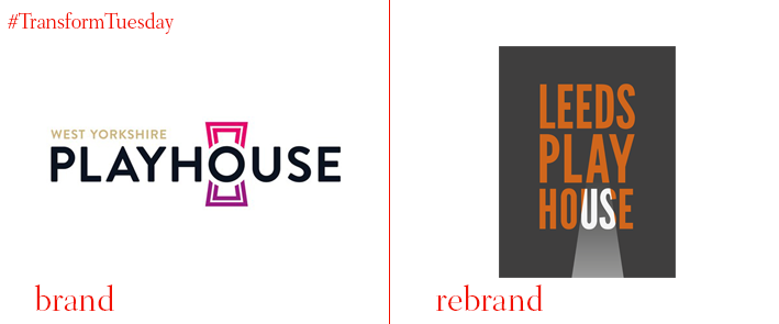
Leeds Playhouse
Brand design and communications agency Reggie London has re-branded producing theatre West Yorkshire Playhouse, following the theatre’s name change and its two-year £15m extension and renovation. Honouring its fifty-year history, Reggie London used a tightly-packed sans font that reflects the 60s origins of the theatre to design the new visual identity. The logo shows the letters ‘us’ from the word ‘House’ under a spotlight, putting emphasis on Leeds Playhouse inclusive open-door approach. Using a colour palette of orange and black, making a direct reference to David Hockney's paintings of Yorkshire, the ‘us’ theme can be seen across the brand. Apart from designing all printed collateral, Reggie London also created a brand video and a series of photographs for the new season.
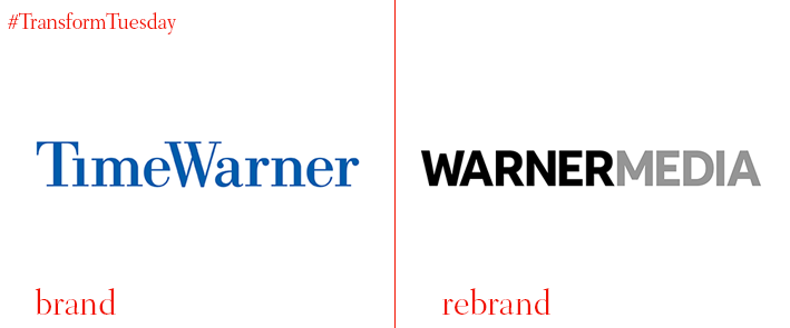
Warner Media
American multinational mass media and entertainment company Time Warner has unveiled a new brand identity that consists of a new name and logo, following its acquisition from multinational telecommunications company AT&T. Now called Warner Media, the company’s logo has undergone a complete renovation, sporting a minimalist aesthetic. The name is displayed in all-caps, in modern san-serif font, in a monochrome colour palette of black and grey. The simple and clean logo makes the intention of Warner media to put practicality over complex designs clear. The new logo is sharp, strict and serious, without any playfulness to it reflecting the brand’s determination and no-nonsense approach.
For more from Transform magazine, follow us on Twitter @Transformsays.


