#TransformTuesday: 25 September
Every week, Transform examines recent rebrands and updated visual identities. This week's picks are below. For more from #TransformTuesday, follow @Transformsays.
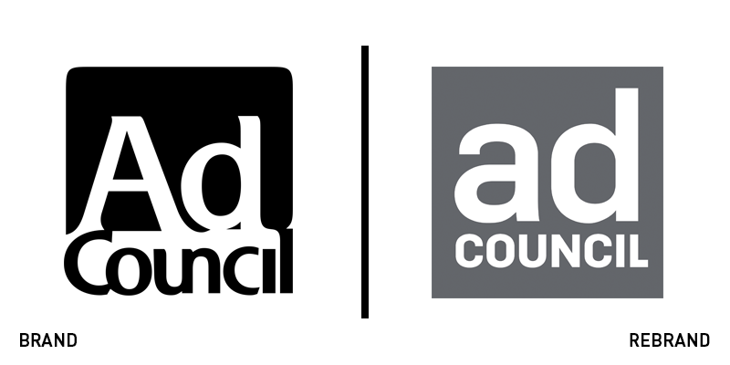
Ad Council
Ad Council, the American non-profit organisation that produces, distributes and promotes public service announcements on behalf of various sponsors, has undergone a rebrand for the first time in almost 50 years to refresh its brand identity, keeping up with the times and new generation of customers. The old, mundane, black and white logo that was created back in 1969, has now been replaced by a new logo that shows the brand name in lowercase fonts and features light blue or grey colours, which help it stand out more in both digital and print media. Ad Council’s rebrand manages to offer a significant change to the organisation’s brand without alienating its following. The new visual identity is not too far from the previous one, just enough so that it reflects the organisation’s evolution through the years.
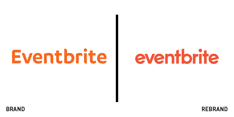
Eventbrite
Global ticketing and event technology platform, Eventbrite has introduced a new visual identity for its brand, including a new logo. Only two years after the previous redesign of the logo, the brand has taken the same route with what seems every other big brand, such as Google and Uber to name a few, sporting a smaller wordmark in sans serif font and in all-lowercase. Furthermore, the tilted ‘e’ makes it recognisable and gives a unique element to an otherwise prevalent logo. Eventbrite’s new brand may not be groundbreaking, it is however clean and simple, with a contemporary feel and optimum digital translation.
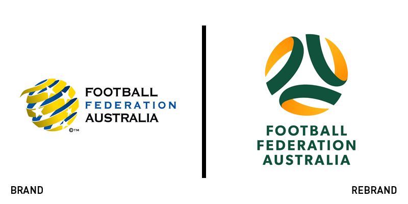
Football Federation Australia
Football Federation Australia (FFA) has revealed a new logo and brand identity, designed by brand agency Hulsbosch, to bring attention to Australia’s football and reconnect with its fans. The rebrand aims to unite the sport under one brand, achieve consistency and create a sense of connection and belonging for its following. The new logo consists of three elements, a direct reference to the atmosphere, diversity and ability to unify, the three main ingredients that differentiate football from the rest of the sports. FFA’s chief executive officer, David Gallop, says, “This new look and feel has been developed in collaboration with our stakeholders and has the support of the member federations who will also look to refresh their identities in line with the new FFA logo in the near future.”
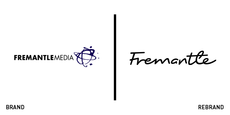
Fremantle
FremantleMedia, content creator, producer and distributor, has rebranded to Fremantle, unveiling not only a new name, but also a new brand identity, logo and website. Following growth that has turned the company into an international creative force, the brand was in need of a revamped look that matched the company’s dynamism. Designed by brand agency venturethree in partnership with Fremantle’s in-house creative team, the new brand captures the core values of Fremantle, showcasing its passion and pride. The new logo has left behind the illustration of the glob and dated typography, swapping it for an elegant, yet minimalist, calligraphic wordmark. Jennifer Mullin, Fremantle’s CEO, says, “Conceived as a creative signature, the new identity sits comfortably alongside cutting-edge content, reminding us of the quality and imagination of the people behind it.” Fremantle has also collaborated with digital marketing specialist Jellyfish for its new website.
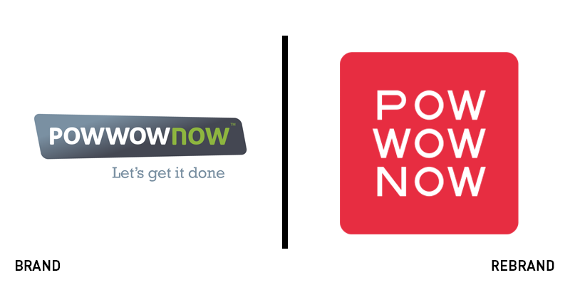
PowWowNow
PowWowNow, the communications software company, has now transitioned from conference calling into web meetings and hosted voice services. To mark its evolution, it has unveiled a new brand identity. The advertising campaign designed to introduce the new identity to the public is led by creative agency, Truant London. With the tagline ‘A new kind of web meeting is here,' the campaign aims to reach a wider audience and promote PowWowNow’s approach of ‘getting the job done fast through better communication.’ Simon Prince, marketing director at PowWowNow, says, “We’re excited and proud to reveal our new brand identity, which supports our vision to simplify the complex world of communication. We believe that when people share ideas, stay connected and talk regularly, business, work and life flow better. We are delighted with the way Truant’s campaign communicates this belief while showcasing our new product suite for all businesses, large and small.”
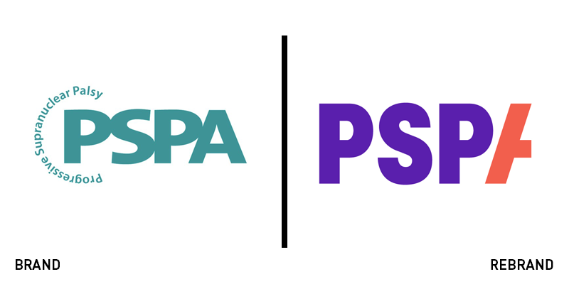
PSPA
The Progressive Supranuclear Palsy Association has rebranded to PSPA, launching a new brand identity, designed in partnership with strategic brand consultancy Brandpie. The charity aims to bring hope to people who suffer from Progressive supranuclear palsy (PSP) and corticobasal degeneration (CBD), encouraging them to fight for better care. The new logo is an improved version of the old, dated one, being at the forefront of the new dynamic and bright brand identity. The bold colours, unassuming typography and abstract aesthetic, all work together to create a visual identity that is frank and contemporary. Additionally, the new strapline, ‘Starts here,’ helps highlight the vigour of the brand. The new brand has been produced by Brandpie Foundation, the charitable arm of Brandpie on a pro bono basis. Sophie Lutman, executive creative director of Brandpie says, “We wanted to make sure that their passion and desire to fight PSP and CBD was translated into something memorable, that stands out, and is an embodiment of the support, strength and energy they bring to everyone affected by these diseases.”


