#TransformTuesday: 24 July
Every week, Transform examines recent rebrands and updated visual identities. This week's picks are below. For more from #TransformTuesday, follow @Transformsays
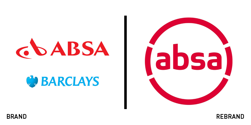
Absa Group
The South African financial service provider group previously known as Barclay’s Africa Group has rebranded back to its original name of Absa Group, following Barclays plc selling its majority stake in the organisation. As part of the change, the group is renaming its listed entity to Absa Group Ltd, reflecting its expanding presence across the African market and independent ventures. It also hopes the new rebrand will signal the bank’s expansion across digital, which aims to reinforce its customer proposition and passion for innovation.
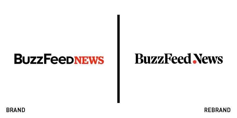
BuzzFeed News
Carried out in-house, the news branch of media company BuzzFeed, BuzzFeed News, has launched a rebrand. Originally known for its lighthearted ‘listicle’ style articles, the move towards serious journalism is emblematic of the current turbulent media landscape. And, adopting a unique logo and associated brand collateral, the new visual direction for BuzzFeed reflects its shift to a more serious journalistic force. However, BuzzFeed News retains the original black and red colour palette, and will also include its unique light-hearted news alongside more serious topics.
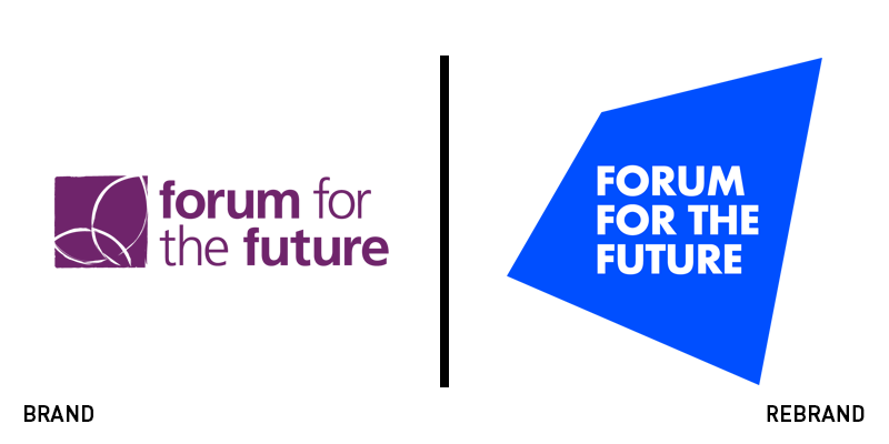
Forum for the Future
British-registered not-for-profit organisation Forum for the Future has released a new rebrand, including updated visual identity and logo. Leading a global community of over 130 organisations working to solve complex sustainability challenge, Forum for the Future needed a brand to reflect its reach and help it connect emotionally with its global audience. Birmingham, UK-based agency IE Brand created the new brand messaging, visual identity and logo. Described as ‘A window into the future,' the logo suggests a world positively transformed by Forum for the Future. "Our distinctive new visual identity beautifully represents our values, and truly reflects our ambitious vision for a sustainable future," says Forum for the Future’s CEO Sally Uren. IE Brand also created a sub-brand identity for the School System of Change, Forum for the Future’s learning community.
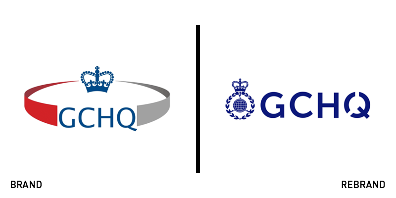
GCHQ
The UK’s intelligence and security organisation, GCHQ was founded almost 100 years, and currently provides information to the government and armed forces. It has recently launched a new logo, carried out in-house, which modernises the historic brand identity and adapts it further for the digital age. The design now pertains to one colour, a deep blue, streamlining the red and grey and creating a more regal identity for the organisation.
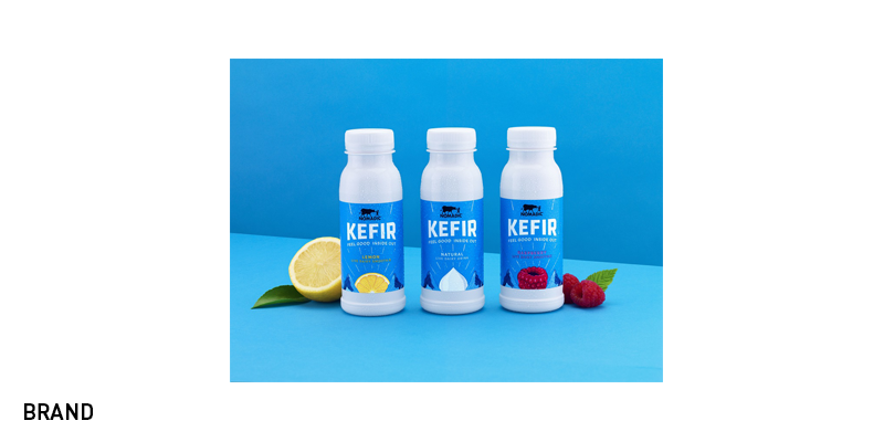
Nomadic Kefir
A cultured and fermented dairy drink, kefir is said to originate from the Caucasus Mountains and has probiotic properties. A new part of dairy brand Nomadic’s range, the company approached London-based design agency Carter Wong to implement new packaging for its kefir drink, using its origins as a motif across its brand touchpoints. Distinguishable on the shelf through its blue colouring, Carter Wong worked with illustrator Daniel Long to add authenticity to its brand characteristics and typography. Sarah Turner, managing director at Carter Wong, says, “The popularity of fermented drinks including Kefir and Kombucha has risen dramatically in recent years as more consumers discover the health benefits of these fermented functional products. As a result, new products are coming to market all the time and each new brand is having to work even harder to capture consumers’ attention.”
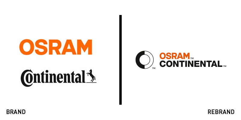
OSRAM Continental
Formed from the merger of sustainable lighting company OSRAM and electronics company Continental, the new organisation OSRAM Continental aims to offer sustainable, future-focused lighting solutions to the automotive industry. To highlight this new focus the merger has released a new logo and associated brand identity, based on the brand promise, ‘Shaping the future of mobility lighting with seamless connectivity’ and three key principles - contrast, movement and focus. The identity was developed by Munich, Germany-based KMS Team. Nadine Schian, head of communications, marketing and brand at OSRAM Continental GmbH, says, “We have big plans: Our goal is to establish ourselves as a new player in the market as quickly as possible. For this we need a strong brand that is unmistakable and clearly communicates our brand values.”