#TransformTuesday: 23 October

Every week, Transform examines recent rebrands and updated visual identities. This week's picks are below. For more from #TransformTuesday, follow @Transformsays.
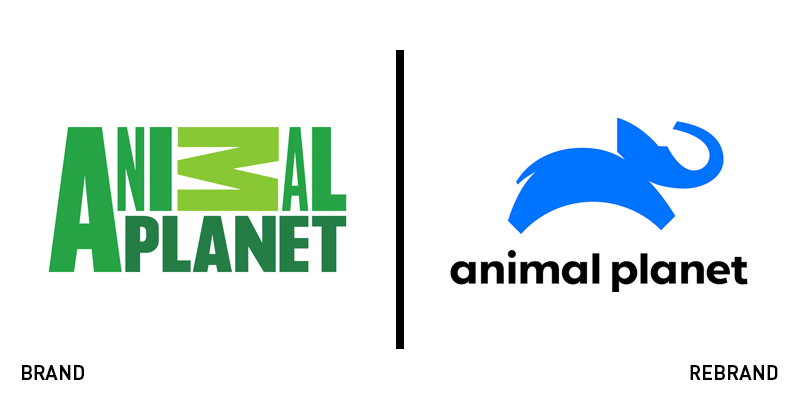
Animal Planet
An American TV channel dedicated to exploring and showcasing the life of animals since 1996, Animal Channel, has launched a new logo designed by New York-based graphic design firm, Chermayeff & Geismar & Haviv. The new logo marks the brand’s shift into a new proposition that promises high quality content to bring people together through the shared love and admiration of animals. With the logo changing after 10 years, Chermayeff & Geismar & Haviv had to compete against and established and immediately recognisable visual identity. To maintain its nostalgic element, the new logo uses an illustration of an elephant with a globe, referencing one of Animal Planet’s classic logos. The leap of the elephant puts a playful and joyful spin on a simple image, while the colour palette has been switched from various shades of green to blue and black.
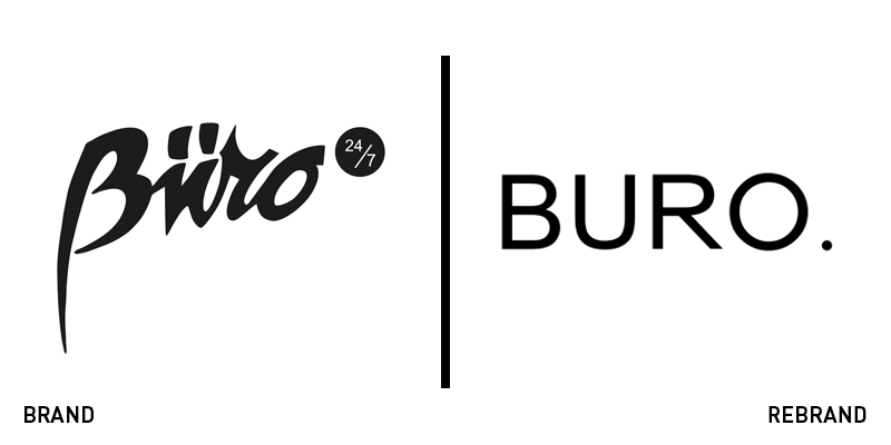
Buro
Digital publisher Buro Global has introduced a new brand identity for Buro24/7, its luxury lifestyle brand that targets wealthy Millennials. The new visual identity includes a complete makeover of the brand’s websites and digital network, in an effort to enter a new age of investment, helping the brand evolve and expand. The new identity was designed by group creative director Patrick Waugh and sports a cleaner, simpler and more elegant look that matches the identity of its audience. A new icon has also been introduced, called the ‘Buro dot’, which indicates the nonstop nature of the business. The Buro dot will be used along with the wordmark and across all Buro’s communications and platforms. Nick Smith, CEO of Buro Global, says, “While we’ve always been a trailblazer in the digital publishing space, the unveiling of our new brand identity symbolises a greater ambition for Buro24/7. It’s an era of growth, innovation and investment. We are the new face of luxury media.”
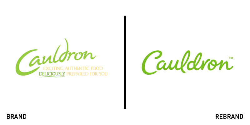
Cauldron
To reach a new, younger customer base and remain competitive against every other free-from range every other brand seems to come out with, Cauldron, UK’s popular plant-based protein brand, has undergone a rebrand. With a history of over 40 years, Cauldron’s new visual identity has been designed in collaboration with design studio Something More, integrating the brand’s heritage and modern outlook on not only its design, but also its products. The new logo has kept its signature green shade, dropping the strapline and introducing a bolder, curvier font that gives a more simple, yet contemporary overall look. Alongside the brand’s new look, Cauldron has launched a new brand campaign new products, determined to reach its demanding 2019 growth targets. Liz Griffin, UK innovation manager at Cauldron & Quorn, says, “The appetite appeal through unique modern and relaxed foodie photography will set us apart in the category and resonate with a younger consumer.”
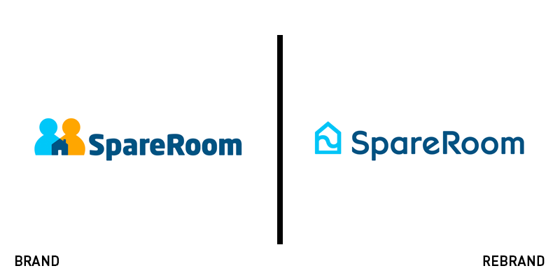
SpareRoom
Leading flat- and house-share site SpareRoom has become an essential tool to anyone looking for accommodation in the UK, gaining a whooping number of 7m users. Looking to expand its business in the US, SpareRoom has appointed branding agency Idea Is Everything (IE) to design the company’s first ever rebrand, visually transforming its identity in order to compete in the demanding American market. Considering the emotional connection between the brand and its audience as the key prerequisite for the company’s success, IE developed a brand based on the idea that encourages people to ‘Find Home Together,’ fortifying the focus on house-sharing. The new logo has simplified its colour palette keeping only the well-known shade of blue, while the house illustration appears more abstract and minimalist. IE also designed a bespoke typeface, SpareRoom Sans, which complements the logo and highlights the brand’s diversity with the use of alternate characters.
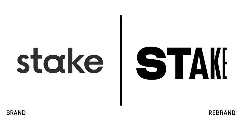
Stake
Australian share trading firm for US stocks, has revealed a new brand identity as a result of the company’s growth and its introduction of a share trading app that addresses a global audience. Wanting to disassociate trading from its reputation as an overly complex and difficult sector, Stake worked with branding agency DesignStudio to build a brand identity that would portray trading in an exciting light and focus on its opportunity potential. DesignStudio based the new identity on Stake’s future-forward proposition, ‘Never Settle,’ which encourages customers to challenge themselves. Built around this idea, the new logo reflects the momentum of Stake’s proposition, with the effect of motion front and centre, a direct reference to the movement and fluctuation of global stock markets.
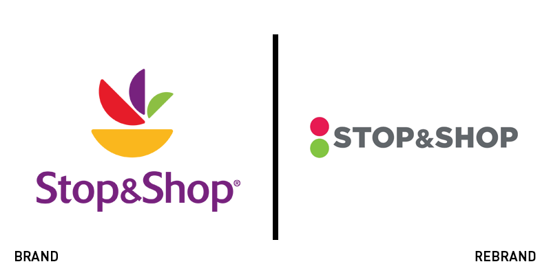
Stop & Shop
US supermarket chain Stop & Shop has introduced a new brand and visual identity following the renovation of its supermarket in Hartford, Connecticut. The new Stop & Shop logo is an evolution of the iconic ‘stoplight’ logo the brand used until 2008, when it was replaced by a broader logo, specifically designed to be used by it’s sister chain, Giant, as well. However, the reputation and awareness of the first logo, even 10 years after its replacement, led Stop & Shop reintroduce a similar brand icon. The abstract illustration of the stoplight now features on the left side of the wordmark instead of the right, while the wordmark itself uses a simple, sharp and bold typeface that is easily adaptable across digital touchpoints.