#TransformTuesday: 20 November

Every week, Transform examines recent rebrands and updated visual identities. This week's picks are below. For more from #TransformTuesday, follow @Transformsays.
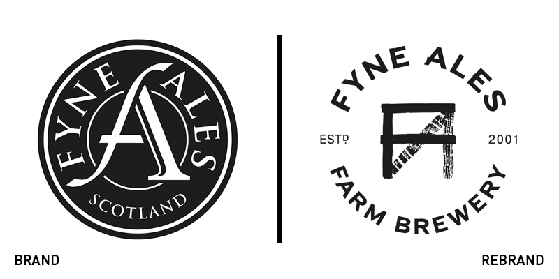
Fyne Ales
Located near Loch Fyne in Scotland, Fyne Ales, the 17 year-old brewery has seen significant growth over the years, having come to produce around four times per week the amount of beer it used to produce in 2010. For the brand to correspond to the brewery’s success, Fyne Ales appointed Glasgow-based design studio O Street, to design a new logo and packaging, updating the brand’s overall visual identity. The new logo is big a departure from the old one, which looked generic and failed to stand out on the shelf. Drawing inspiration from the wood found on the brewery’s fences, O Street designed a monogram that has the letters ‘FA’ constructed out of planks, a technique which is also carried through to the wordmark ‘Fynes Ales. The result is a simple, yet unique visual identity that has kept its monochrome colour palette and is optimised for the nature of the brand and its heritage.
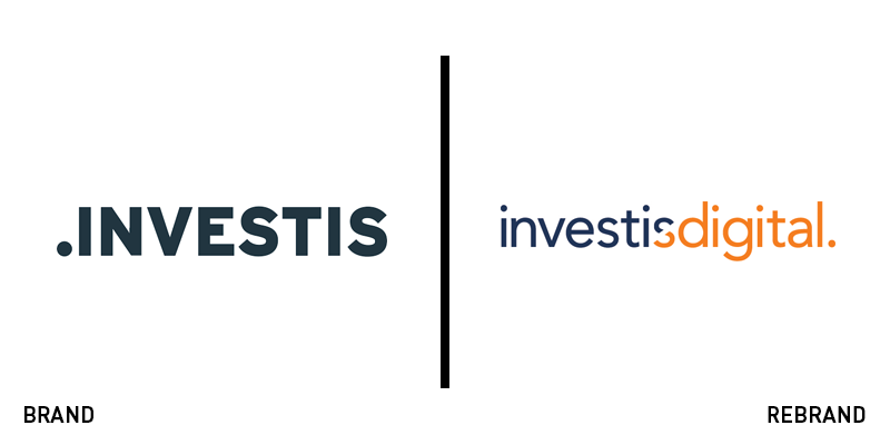
Investis
Global digital communications company, Investis has been renamed Investis Digital and has introduced an updated visual identity, following its acquisition of and integration with ZOG Digital. With a client list consisting of Ascential, ASOS, Fruit of the Loom, Rolls-Royce, WWE and Wyndham, among others, the new identity signifies the shift in the brand’s positioning and highlights the growth the brand has seen in recent years. In the context of the rebrand, Investis Digital has also rolled out a new global website. The new logo no longer has the bold fullstops before the wordmark, while the colour palette of dark grey has been swapped for dark blue and vibrant, eye-catching orange. Furthermore, the new logo has replaced the bold all uppercase typeface for a more delicate lowercase one, giving the logo a modern feel. Don Scales, global chief executive officer of Investis Digital, says, “We are unlike any other in the marketplace in that we can not only develop content and communications, but also measure, amplify and deliver this content across various channels and platforms. Our new name and branding reflects this enhanced value proposition for clients and better showcases our capabilities as a forward-thinking digital communications company.”
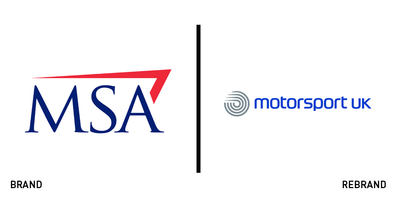
Motorsport UK
Motor Sports Association, the governing body for four-wheel motorsports in the UK, has changed its name to Motorsport UK, as part of an change in its strategic brand positioning that sees the brand transitioning from a traditional government organisation to a membership-focused, contemporary one. The new visual identity has been crafted by branding agency rbl, which begun the collaboration with Motorsport UK in June 2018, designing the brand’s new brand platform, identity and launch campaign, which coincides with the licence renewal process. The updated identity for Motorsport Uk has been built in order to create a strong and consistent community across the whole of motorsport in the UK. To symbolise the new brand’s unifying element, rbl has used he new four concentric circles that represent the four-wheels across four nations. Adam Concar, head of creative at rbl says, “We wanted to create a brand that could inspire and bring together people from all walks of life who share a deep passion for cars, speed, sport and the extraordinary, adrenaline-fuelled fun that can be had on four wheels!”
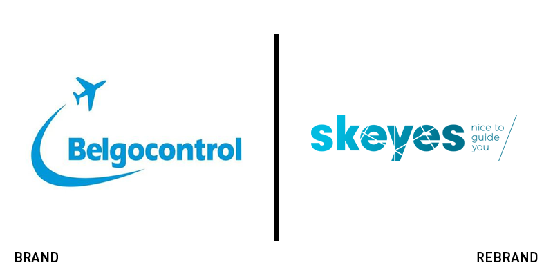
Skeyes
To celebrate its 20th birthday, Belgocontrol, the Belgian air navigation and traffic service provider, has undergone a brand makeover, changing of its name to Skeyes. Skeyes is a play on the words ‘sky’ and ‘eyes’ and refers the focus on the sky and the future. With the punny strapline, ’Nice to guide you,’ Skeyes shows a friendly and relatable face to its customers. The choice of a colour palette of blue and green was not made randomly. The two colours offer a calm aesthetic, while signifying safety and sustainability. Furthermore, the lines found through the logo are a direct reference to the lines the air traffic controllers see on their radar screens. Johan Decuyper, Belgocontrol’s CEO, says, “The present that we are giving ourselves on the occasion of our twentieth anniversary, is a part of the new corporate culture that we introduce. I am proud that I can help shape the reform of this dynamic company. But this is just the beginning of the challenges ahead: we have to maintain our position in the international competitive environment of air traffic control.”
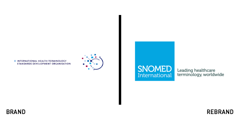
Snomed International
London-based international non-profit standards development organisation, Snomed International, has revealed a rebrand led by international brand and digital agency Nucleus. The updated identity includes, among others, a renovated new website design. Moving away from the sterilised look of the academic approach the brand adopted in the past, the new visual identity for Snomed International has been designed to align with its business strategy, testing a number of formats and ideas with Snomed International’s stakeholders, to ensure the final result will address a wide variety of audiences. The end product is a multilayered, contemporary website that offers optimum navigation and serves as shop, while also showcasing the new brand. The new logo has dropped the intricate illustration featured on the previous one and sports a minimalist look consisting of a light blue square shape with the wordmark inside, written in a simple, sans serif font in white.
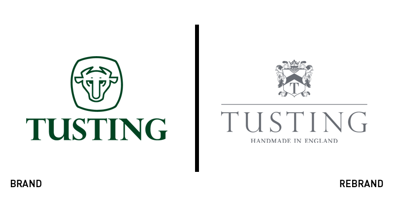
Tusting
British leather goods maker, Tusting, has introduced to the market a new brand identity crafted by London-based branding agency Straight Forward Design. The new brand sees changes both in Tusting’s visuals and its tone of voice. Departing from a brand that seemed outdated and failed to reflect Tusting’s true identity Straight Forward Design put the brand name front and centre in the new logo, website, product range and marketing collateral. This is not the first time the two companies collaborate, with their relationship going back almost a decade. The new logo combines Tusting’s heritage with a modern take on the world. Drawing inspiration from an old Tusting family coat of arms, the heraldic shield was cropped to resemble a leather mark, with the crown made from acorns, which contribute to the tanning process. The colour palette consists of dark grey and yellow, another reference to Tusting’s history. To accompany the rebrand, Straight Forward Design has also published new look books, introducing the new product range and website, where video footage showing the manufacturing process, developed by Straight Forward Design, can be found.


