#TransformTuesday: 20 March
Every week, Transform examines recent rebrands and updated visual identities. This week’s picks are below. For more from #TransformTuesday, follow @Transformsays
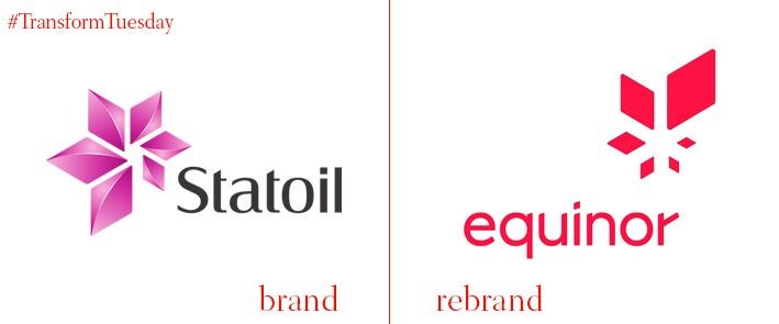
Equinor
Following a recent trend of energy company rebrands, Norway-based oil extraction company Statoil has now rebranded to Equinor. The new name, which the company says forms from ‘equi’ as a starting point for words such as ‘equal,’ and ‘nor’ for Norway, aims to reflect the company’s transition to a greener energy supplier. As one of Norway’s largest companies and symbolic of the economic success the country has enjoyed in recent years, the rebrand has been met with mixed reviews. Nevertheless, the new brand signifies an industry-wide recognition of a new era in energy extraction. “Looking toward the next 50 years, reflecting on the global energy transition and how we are developing as a broad energy company, it has become natural to change our name,” says Equinor president and CEO Eldar Sætre in a statement. “The name Equinor captures our heritage and values, and what we aim to be in the future.”
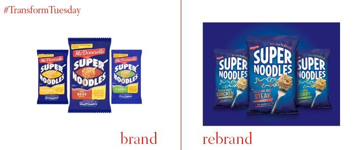
McDonnells Supernoodles
In a rebrand effort led by London-based creative studio Family (and friends), Irish instant noodle brand McDonnells Supernoodles has updated its packaging and brand design. A recent addition to the McDonnells' repertoire, which includes a popular curry sauce created for the Irish palate, Family (and friends) has ensured the product reflects its key three flavours while avoiding overly informal overtones. The logo has been given an impactful ‘broad chest’ and to inject some fun into the now-sustainable paper packaging, says Derek Johnson, strategy director at Family (and friends), “The fork icon becomes a dynamic superhero, caped in noodles, dashing across the pack carrying flavour.”
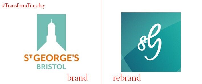
St George’s Bristol
A church dating back to 1863, St George’s, based in the English city of Bristol, has been refurbished and repurposed as a multipurpose arts and entertainment venue. Set to relaunch in April 2018, a rebrand project led by Bristol-based brand agency Mr B and Friends sees St George’s Bristol take on a bright and flexible new identity. A logo was crafted to reflect the former church’s new role as an entertainment hub, taking on a dynamism inherent in its new brand ethos ‘Feel moved.’ Dagmar Smeed, head of marketing at St George’s Bristol, says, “The response has already been highly positive and we are confident it will help attract new audiences to St George’s, to enjoy our music and events, as well as exploring the new exhibitions and spending time in our café bar and gardens.”
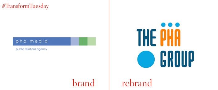
The PHA Group
The London-based PR and communications agency formerly known as PHA Media has rebranded with a new company name and logo, reflecting its transition to a more integrated agency model. The PHA Group, as the agency is now known, underwent the extensive in-house rebrand process to reflect the PHA Group’s recent expansion and inclusion of a new digital studio which aims to further consolidate its client offering. A new strapline, ‘Vibrant people, who deliver. Simple’ reflects the PHA Group’s ethos. Speaking of the rebrand, The PHA Group’s chairman, Phil Hall, says, “PHA has evolved rapidly in the last 13 years and the partners felt it was time to rebrand the business to reflect our evolving story. We wanted a fresh, modern identity that while building on the foundations we have laid places our biggest asset, our people, at its core.”
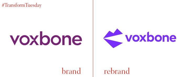
Voxbone
Communications as a service (CaaS) company Voxbone is a global phone system, connecting clients in 60 countries with communications networks. Rebranded by London-based branding agency Onwards, the Brussels-based service aims to communicate its own purpose to a wider audience – brand recognition was low outside of its target demographic. The multinational nature of Voxbone makes it a unique organisation, reflective of a myriad languages and cultures. Yet its new brand reflects Voxbone’s mission to simplify global communications, says brand story page by Onwards. “Voxbone’s ultimate benefit is simplicity. But simplicity alone is generic,” says Onwards. “We gave it meaning by adding a twist born from its outlier spirit. Voxbone don’t just make the insanely complex world of global communications simple, its makes it ‘Strangely Simple.’”
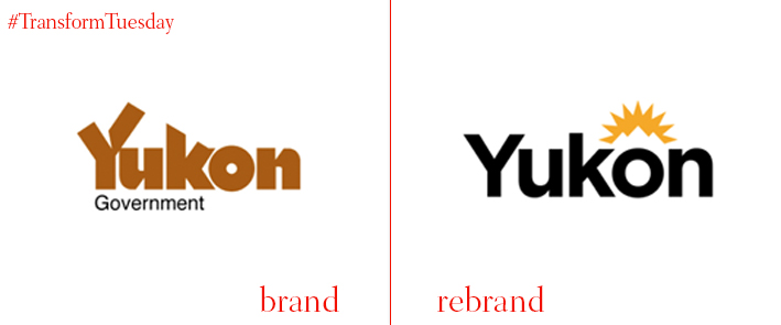
Yukon territory
Following a rebrand exercise costing almost $500,000, the Yukon region has released a new logo and place brand identity. Encompassing a user-centred website and a more mobile-friendly brand, the Canada-based Yukon territory has the smallest population of any province in the country yet is globally synonymous with wilderness and wild beauty. The new logo, which depicts a sun rising over the Yukon territory, was created to minimise the confusion abound after Yukon’s approximately 100 logos were being used for different purposes. "We heard from Yukoners that they often found our communications confusing and frustrating, and they weren't always sure if they were actually dealing with the government of Yukon," says government spokesperson Kendra Black. “We think this will make it simpler, easier, and more efficient for the public."
Read last week's column, TransformTuesday: 13 March
For more from Transform magazine, follow us on Twitter @Transformsays


