#TransformTuesday: 20 February
Every week, Transform examines recent rebrands and updated visual identities. This week’s picks are below. For more from #TransformTuesday, follow @Transformsays
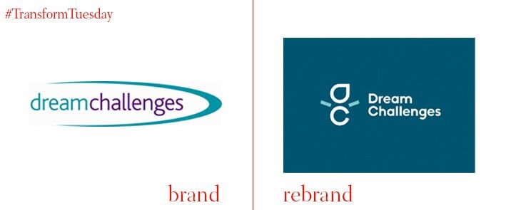
Dream Challenges
Bringing together UK-based Specialist Journey’s two arms, Action for Charities and Dream Challenges, Bristol-based agency Mr B & Friends has rebranded both activity-based brands under the Dream Challenges moniker. The successful new branding is more action based than its predecessor that could easily have been the branding for a feminine hygiene product. This hero stance of the new logo is presented in gender neutral blues and greens and is both friendly and memorable. Pleased head of marketing at Specialist Journeys, Safia Bhutta, says that the branding will “invite and inspire people to participate.”
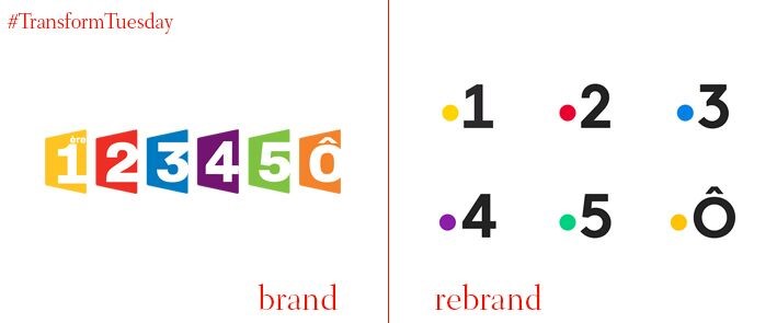
France Télévisions
Paris-based Movement has rebranded the French public television network, France Télévisions. The previous branding by fellow Paris-based firm Gédéon featured channels inside perspective like polygons in bright colours. The broadcaster’s new branding features a dot at t-bar height that abuts each channel number with its legacy bold colours accenting either the background of the logomarks or the logomarks themselves. This minimalistic branding is fresh while evoking something of a remote control - which may not be sexy, but is on-point.
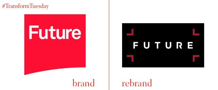
Future plc
Future plc has a new logo designed by Fuel. Its previous logo featured a corporate looking rising logomark over a slight curve in red and white. Rather than point towards a new day, this old logo looked stale where Future’s clients are creative knowledge professionals looking for innovation. The new branding retains its previous featured colours but little else. Instead, the new signature element in their logo is its four white croplines that match the width of each of the logotype’s confident characters against a black background. The new branding is set to establish Future plc as a business ready to capture the next ‘big idea’ for its clients.
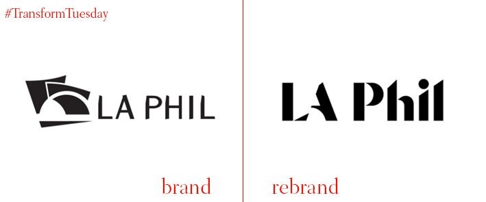
LA Philharmonic
Designer Anders Svensson (2D3D) with Los Angeles-based TBWA\CHIAT\DAY has redesigned the LA Philharmonic logo. The previous logo was designed by Bruce Mau Design to make specific reference to the orchestra’s iconic Frank Gehry designed Walt Disney Concert Hall. It featured a logomark of the hall as well as a custom made ‘A Font Called Frank’ for its logotype. Maintaining the legacy of the brand’s previous identity, Svensson subtly evoked the lines and shapes of the Walt Disney Concert Hall and its other major venue, the Hollywood Bowl, to create a dynamic new logomark. TBWA\CHIAT\DAY commissioned typographers at the Colophon Foundry to customise Aperçu as a complimentary font for the philharmonic’s collateral. Its newest logo iteration hopes to last for closer to a century than its previous incarnations 30-year run.
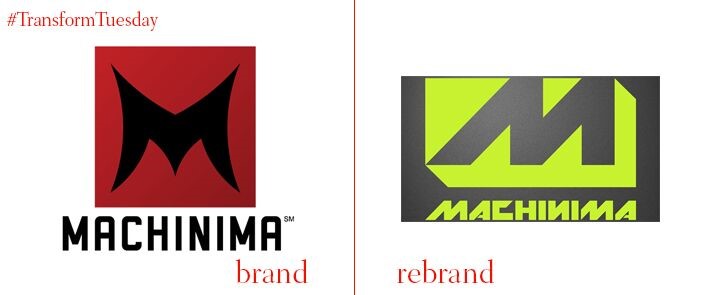
Machinima
Machinima began in 2000 as a YouTube multichannel network, and has since become a content distributor that helps its network monetise and promote its gaming and entertainment work in front of its parent company, Warner Bros. Venice, California-based agency Clever Creative redesigned Machinima’s branding to reflect this growth. Though a complete visual abandon from its previous identity, its neon green and grey colours and tough, futuristic logotype still maintains its gamer feel. Warner Bros. Digital Networks president, Craig Hunegs, says that this rebranding is “resonating with its growing audience while celebrating the best fandoms and gamer content.” Over 140 million unique visitors frequent Machinima every month.
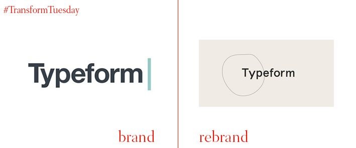
Typeform
Global studio DesignStudio has created a new identity for Typeform, a Barcelona-based company that builds forms and surveys. Typeform’s previous logo was a very standard form wordmark with a featured horizontal line next to it like a blinking cursor. The new identity is decidedly more fluid. DesignStudio’s Alex Johns describes its logomark ring as a “living logo” that changes shape with the work and should feel like Pablo Picasso or Joan Miró. Its wordmark is done in typeface of the moment Aperçu. Overall the new identity feels like a minimalist Dada logo against neutral blacks, whites and taupes. The idea is that the brand be as open to interpretation and change as its clients and their opinions.
For more from Transform magazine, follow us on Twitter @Transformsays