#TransformTuesday: 19 June
Every week, Transform examines recent rebrands and updated visual identities. This week’s picks are below. For more from #TransformTuesday, follow @Transformsays.
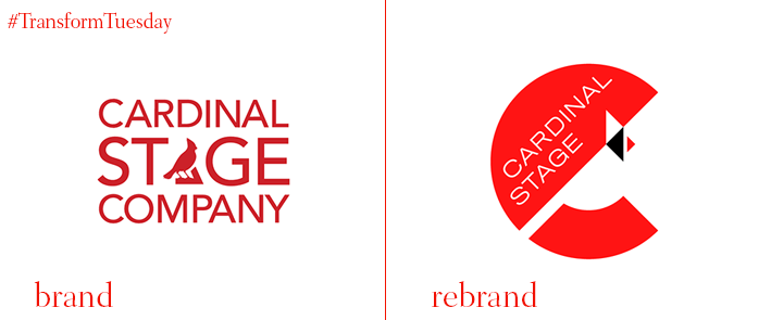
Cardinal Stage
Indiana-based non-profit professional theatre company Cardinal Stage has introduced a new brand identity for the first time in 12 years. Keeping the cardinal bird, which is the official state bird of Indiana, at the centre of the rebrand, graphic design firm UnderConsideration revamped the design of the bird, making it more abstract and more geometric. The colour palette consists of red, black and white, while the negative space of the bird illustration spells the letter ‘C’ with a simple wordmark of the brand name on top. Furthermore, UnderConsideration collaborated with design agency StudioTBT for the creation of animations that can be used on social media outlets as well as PPT presentations. The simplicity of the new logo allows it to be adaptable to sub-brands, with colour and images being able to be added.
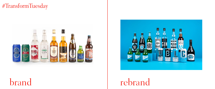
Co-op alcohol beverages
UK food retailer Co-operative Group has appointed Leeds-based independent branding agency Robot Food for the redesign of its rage of in-house alcoholic beverages. While the old packaging blended in with the rest of the labels, the new packaging aims to stand out among its competitors and achieve consistency within the range. The desire to stand out is apparent in the colours that have been chosen for the new visual identity, bright blue, black and white, which are an unusual colour selection for alcoholic beverages. As Robot Food say in its project page, “The result is an electric but cohesive range that sits confidently alongside the leading brands and rewards savvy Co-op customers with beautiful design worthy of any basket.”
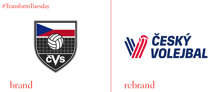
Czech Volleyball Association
Czech Volleyball Association (CSV), the governing body of volleyball and beach volleyball in the Czech Republic, has partnered with Prague-based branding and design agency Dynamo design to create a new brand identity that will reflect the organisations evolution and character. Using the colours of red and blue and white as the colours of choice, the new logo illustrates the letter ‘v,’ making a direct reference not only to the sport of volleyball, but also to the Czech flag. The asymmetry gives the logo a modern feel, making it more appealing to the eye. The new logo is simple and clean, which translates equally good on-screen and in print.
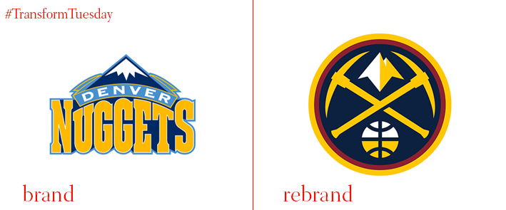
Denver Nuggets
The Denver Nuggets, an American professional basketball team based in Denver-Colorado, has unveiled a new brand identity that consists of a new colour palette, five new logos and three new uniforms. The old logo has been the same since 1993 and a change was due for the team to showcase its dynamic and creativity. The overstated curves on the Western-looking font that seemed outdated and tacky have been swapped for a modern and contemporary design with a colour palette of navy blue, yellow and burgundy. As stated on the Denver Nuggets’ press release, “The image revitalization occurs as the Nuggets continue to shift and evolve into a new era of basketball. The innovative marks and uniforms acknowledge the team’s past, while concurrently looking forward and identifying the transformation of the Mile-High City.”
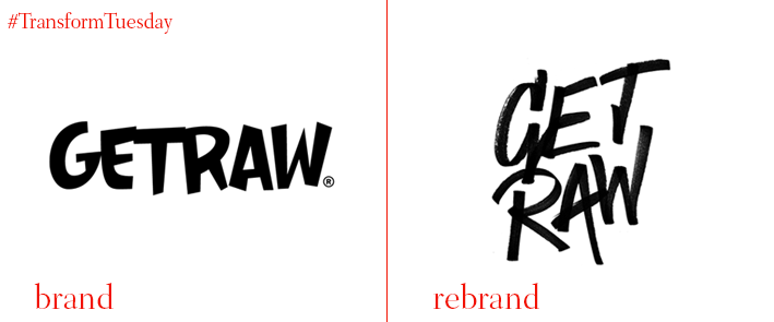
Get Raw
Swedish brand of organic, vegan, gluten-free health bars founded in 2013 has undergone a rebrand, led by Stockholm-based branding agency Snask. The new logo has maintained the back colour used previously, introducing a hand-rendered font that appropriately reflects the brand name by displaying a raw aesthetic. The rough around the edges look of the logo comes across as both minimalist and bold, enhancing the Get Raw’s image as a modern and trendy brand. The new logo is displayed across all packaging with the tagline ‘Junk-free snacking’ written across in a discreet, thin typeface.
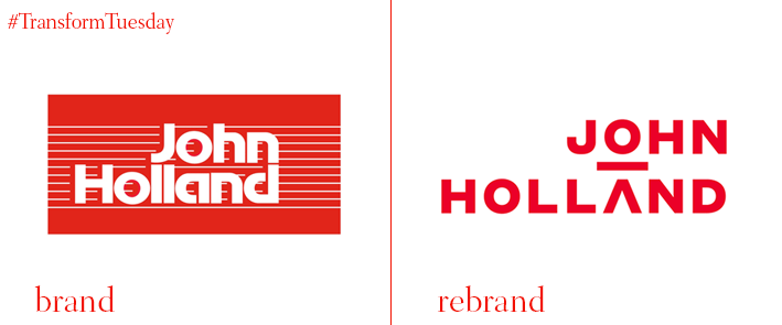
JOHN HOLLAND
Australian civil engineering company JOHN HOLLAND has revealed a new brand identity designed by Sydney-based creative and design agency Frost Design. The new identity aims to modernise and humanise the company’s image, while honouring its heritage. The new logo features a contemporary, geometric typeface that displays an abstract image of a person by placing a horizontal line between the ‘O’ of ‘JOHN’ that is on the top and the ‘A’ of ‘HOLLAND’ that is below. Joe Barr, CEO of JOHN HOLLAND says, “Putting a person at the very heart of our brand mark shows our focus on people-centred solutions. Frost Design worked with us to create a shift that injects more meaning into our identity, while still making us easy to recognise.” The colour palette is red and white, which matches the boldness of the typography.
For more from Transform magazine, follow us on Twitter @Transformsays.


