#TransformTuesday: 15 May
Every week, Transform examines recent rebrands and updated visual identities. This week's picks are below. For more from #TransformTuesday, follow @Transformsays.
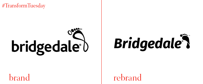
Bridgedale
Technical sock manufacturer Bridgedale has collaborated with creative design agency Brandon for a rebrand that includes a new visual identity as well as an improved SKU navigational system. The company’s new look was designed to make shopping easier and showcase the benefits of Bridgedale’s fusion technology, Fusion Tech, which is a special blend of yarn and knitting technology unique to the retail market. The new visual identity combines photography with a series of visual cues, informing the customers about the different types of socks in the Bridgedale range and helping them choose what better fits their needs. Richard Taylor, managing partner of Brandon, says, “Bridgedale’s packaging needed refreshing to better reflect Fusion Tech and to make it easier for shoppers to navigate the range. The identity and brand needed to be modernised to make it relevant to today’s audience, enable shoppers to easily pick the best socks for their needs and highlight the use of Fusion Tech to provide standout.” Brandon’s team chose as a concept ‘Journeyman: helping people on their journey' after conducting market research among outdoor walkers in the UK and across Europen, in order to figure out what the new brand identity should be.
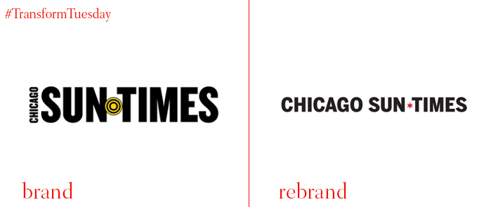
Chicago Sun Times
The oldest daily newspaper in Chicago, Chicago Sun-Times, has partnered with advertising & marketing agency Ogilvy to introduce a new logo. The new Sun-Times logo features a star from the Chicago flag, honoring its roots and the Chicagoans’ support. Along with the new logo, the Chicago Sun-Times released a revamped newspaper and website. Sun-Times CEO Edwin Eisendrath says, “I’m grateful to everyone at the Sun-Times and to the superb team at Ogilvy for the hard work they did together so that we can better communicate with our readers. We’re debuting a more straightforward and cleaner look both in print and at suntimes.com, and serving up content in a more organised way on both platforms.” The rebrand is not limited in just the print format, but also the digital one, with a new news app and podcasts on race relations, sports and more. The new website features larger photos and it resembles the headline fonts and type style of the newspaper, while different sections are color-coded to match the colors of the section toppers in the paper.
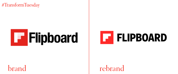
Flipboard, a news and social network aggregator that allows users to select feeds from various news websites and social media accounts for an easier read, has launched a rebrand designed by its in-house team in collaboration with San Francisco and CA-based branding and strategy studio Moniker. Flipboard’s old logo featured transparent window panes at its centre, referencing the idea of the aggregator being a window onto great stories. The new logo has been redesigned to display a fully open window, and a new, brighter shade of red. The pixelated “F” icon has been modernised by making it opaque and a single-color, which helps with its on-screen translation as well as minimalist aesthetic. As stated on Flipboard’s site “Our F becomes a distinct storytelling platform where we can feature inspiring points of view. And, you might notice a staircase in the white space. This was a serendipitous discovery, but once we saw it, we couldn’t unsee it. Because it speaks so well to our vision of advancing the conversation, the team decided to pursue this concept in more depth.” The result is unique, with the intersections of the images making both the images and the logo at the bottom stand out.
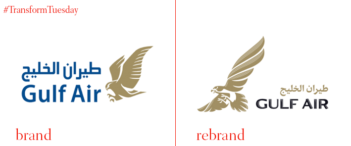
Gulf Air
Gulf Air has introduced a new identity designed by independent global consultancy Saffron. Gulf Air’s previous logo sported a falcon, which in the Middle East represents courage, perseverance and freedom. Not wanting to stray far from the iconic logo and honoring the company’s heritage, the company kept the falcon as in the core of its identity across the brand. Saffron studied the anatomy and movements of falcons in their natural environment in order to come up with a renovated, more realistic version designed by illustrator Martijn Rivjen. Saffron also used Gulf Air Sans, a custom-made typeface that mimics the shape of the falcon’s claws, beak with shading that gives the effect of the wings’ texture. The typeface can be used in Arabic and Latin and comes in three different weights. The colour pallet has kept the signature gold and white, while swapping the royal blue for a more modern-looking black. However, the new visual identity also includes an abstract pattern that can be used either bold and colorful or more subtly, when at the same time it keeps the falcon as the focal and connecting point.
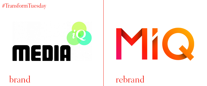
Media iQ
Media iQ has launched a new brand identity, adopting the name MiQ. The rebrand aims to establish MiQ as the leading global Marketing Intelligence company and find solutions to issues that trouble the market. MiQ is a pioneer in the media and marketing industry, being one of the first companies to take on Marketing Intelligence, a system that gathers and analyses relevant information specifically for the purpose of accurate decision-making in determining market opportunity, market penetration strategy, and market development metrics as its main business strategy. MiQ differentiates itself from its competitors by entwining artificial intelligence with human resourcefulness, a tactic that put the company on no.4 in the Sunday Times ‘Track 200 fastest growing International UK Companies’ earlier this year. Gurman Hundal, co-founder and CEO of MiQ, says, “Since Lee and I founded MiQ in 2010, we have always put the company culture at its heart. We pride ourselves on our people. This is why, despite the technology and increased importance of data to drive forward the future of marketing, it is also important to have great people. It is the people and technology that help businesses win, and we will retain this vision as we move into a new era.”
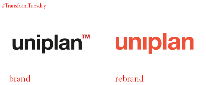
Uniplan
Brand experience agency, Uniplan has undergone a rebrand, which consist of a new corporate identity, a redefined service offering and a new visual look. Christian Zimmermann, CEO at Uniplan, says, “Uniplan’s new corporate identity fully reflects our people, our services, and our work. The industry has been transforming with increasingly notifiable demands in digital and content creation. In addition, the appearance of multi-discipline agencies fighting for their share of the market is turning the industry into a very volatile field run by fierce competition. Uniplan has sensed this transformation globally and made the bold move to reinvent itself to answer the needs of its clients and address the market evolution.” The Uniplan website has been revamped to match the company’s new identity. The new visual identity is a result of the agency’s growth and evolution. The dynamic of the purpose-driven company, is reflected on the company’s new corporate strategy.
For more from Transform magazine, follow us on Twitter @Transformsays


