#TransformTuesday: 13 November

Every week, Transform examines recent rebrands and updated visual identities. This week's picks are below. For more from #TransformTuesday, follow @Transformsays.
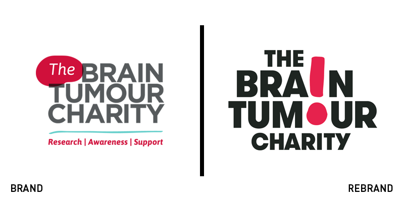
The Brain Tumour Charity
Following the merger of Brain Tumour UK, Samantha Dickson Brain Tumour Trust and the Joseph Foote Trust in 2013 and its significant expansion since then, the Brain Tumour Charity has unveiled a new logo that communicates a clear and dynamic brand identity. Designed by London-based branding agency the Clearing, after a year-long process of researching and testing, the new visual identity aims to reach as many people as possible and raise awareness for its cause. The new logo has seen a playful and vibrant update, switching the colour grey for a bolder black, while keeping its bright red elements that help the logo stand out. The bolder typeface along with the implementation of an exclamation mark, have achieve to convey the urgency of the cause, inviting people to act now. Antonio Cappelletti, director of digital engagement and communications for the Brain Tumor Charity, says, “Our new brand promise, accelerate change, demonstrates that same urgency and will help us reach more people than ever before. This will enable us to raise more awareness, fund more research and support more people affected by brain tumours.”
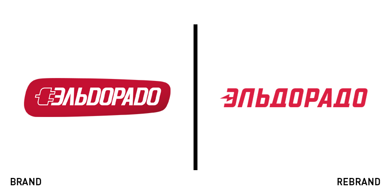
Eldorado
A Russian electronics retailer that spans more than 400 stores, Eldorado has introduced a new visual identity designed by Moscow-based branding consultancy, Linii Group. The refreshed visual identity has been launched as part of an expansion strategy for the firm. The new look for the brand has a minimalist aesthetic, focusing on simplicity. The plug illustration the old logo carried has been switched for a combination of the letter Э alongside a lightning symbol, which can be found alone or as part of the wordmark. Linii Group kept the same colour palette of the previous logo, with the bright shade of red achieving strong recognition, while conveying the brand’s dynamic expression.
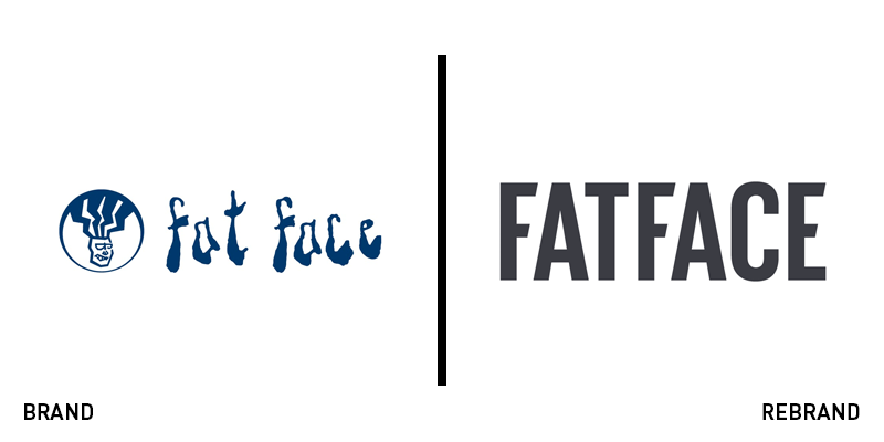
FatFace
FatFace, the 30 year-old British high street brand, known for its peculiar name and unique logo design and typography, has rolled out a new visual identity. The release of the new brand comes at the end of a long process of shifting the brand’s positioning from a fun and funky clothing and accessories retailer to a more sophisticated one. The brand moved away from the ‘90s dreadlocked head and scribbly typeface of its previous logo. Instead, using a bulky sans serif font with the letters ‘f’ and ‘e’ featuring slanted edges, offering a more contemporary feel, as well as better digital translation. The rebrand also includes a change in the logo’s colour, abandoning the staid shade of dark blue for a charcoal colour that is sleek and simple.
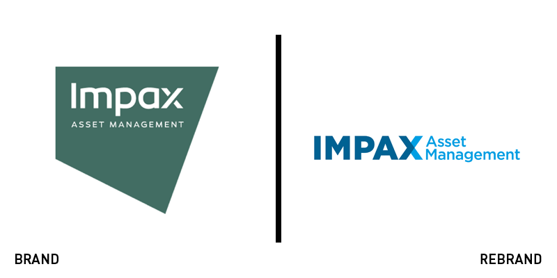
Impax Asset Management
Impax Asset Management Group, a global investment firm, following its acquisition of Pax World Investments and a renewed objective to become a global leading investment manager, has renovated its brand identity to match its ambition. The rebrand was led by brand consultancy Lloyd Northover and creates a unified and consistent brand for the merged company. The new logo shows the wordmark written in a bold, yet simple uppercase font, replacing the colour palette of forest green with two shades of blue. The same strapline remains, this time written in lowercase, creating a flexible brand that shows all of Impax’s businesses belonging to the same family, while allowing the possibility for separate names. Finally, Lloyd Northover created a design for print and digital collateral, while brand guidelines were established to allow the internal implementation of the new visual identity.
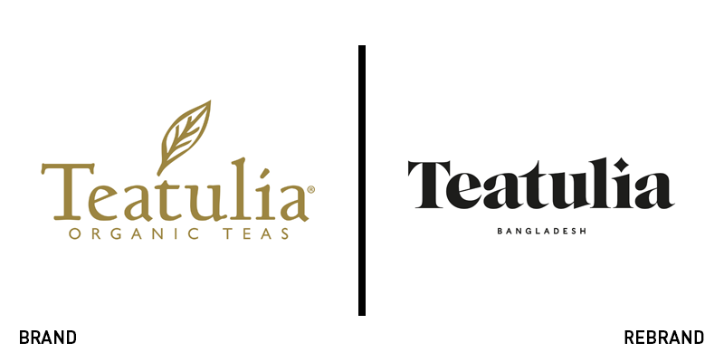
Teatulia
To celebrate its launch in the UK market, Bangladeshi tea brand Teatulia has introduced a new brand identity, crafted by British design studio Here Design. The studio, inspired by Teatulia’s heritage and unusual brand positioning as a single-source tea garden, created a bold brand identity to ensure Teatulia stands out on the shelf. The new logo has swapped the gold colour for a simple black one, using bold lettering and displaying the tea’s origin under the main wordmark with a strapline wiring ‘Bangladesh’ instead of ‘organic teas,’ which was there previously. Kate Marlow, creative partner of Here Design, says, “We have delivered a bold new identity for Teatulia’s entrance to the UK which celebrates its roots as a single-origin tea and rivals the coffee house as the home of cultural scenes.”
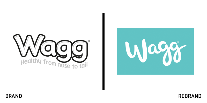
Wagg
To mark its territory against a competitive market, Wagg, a UK pet food brand, has worked with brand design agency Robot Food to upgrade its visual identity and brand positioning. The new logo is a big departure from the previous look, leaving a boring monochrome colour palette behind, while introducing a playful and exciting spectrum along with a more elegant graphic typeface. Martin Widdowfield, creative director of Robot Food, says, “The name Wagg was the perfect starting point and begged for a new brand mark with all the personality of our furry friends. It also inspired a completely ownable photography style for the brand, stepping away from the repetitive and cliquish dog images typically seen across the category. We chose a broad selection of tails to celebrate all dogs, from man’s best friend sat on the sofa to the best in show.”