#TransformTuesday: 13 March
Every week, Transform examines recent rebrands and updated visual identities. This week’s picks are below. For more from #TransformTuesday, follow @Transformsays
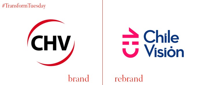
Chilevisión:
Established in 1960, Chilevisión, has spent much of its history changing ownership. Yet as Chile’s third largest television network, the brand’s influence as a vessel for Latin American culture has been a key aspect of its growth, remaining one of the nation’s top broadcasters for news, celebrity gossip and telenovelas. Its newest identity fosters a playful dynamism previously unseen across its brand image.
Choosing to redevelop its core logotype and colour palette in-house, Chilevisión has redesigned its visual portfolio across all touchpoints. Adopting a pink, rotated ‘C:V,’ the principle logotype now incorporates the brand’s entire name, with its abbreviated shorthand now resembling a smiley face.
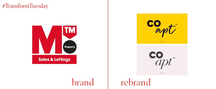
Coapt:
Brighton’s largest lettings agency, MTM Property, spent a year investing in the redevelopment of its own brand in collaboration with strategic brand agency, Pixeldot. Through research that included internal workshops and client and tenant interviews, the collaborative endeavour has rebuilt the brand as Coapt.
Departing from the bold red of the previous brand, the new identity incorporates imaginative, colourful and bubbly font, strategically split between two audiences; students and landlords. Both visual journeys harness tone of voice, community purpose and forward-thinking design to re-establish Coapt as a customer and community-focused lettings agency.
Luke Taylor, creative director and co-founder at Pixeldot, says, “We wanted to create a new identity which spoke to MTM’s full customer base. The new name, Coapt, literally means ‘to bring together;’ echoing the positive commitment the company is making to students and landlords alike.”
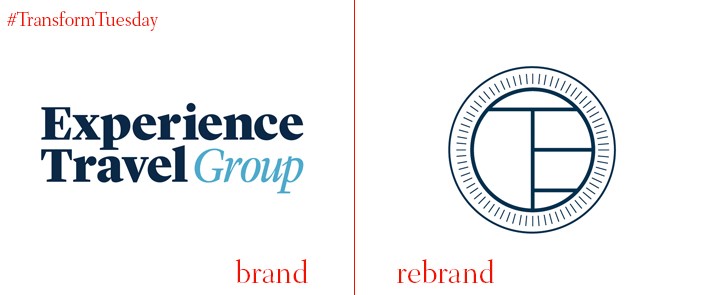
ETG Travel:
Boutique travel firm, Experience Travel Group, has redeveloped its core identity in partnership with creative consultancy, BrandCap. Overhauling its brand positioning, purpose, strategy and identity, the new approach aims to focus on the brand’s luxury personality, typified through unique travel photography and refreshed marketing collateral that highlights the brand’s bespoke network of local partners.
Reflecting its premium approach, the new identity adopts a cleaner design, with a simpler typeface that translates across the entire brand offering. Using a muted colour palette of ink and eggshell, with a sage green used across print and digital, the principle logo is inspired by a compass and key formation, pushing forward an emphasis on unlocking, or discovering, new experiences.
Vanessa Turner, senior designer at Brandcap, says, “Experience Travel Group is a company that all of us would love to go on holiday with – therefore it has been a delight to help create a brand that best reflects the ethos and ambition of the company.”
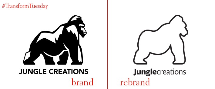
Jungle Creations:
Created by the newly formed branding agency, LoveGunn, the redesign of British media company, Jungle Creations, was achieved through a series of off-site branding workshops with the company’s senior management. Its mascot-like gorilla, in addition to the company’s wider sub-brands, have been reimagined by LoveGunn to embrace a pared-down, softer and more neutral identity.
Realised through a new website, colour palette, typeface and image and video portfolio, the Jungle Creations rebrand incorporates unique identities that consider the diverse audience of each channel. Its Twisted, VT and Aardvark channels have been realigned with Jungle Creations’ refreshed and sophisticated brand aesthetic.
Tom Love, creative director at LoveGunn, says, “Each channel has such a distinctive voice and audience, and we wanted to create individual identities and brands that could be adaptable across social platforms as well as websites and merchandise. We’ve taken a strategic approach to each refresh, considering both the design aesthetic and the overall business interests.”
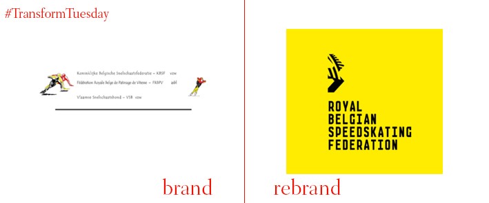
Royal Belgian Speedskating Federation:
As part of a global push for the promotion and investment of winter sports, best captured in the success of the recent Winter Olympics, the Koninklijke Belgische Snelschaats Federatie (KBSF), or Royal Belgian Speedskating Federation (RBSF) in English, has recently rebranded through the work of Belgium-based designers Henk Willems and Jelena Peeters.
The new identity harnesses the sport’s lifeblood; speed. Developed through a diverse logo-set that reworks a bird-shaped ‘B’ in four different ways, the identity sees a new logotype engage viewers against a vibrant yellow backdrop. Across the wider brand collateral, Belgium’s other primary national colours, red and black, weave in and out of each other through rich, limitless features that surround the image of a Team Belgium Speedskater.
Introducing a new mantra, ‘Passion in Motion,’ Willems and Peeters work features across a range of marketing material, as well as the competitive kit. Competing herself for the Belgium team, Peeters direct proximity to the Federation, as well as being a member of the team, contributes to the striking and engaging elements of the rebrand.
For more from Transform magazine, follow us on Twitter @Transformsays


