#TransformTuesday: 12 June
Every week, Transform examines recent rebrands and updated visual identities. This week's picks are below. For more from #TransformTuesday, follow @Transformsays
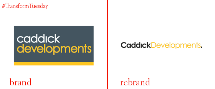
Caddick Developments
One of Yorkshire’s best-known property development consultancies, Caddick Developments, has rebranded its logo, digital assets and visual identity. A long-established brand in the region, Caddick Developments relied on its heritage for business – but its broader offering was lost on new clients. To reconnect its image with its mission and make the Caddick Development brand more relevant to its customers and workforce, UK-wide digital and marketing agency DS.Emotion redefined the company’s identity with a more universal image. Uniting its developments, living, construction and group companies under its new identity, DS.Emotion was careful to retain the colour palette while creating a more future-focused brand.
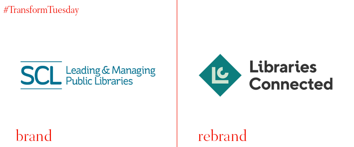
Libraries Connected
The Society of Chief Librarians (SCL) has launched a new identity as a new charity under the name of Libraries Connected. The new charity continues to espouse SCL’s philosophy of ‘supporting and advocating for the power of libraries at the heart of local communities’ while representing library services across England, Wales and Northern Ireland as a membership organisation. Furthermore, Arts Council England has invested in the charity, giving it the ability to recruit a small team of members that will help make the charity evolve and become more productive. Libraries Connected has been accepted as an Arts Council sector support organisation for libraries and will be granted awards to offer support services to the arts sector.
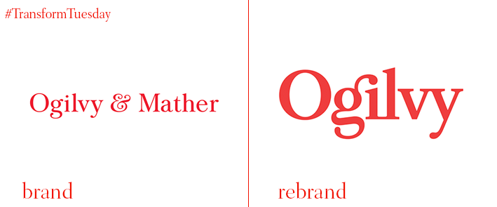
Ogilvy
The integrated creative network founded in 1948. known as Ogilvy & Mather, has announced a rebrand, led by American brand consultancy Collins. It aims to bring focus to the company’s purpose and simplify its structure by unifying Ogilvy’s components under a single brand name. The new visual identity sports a new simplified logo, that, due to its minimalist nature, translates better on-screen, helping the brand adapt to digital. According to the Collins website, “Like our strategic work, the visual identity system has its roots in Ogilvy history. The new logo transitioned from David Ogilvy’s signature-the mark of one person – to a redrawn version of the existing corporate typeface, Baskerville – thus becoming the mark of many people.” The new simple yet elegant look of the brand will appear on all digital and print media, as well as on the brand’s advertising materials.
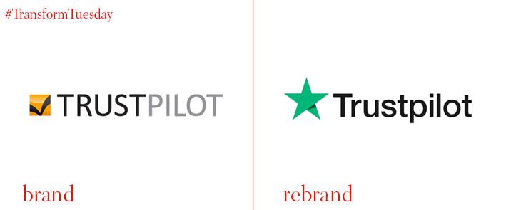
Trustpilot
Denmark-based independent review platform Trustpilot has launched a new brand identity. It marks the company’s transition from a software tool used by businesses to collect customer feedback, to a global platform that bring companies and customer together. The rebrand was led by brand consultancy venturethree following extensive research showing that what customers mostly seek is transparency. With this knowledge in mind, the agency came up with a new logo that consists of a star with an arrow embedded in it, reflecting the company’s quality and is easily recognisable for all stakeholders. Trustpilot’s proprietary widget, Trustbox, was also revamped and is now easier for brands to adopt.
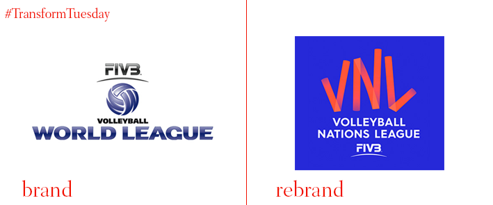
FIVB Volleyball Nations League
The international Volleyball Federation (FIVB) has introduced a new logo and identity for the FIVB Volleyball Nations League. The new brand identity was designed by London-based brand consulting and design agency Landor in collaboration with London-based creative studio ManvsMachine to enhance the fan experience by making the league one of the most important events the sport has to offer. Drawing inspiration from the team spirit that represents one of the core values of Volleyball, Landor put at the centre of the new identity the sport itself, using the court’s colours and grid lines for the design of the new graphic system. Furthermore, Landor partnered with ManvsMachine to create a new logotype and typography, where, according to Landor’s press release, “The shape of each letter was created with motion capture, tracking the trajectory of the ball passing from player to player.”
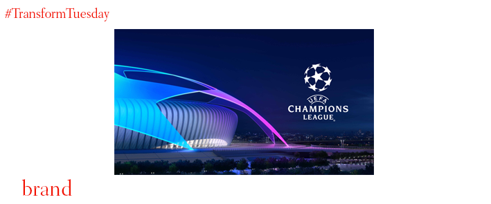
UEFA Champions League
The annual football competition led by the Union of European Football Associations (UEFA), UEFA Champions League has partnered with branding and digital creative agency DesignStudio for the creation of its new brand identity. The new branding marks the first rebrand the championship has seen in 16 years, and it features a star-shaped ball as its main icon, aiming to ‘illuminate spectacular moments in football.’ DesignStudio maintains the dark blue colour scheme, adding brighter shades of blue, cyan, magenta and white to give it a more contemporary feel. The agency also worked with type foundry Fontsmith to update the brand’s typeface, Champions, making it more lightweight. The new identity will be displayed across all of UEFA Champions League’s touchpoints, in both digital and print materials.


