#TransformTuesday: 10 April

Every week, Transform examines recent rebrands and updated visual identities. This week’s picks are below. For more from #TransformTuesday, follow @Transformsays
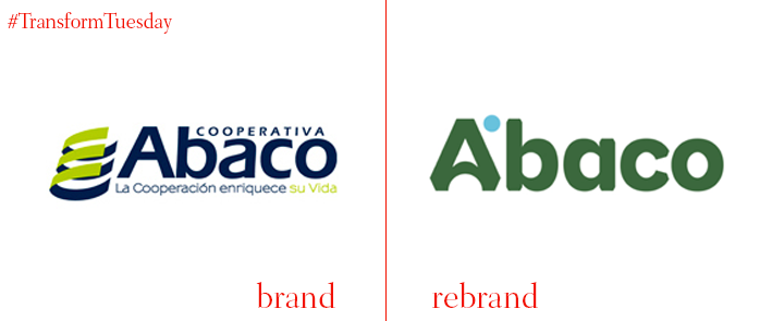
Abaco
Late in 2017, Peru-based non-profit credit union Abaco launched a rebrand. The project, led by Lima, Peru-based brand consultancy Brandlab, pertains to Abaco’s over century-old heritage but employs a fresh, unique colour palette. While simultaneously consolidating Abaco’s vast brand architecture, the rebrands sees Abaco shine among a plethora of competing financial services brands. Brandlab says, “Eager to make the firm more attractive, Brandlab™ organised and revitalised the brand. Now, Abaco embraces its most valuable active: those clients who share [its] memorable, fresh and personal growth histories.”
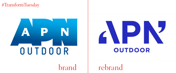
APN Outdoor
Australian brand design studio Hulsbosch has launched a new identity for Australia and New Zealand out-of-home media provider APN Outdoor, helping the company to the forefront of the outdoor media market. Using rigorous research, including panel interviews and stakeholder assessments, Hulsbosch has developed a new brand identity that draws on APN’s legacy as a communications-first brand. Carolyn Pitt, client services director at Hulsbosch says, “This idea of smarter impact, combined with a creative idea of amplifying APN Outdoor’s clients’ voices – which can be seen through the logo design – is set to support the business in achieving the clear direction its new leadership team is pursuing.”
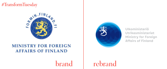
Ministry for Foreign Affairs in Finland
Based in Helsinki, the Ministry of Foreign Affairs in Finland leads the country’s foreign policy and representing Fins across the world. Discarding the ministry’s previous identity, a somewhat ungainly and ill-conceived identity for a region renowned for tight design, the ministry’s new brand concept has been developed by Finnish brand, design and marketing agency 358 to reflect the country’s place in a dynamic world. In a press release, the Ministry for Foreign Affairs in Finland says, “The identity concept is crystallised in the logo, where the Lion of Finland is part of an ever-changing globe. The globe reflects global cycles and their movement. The lion of Finland communicates credibility, stability and prosperity.”
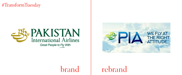
Pakistan International Airlines
Pakistan’s flagship airline, Pakistan International Airlines (PIA), has launched a new livery, logo and brand identity to cement the brand’s place in Pakistan’s air industry. Led by an image of the wild goat species the markhor, Pakistan’s national animal, the updated livery replaces a previously generic logotype which did not strongly identify PIA among its competitors. CEO and president of PIA, Musharraf Rasool, says, “[The] markhor is a national animal which is a fighter and does not lose heart in the hard time as it is couraged [sic] to climb the mountains regardless of the difficulties. PIA will also touch the heights in the same manner.”
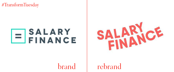
Salary Finance
London-based integrated branding agency Ragged Edge has created a fresh identity for Salary Finance, a start-up cofounded by Dan Cobley, the former head of Google UK and Ireland. Salary Finance, which partners with employers to offer employees a range of salary-linked benefits, now embraces an uplifting verbal and visual identity that aims to bring colour and warmth to a sector characterised by its lack of brand innovation. Max Ottignon, co-founder of Ragged Edge, says, “This wasn’t just an identity project. The brand needed to retain some challenger spirit, while confidently navigating an industry of financial institutions and payday lenders.”
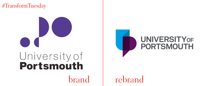
University of Portsmouth
In the city of Portsmouth, on the south coast of the UK, the University of Portsmouth has unveiled a new logo for its digital and print channels. Based on the university’s ‘2020 strategy,’ the new design aims to propel the University of Portsmouth to the forefront of an increasingly competitive higher education sector. Carried out in-house, the new brand reflects the university’s future ambitions, which include tapping into the international higher education sector. The University of Portsmouth’s project page says, “[Stakeholder] feedback inspired the new UP logo, which illustrates the university’s growing success and reputation. Revitalising a brand is about more than a new logo. The university’s aim is to ensure its external presence reflects what it stands for, which includes the investment in your future education and career.”
For more from Transform magazine, follow us on Twitter @Transformsays


