#TransformTuesday: 1 May

Every week, Transform examines recent rebrands and updated visual identities. This week's picks are below. For more from #TransformTuesday, follow @Transformsays.
Argentina
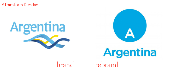
Argentina’s Ministry of Tourism has announced a rebrand for the country, designed by the Buenos Aires office of branding firm Futurebrand. This is not the first time the two companies have collaborated, with Futurebrand being responsible for the country’s old logo, first introduced in 2005 and revised in 2012. The old logo, despite its unique graphic style and the use of the country’s flag colours of blue and yellow, failed to reflect Argentina’s core identity. The new visual identity features a blue circle with an ‘A’ placed its southern end, suggesting Argentina’s location in the map. Below the circle, the word ‘Argentina’ is written in Gotham Rounded font, with the choice of typeface to achieve consistency throughout Argentina’s brand. Gustavo Koniszczer, managing director for Latin America of FutureBrand, says, “The new symbol is a viewer through which everything the country has to share and show, but always with reference to the ‘A’ marking the location of the country in the world.”
Glamour
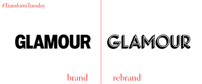
One of the biggest fashion and beauty magazines published by Condé Nast Publications, Glamour, has introduced to the public its new visual identity following the appointment of Samantha Barry as its new editor-in-chief. The May issue, overseen by creative director Nathalie Kirsheh, looks significantly different, with a thick white border frame and a new logo that sports a geometric typeface that is minimalist and is designed for optimal on-screen translation. Glamour’s website has also seen some changes, while a full redesign is due on September. The magazine’s old logo, which featured all uppercase sans serif typeface, felt outdated and bland, unable to make the magazine stand out. The new logo, however, is unique and distinguishable and manages to be both classic and current.
Mindspace
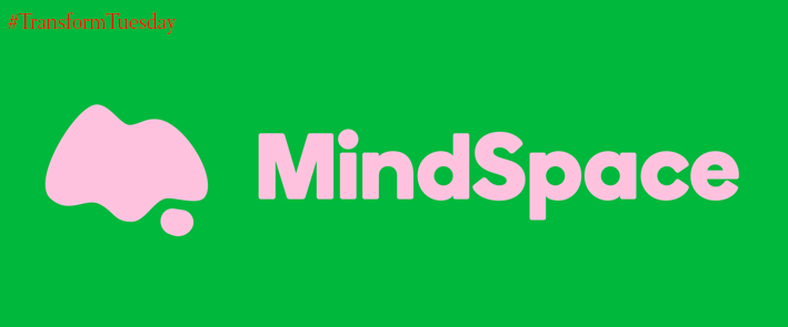
Web design agency Ahoy has helped children’s mental health charity Mindspace rebrand, enabling it expansion across the UK. Mindspace was established in 2016 in Barnsley, UK, under the name of 4: thought. Ahoy begun by renaming the organisation to Mindspace, which is less abstract and reflects the identity of the charity. In an effort to appeal to the charity’s target audience of 11-16 year-olds, Ahoy used bright colours and bold typography, as well as a tone of voice which addresses even the most awkward of topics in a friendly manner. A colour palette of pastels, bright, neon and dark is featured to reflect the many moods and emotions young people experience. The logo is rounded, with a wordmark alongside a thought bubble or a letter ‘M’ offering a soft and inviting result. Lastly, the combination of photography with soft, bold vector shapes, helps children consider about the idea of ‘singular thoughts standing out from abstract, strange or scary thoughts.’
Sacyr
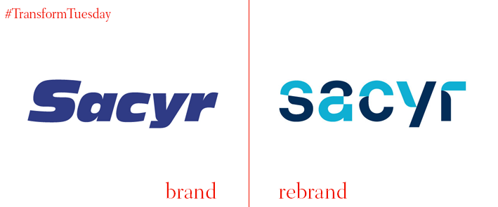
After 30 years, Spanish construction company Sacyr has launched a rebrand, showcasing its commitment for continuous improvement. Sociedad Anónima de Caminos y Regadíos, as the brand is originally called, appointed Madrid-based international consultancy Superunion to build a relationship between the company’s brand and its strategic plan for the future. 'Transformation' is at the centre of this project, with Sacyr wanting to show its capability in transforming any challenge into an opportunity and any challenge into a solution. To reflect this, the company’s tagline 'Global Innovation' has been swapped for ' Challenge.Success,’ in Spanish 'Challenges Met.' The logo consists of a typography in which the letters subtly turn on themselves. The colour palette consists of the same blue as before with the addition of different hues of blue and aqua as secondary colours, symbolising the different divisions of the company. Sacyr also sports a new photographic style that is more personable, but at the same time gives the company a more international feel.
Well & Truly
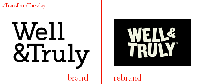
Snack company Well & Truly has collaborated with London-based creative design studio B&B to launch a rebrand with the objective to move away from its original health-focused positioning. The company found itself trapped inside its healthy claims, with its packaging following the design codes of ‘lighter’ options. To combat this, B&B reinvented Well & Truly’s visual identity, bringing the attention on the high quality of ingredients and intensity of flavour. Using an unconventional black background on the packaging with sans serif type in bright hues the brand manages to stand out and catch the consumer’s eye. The bold new visual identity is found across all of the company’s outlets, while B&B studio has also used visuals of real people displaying uplifting behaviour, making the campaign both engaging and relatable.
WOW
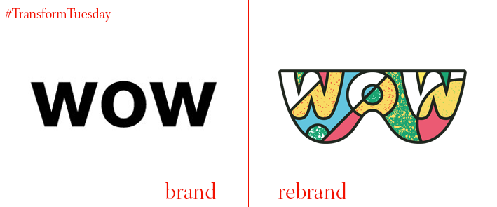
Health and nutrition company WOW has revealed a brand renovation and drastic new pack design across its range of wellness beverages designed by branding agency, Jones Knowles Ritchie (jkr). WOW’s new logo, which features a pair of glasses, is the focal point of the brand’s new identity by encouraging consumers to interact by holding a bottle in front of their eyes, ‘Seeing life with your WOW glasses on.’ The new brand identity will be featured across all touchpoints including digital, social, OOH, activity, packaging and events, in order for consistency to be achieved. Founder Oliver Dickinson says, “Following the growth we’ve seen from our activated charcoal drink since its introduction last autumn; the increasing demand for our chia seed drink and the popularity of our probacteria water in France, we believe we can educate consumers on functional drinks and be leaders in the sector with our new brand identity.”
For more from Transform magazine, follow us on Twitter @Transformsays

