Tradition meets forward trajectory in Carlsberg's global rebrand

When visiting the home of Danish beer Carlsberg in Copenhagen, its history, heritage and position in the world’s pantheon of lager is affirmed. The original brewery still stands near the centre of the Danish capital, proudly exploring Carlsberg’s creation and evolution, as well as its brewing of brands like Tuborg, Somersby, Kronenbourg, Mythos and many others. The site boasts original stables and brewing vats alongside a newly decorated bar and tasting experience, seamlessly blending the old with the new.
Today, it has announced a rebrand that ties Carlsberg’s brand back to that heritage, while still maintaining its forward momentum. Working with British brand agency Taxi Studio, Carlsberg’s rebrand will help unite its products around the world, while crafting a more flexible system based on Danish design principles.
Spencer Buck, creative partner at Taxi Studio, says: "I think the public, when they really get to know Carlsberg, will fall in love with it. Brand's search for purpose is a bit of a buzzword, but it's incredibly important. Carlsberg's had purpose since 1847."
What Buck refers to is the pioneering spirit of JC Jacobsen who worked with brewers yeast in an inventive way. He is also referring to, though, Carlsberg’s commitment to sustainability and innovation. The company is currently working toward a zero carbon footprint, zero water waste, zero accidents future, along with eliminating irresponsible drinking.
Jacobsen himself set this ethos out in his will, saying, “In working the brewery, we should be in constant pursuit of better beer so that the brewery may always set the standards and assist in keeping beer brewing at a high and honourable level.”
Taxi Studio took this positioning to heart in developing the rebrand. Rather than pursue design trends – like that of Carlsberg’s ‘København Collection’ of 2017 – the rebrand focused on creating something that would last, much like Carlsberg’s original brewery in Copenhagen’s Vesterbro neighbourhood. “The new design system is very much anti-trend. It’s designed to be permanent, or more permanent than any iteration of the design system has been before,” Buck says. He adds that this objective was in line with Carslberg’s overall sustainability objectives.
“It’s only when you see the previous design that you realise that the new design is new, because it looks like a design that’s always been there. It looks like what Carlsberg should always have been.”
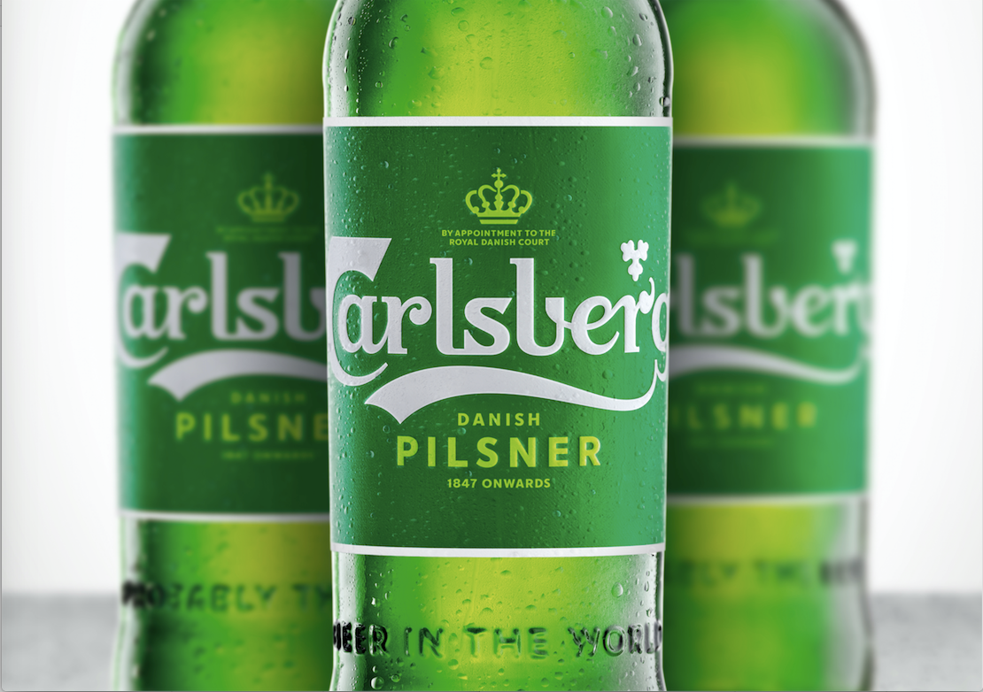
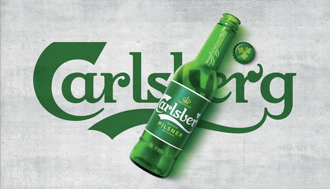
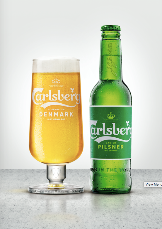
As a result, the visual identity uses Carlsberg icons like the wordmark, crown and Jacobsen’s signature. Yet, it simplifies them to their most essential elements. The biggest change is to the crown icon which transforms from a chunky red-and-gold mark to a simplified, light green illustration. The new master brand lockup is simple, elegant and rendered in dark and light green with a white wordmark. The green gracefully matches the brand’s iconic green glass bottles while still adding a classic richness to the packaging that was missing before.
“It’s only when you see the previous design that you realise that the new design is new,” says Jessica Felby, design director for Carslberg. “It looks like a design that’s always been there. It looks like what Carlsberg should always have been.”
The launch – rolling out in Scandinavian markets as of this month and globally throughout 2019 – will be accompanied by new packaging, sustainable elements like eliminating plastic ring can holders, a new web portal and other on-trade touchpoints. The brand will retain the ‘probably’ strapline made popular during this year’s FIFA World Cup.