The Guardian welcomes tabloid format and digital redesign
UK newspaper the Guardian has today launched a new format for its print publication, departing from the larger custom-Berliner to a more compact tabloid aspect ratio. The redesign also welcomes a new interface across the Guardian’s digital platforms, introducing a new masthead and typeface that sees its continued collaboration with design agency, Commercial Type, yield the newspaper’s most prominent design change since 2006.
Katharine Viner, editor-in-chief of Guardian News & Media, says, “Since we announced our plans to change format seven months ago, it’s been an exhilarating period of creativity, imagination and focus, and I’m thrilled with the result: a new paper that feels bold, striking and beautiful, and still unmistakably the Guardian. It has also been a fantastic opportunity to redesign our website and apps. The Guardian will be a space for big ideas, for debate, for clear thinking and new perspectives.”
The move to tabloid represents an interesting shift for the newspaper, with its previous Berliner format remaining much smaller than the industry standard, best seen through the examples of France’s Le Monde and Israel’s national title, Haaretz. Yet the redesigned print parameters also represent new financial measures for the Guardian, working towards halving its operating losses by April 2018, down from £57m to £25m.
David Pemsel, CEO of Guardian News & Media, says, “The change to tabloid format is an important milestone in our three-year transformation plan and will save several million pounds. The media sector remains challenging. However, our reader revenues are growing well, and more people are reading us than ever before – we now reach over 150 million unique browsers each month and we have over 800,000 supporters.
In 1988, during Peter Preston’s time as editor, the Guardian’s first major visual overhaul, undertaken by designer, David Hillman, revolutionised the paper’s broadsheet format, introducing new methods in ordering information largely unseen across the industry at the time. Yet as print journalism made progressions into the new century, new adjustments became a necessity.
In 2006, under the editorial leadership of Alan Rusbridger, the Guardian began its shift to the Berliner format, unveiling its most notable redesign to date. Developed by the Guardian’s creative director at the time, Mark Porter, the newspaper welcomed its unique blue colour palette, grid-like layout and custom typeface, garnering a nomination in the Design Museum's 'Designer of the Year' competition. It also began to carry over much of its content to digital, producing greater design challenges.
The redesign also welcomes a new font, developed by Commercial Type and entitled ‘Guardian Headline,’ which sees the paper implement clearer line spacing, as well as overall typesetting to improve readability. Complimenting the launch, a new promotional video developed by UK-based advertising company, Karmarama, depicts the new trajectory for the newspaper as it begins to focus on its vast global reach.
The Guardian’s sister publication, the Observer, will also launch in tabloid on January 21.
For more from Transform magazine, follow us on Twitter @Transformsays
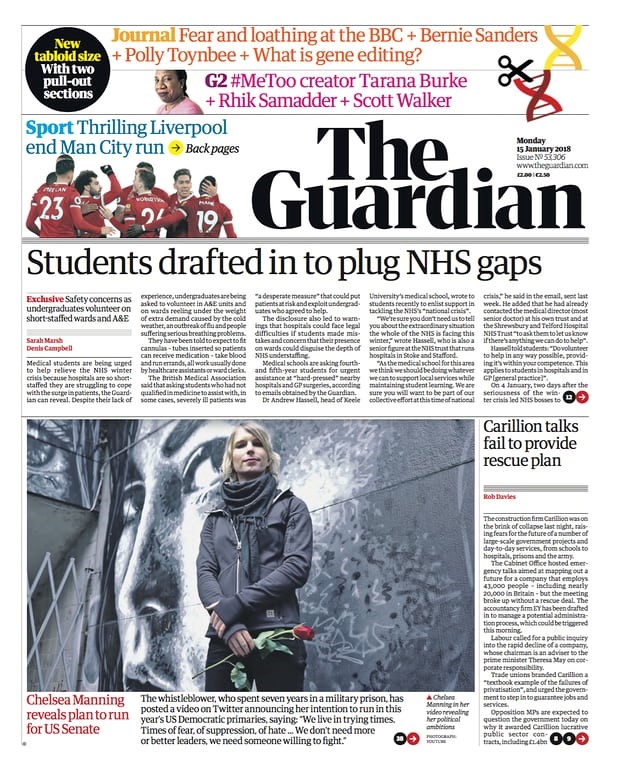
The Guardian is a bastion of many values, including fierce, independent journalism and giving the disenfranchised a voice. Yet, says Anthony Cox, the newspaper’s latest rebrand, from blue 2006 Berliner style to monochrome tabloid, hasn’t quite hit the mark.

It’s hardly a front-page story that newspaper sales have been slowly heading south for some time, prompting the need for their owners to look for alternative, more sustainable commercial models. So, after the launch of the Guardian’s new tabloid-format paper this week, it won’t be surprising if headlines focus on survival as the driver of change. After all, Guardian Media Group has been open about the move being part of its ‘transformation plan’ to save millions for the business.
What first stands out is how safe it feels – a little at odds with a champion of independent news journalism. Gone is the instantly recognisable dark blue belt with lower case logo, replaced with a new monochromatic masthead in title caps. It’s certainly confident but feels somewhat traditional, with its two-tiered shape just adding that little contemporary touch. The new ‘G’ icon used for the app looks a little cooler, but feels a little out of keeping with the rest of the design.
Sadly, it just doesn’t stand out on the newsstand anymore. It’s gone from what felt like a beacon of difference to another tabloid lost among the noise of black and white. But the Guardian has never been about black and white. It’s a brand that acts as a space for ‘new voices…the unheard…whistleblowers…for hope.’ It feels like something of that attitude has been lost.
Maybe it’s a response to the times (rather than The Times), but it also feels a tad solemn as a front page and particularly within the mobile app landing page, where the black, white and red scream ’serious stuff!’
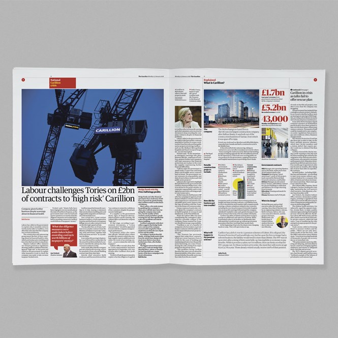
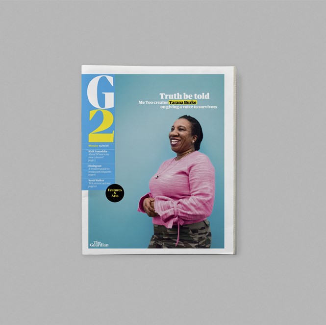
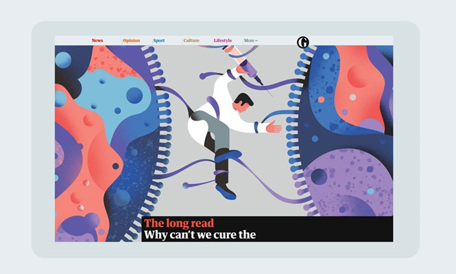
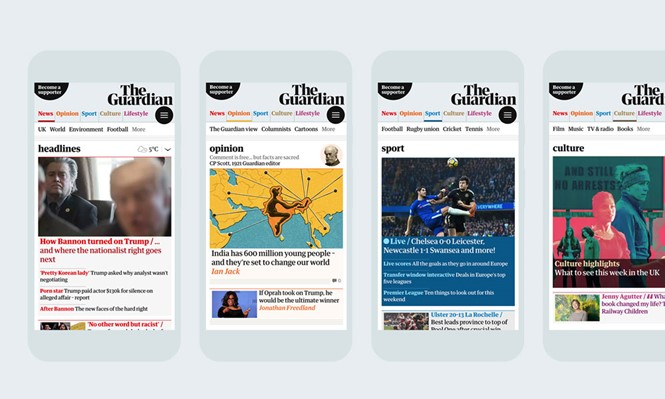
Where the redesign starts to show more value is in its addition of brighter, vibrant colours into the palette. In print, it lifts the G2 section to something more magazine-y and the new Journal supplement is given a background of subdued salmon which feels fresh and allows brighter, ‘poppier’ colours to pull out key points and create eye-catching infographics. From the desktop homepage, however, headline colours are used as navigation through news, opinion, sports, lifestyle and culture, but in practice it makes for a bit of a colour riot.
It’s not entirely clear what this redesign is trying to fix. At its best it can help give some space and energy to some of the Guardian’s great content, but it lacks that immediate difference and impact. It’s still early days, of course, and we’ll soon see how this new look explodes out to weekend magazines and the Observer. For now, it needs some bedding in to see if it can help protect the brand and all it stands for into the future. I hope it can.
Anthony Cox is associate director and head of strategy at Dragon Rouge


