Spotlight on Formula One
Formula One debuted a new brand to represent the fast-paced sport on a global scale. The move may help the sport change its reputation, but trademark uncertainty still reigns on the racetrack. Taylor Rice reports
On 13 May 1950, Giuseppe Farina crossed the finish line of the UK’s Silverstone Circuit after two hours, 13 minutes and 23.6 seconds, winning the first World Championship Formula One race. Since that inaugural World Championship Grand Prix, Formula One has been a premier sport that prides itself on the speed, precision and technological innovation which sets it apart from comparable racing series and makes it an iconic, globally recognised brand.
Formula One’s global appeal is a major factor in its success. In the 2017 season, Formula One held 20 races in 20 countries across five continents, with a total attendance of over four million and a global television audience of 352m. According to The Economist, it has the third-largest television audience for a global sporting event, behind the FIFA World Cup and the Olympics, and its 2017 revenue was estimated at £1.3bn.
Statistics of that calibre are what made Formula One an appealing asset for American mass media company Liberty Media Corporation, which purchased Delta Topco – the company that owns Formula One – from CVC Capital Partners for £6bn in January 2017. According to Formula One Group executive chairman Chase Carey, in an interview with Spanish daily AS, Liberty purchased F1 because it said the sport had “entered a crisis” and “needed a renewal.” Indeed, according to Motorsport’s 2015 Global Fan Survey, 35% of fans found the sport ‘boring’ and over 20% used the term ‘corrupt’ when asked to name F1 brand attributes. When it came to positive attributes, only 15% of fans used the term ‘exciting’ and less than 5% found it ‘fun.’
Ellie Norman, Formula One’s newly appointed (and first-ever) marketing director says, “It was clear we were going to need to address some fundamentals of our brand, if we were to realise our ambition to make Formula One a major entertainment player and claim our rights to be the global media brand we should be.” In order to do this, Liberty Media Group paired up with London-based insights and brand consultancy Flamingo to conduct a brand health study, which obtained feedback from fans in multiple countries. “When we talked to fans across the globe what we heard was people loved the real, exhilarating, unpredictable, and incomprehensibly fast elements of the sport,” Norman says. “But many felt those days were behind us and that the sport has become almost impenetrable for fans, particularly new ones.”
Although Liberty Media’s ownership saw small changes implemented throughout the 2017 season, by far the largest was the announcement of Formula One’s rebranding and accompanying new logo, which was unveiled at a live ‘end-of-season spectacle’ at the close of the Etihad Abu Dhabi Grand Prix on 26 November. This new logo, created by advertising agency Wieden+Kennedy London, is the first in 23 years, when F1 introduced its ‘Flying One’ logo, by Carter Wong, in 1994, and the fourth in the brand’s 68-year history.
Wieden+Kennedy, most famous for creating Nike’s ‘Just do it’ slogan, was approached by F1 and given the challenge of creating a visual identity that would help the company shift from being a rights holder to a global media brand. “We are trying to reposition Formula One from a purely motorsport company to a media and entertainment brand with the heart and soul of a race car driver in the middle of it,” says Formula One’s commercial chief Sean Bratches.
Part of that effort includes drastically increasing F1’s presence in the digital space. Currently, less than 1% of the organisation’s revenue is from digital, and Liberty Media is hoping to change that. The first step, according to Bratches, was ridding F1 of its former logo, which was not ideal for digital platforms or merchandise. The negative space creating the ‘1’ did not translate well to digital, and the brand was concerned about the number of fans who had never recognised the invisible ‘1.’ The aim was to make the new logo sleek, simple and optimal for digital use.
The resulting design is inspired by the form of a Formula One car. It is “flat, low to the ground and with a suggestion of speed,” says Wieden+Kennedy’s executive creative director of content and design Richard Turley. “Sleek, sharp interlocking components celebrate the technical prowess of Formula One engineering teams.” The logo, which mimics two race cars heading toward the finish line, has a modern-retro look with widened aspects and bright red design contrasted against a black background.
“We are trying to reposition Formula One from a purely motorsport company to a media and entertainment brand with the heart and soul of a race car driver in the middle of it”
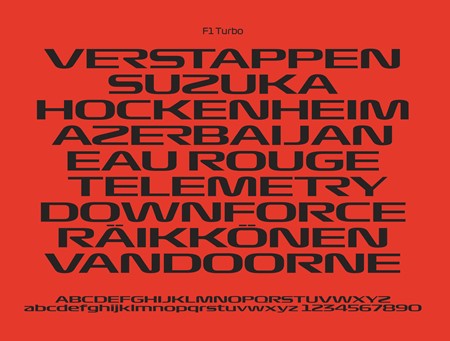
Working with a colour palette of red, black and white, Formula One also introduced three custom fonts, designed by French type designer Marc Rouault, for its wordmark and promotional materials. The fonts – named Regular, Torque and Turbo – feature bold lettering and rounded edges that capture the fluidity of a racetrack.
The new logo and typography will be implemented across 21 F1 courses for the upcoming season. Turley says, “Our plan is to give each different set of stakeholders guidelines that help articulate our vision but don’t restrict them too much.” Broadcasters, promoters, marketers and other parties involved will be able to use the new visual identity and set of fonts in a way that allows them a level of creative freedom and variety while still remaining aligned with the overall look of the F1 brand. “The guidelines give F1 the ability to mix [the fonts] as they see fit, dialling them up or down, season to season, enabling each year to feel distinct yet consistent.”
Turley says that the logo signals the start of a new era for Formula One, but that Wieden+Kennedy’s relationship with F1 is expected to continue over a period of years. “This change in [F1’s] branding and business model will be an ongoing challenge, especially as the quantity of physical touchpoints can appear pretty daunting.”
Implementing F1’s new branding has in fact been a challenge, with the organisation receiving immediate pushback from fans across the globe who are hesitant to part with the 24 year-old logo that many consider iconic. Turley says, “The response from F1 fans has ranged from loving it, to somewhat sceptical, to outright hostile and all points in between. They are, quite rightly, going to need to be convinced that these changes, however cosmetic in terms of a logo, are going to have a positive effect on their enjoyment and growth of the sport.”
F1’s drivers may similarly need to be convinced. After the new logo was revealed at Abu Dhabi, Mercedes driver and 2017 World Champion Lewis Hamilton told reporters, “I think the one that we already had was an iconic logo. Just imagine Ferrari changing their logo, or Mercedes changing their logo. I don’t think the new one is as iconic, but maybe it will grow on us.” Second and third place winners Sebastian Vettel and Valtteri Bottas similarly voiced support for the former logo, questioning the need for change.
Wieden+Kennedy is confident that, in time, the logo will become just as accepted as its predecessor. Turley speculates reasons for the logo’s current controversy: “Maybe it’s got something to do with it being launched right at the start of the fallow time in the F1 calendar; post-season with no races and when fans are still desperate to talk about anything related to their obsession.” He adds, “Plus F1 is a spectator sport, and as is often observed, logo launches these days are spectator sports in their own right. Perhaps the combination has had a somewhat incendiary effect on fans and followers of both the sport and design.”
However, in January, a larger controversy than fan disapproval emerged surrounding the new logo. One user on Twitter noticed that the new F1 logo bears a striking resemblance to the logo of Futuro compression tights. Futuro, which is owned by the multinational conglomerate 3M, which produces Scotch Tape and Post-it Notes, registered trademarks for the logo in Europe and North America in February 2017, while F1’s trademark application was not submitted until November 2017 and is still pending approval.
The two brands technically operate in separate markets. 3M’s trademark is filed under the category of ‘special clothing for medical purposes,’ while F1 filed its trademark for 24 of 45 options, including ‘clothing’ but excluding ‘special clothing for medical purposes.’ However, this does not guarantee that F1’s trademark application will be granted, especially if 3M lodges a complaint. The European Court of Justice ruled in 2008 that trademarks are “protected by a basic rule which prevents the registration or use of a sign identical or similar to a registered trademark, for goods or services identical or similar to those for which the mark is registered.” The word ‘similar’ is key for 3M’s case, since both have trademarks filed for a type of clothing. Although confusion in the marketplace is unlikely, the similarity between the logos may still be striking enough to put F1’s trademark filing in jeopardy.
It should also be noted that a common solution to similar situations—a financial settlement in exchange for agreement not to lodge opposition to the trademark filing—would serve to make the logo even more unpopular amongst fans and those in the league, since the money that is paid toward the settlement would ultimately lessen the amount that drivers and teams will be paid in the upcoming season. The distribution of income to teams is already a controversial topic within the league, and one that Liberty Media has promised to help improve. Wieden+Kennedy had no comment on the logo similarities, and Formula One has yet to acknowledge or address the conflict, so the fate of F1’s new brand is unclear.
The delay in trademark approval could prove to be a difficult blow to Liberty Media’s vision for F1’s 2018 season overall. Following the brand health study, Liberty Media announced that it was opening a new office in London, launching a new F1 streaming service and had signed a merchandising deal with American sportswear retailer Fanatics. It also announced plans to turn each Grand Prix weekend into an event similar to the Super Bowl, complete with dedicated FanZones and “a massive [merchandise] tent experience.” Liberty Media also hopes, over the next few years, to expand to as many as 25 races per season.
The new Liberty Media era has restored faith in the brand thus far according to Motorsport’s 2017 Global Fan Survey, which surveyed over 200,000 F1 fans in 194 countries. When fans were asked what attributes they associate with the brand, terms such as ‘exciting’, ‘competitive’, ‘prestigious’ and ‘world-class’ saw a double-digit increase from 2015’s survey, while negative terms such as ‘boring’, ‘corrupt’ and ‘threatened’ decreased by an average of 13.3%. This is perhaps in part due to Liberty Media’s proposed spending cap and promise to more evenly distribute income between teams, previously a major complaint amongst F1 fans. However, with the widespread criticism of the new logo and the looming possibility of conflict with 3M, how much longer the faith in Liberty will last, if it still exists at all, remains to be seen.
Peer review
Ryan Tym, director, Lantern Design
![]()
Branding agencies spend a lot of time trying to convince clients that there is far more to an identity system than the logo. The supporting visual and verbal assets have as much, if not more of a part to play in defining a brand style. But every now and again, an organisation comes along where the logo is undoubtedly the hero asset and F1 is no exception. Not least because the previous design by Carter Wong is rightly listed as a design classic, but also because in application, it’s so often seen in bold, brazen isolation.
Despite the old logo’s 31-year history, it never really felt dated. That was until the new version was released. The talented team at Wieden+Kennedy, led by Richard Turley, has created an overnight icon – a universally recognisable symbol, which bears all the hallmarks of the sport’s speed, style and engineering finesse. Whether you see the logo as the shape of a streamlined car or the dramatic bends on a track, it instantly captures the attitude and sprit of the race and feels wholly appropriate for a global entertainment brand. Of course, there’s no clever use of negative space to satisfy the appetite of the classic graphic designer, but the new minimalist style brings with it a confidence that reflects the sport’s own character.
There’s limited evidence of the wider visual style at this stage, with the exception of three typefaces to complement the logo. Although these work well on early on-screen mock-ups, the appetite for that flexibility may fade through long term implementation, with F1 Regular potentially emerging as the dominant typeface, supported by a range of weights.
One notable benefit of the rebrand was the public display of professionalism and candour that both Carter Wong and Wieden+Kennedy have shown since launch. In an industry plagued by negative reactions from designers and punters alike, the gift of a bottle of champagne accompanied by a card with the words ‘Thank you for giving us such a hard act to follow’ arrived at the Carter Wong offices before Christmas. As they so neatly commented, “The design world is a nicer place when we all appreciate each other and the work we do. Here’s to everyone’s ongoing success.”