Sense of belonging in University of Roehampton rebrand
Competition among UK universities is at an all-time high. With rising tuition fees and an increasingly competitive work environment, people of university age are becoming more selective about where they choose to study. In turn, communications efforts from universities determined to impress prospective students and stand out in a marketplace of around 130 institutions has heightened. For the recently-rebranded University of Roehampton, achieving differentiation means an emphasis on inclusion and the university’s strong community feel.
Located in south west London, between Putney and Richmond, the University of Roehampton is a public university which has enjoyed university status since 2004. Initially founded as Roehampton College of Higher Education, it became Roehampton University and then rebranded as the University of Roehampton in 2011. However, the historic teaching and community ethos of the university remains, largely informing the new brand and marketing strategy created by London-based design agency, Taxi Studio.
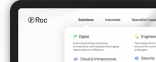
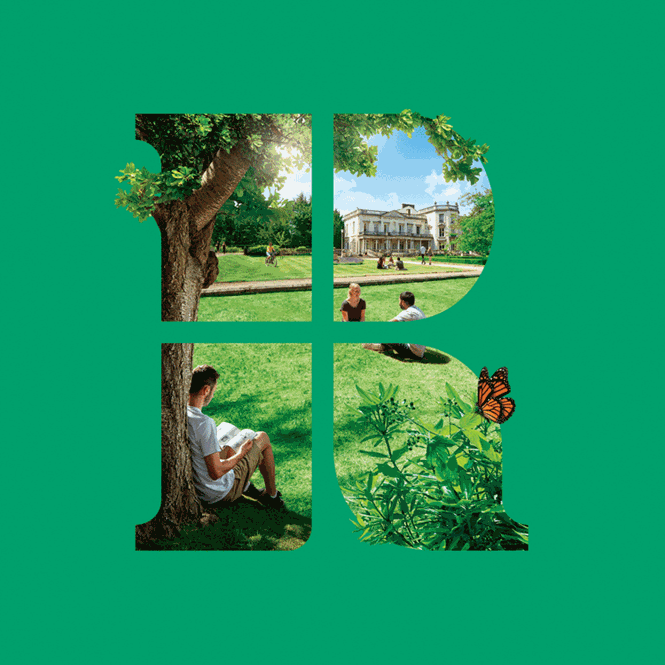
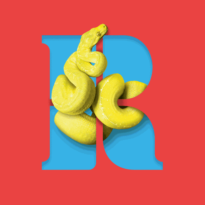
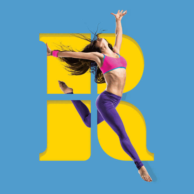
Building on the colleges of Whitelands, Southlands, Digby Stuart and Froebel, which initially comprised Roehampton College of Higher Education and to which University of Roehampton students now belong, Taxi Studio has developed an identity-based visual brand and accompanying digital identity. A new logo for the University of Roehampton is comprised of four sections in the letter R, representing the founding colleges. A subtle dark and light green colour palette replaces the previous yellow, blue and red patterned offering, providing the basis for the university’s updated website and associated marketing materials.
For Karl Wills, associate creative director at Taxi Studio, the optimisticand future-focused nature of the university informs the rebrand – and the University of Roehampton community, too. Wills says, “We’re thrilled to have created a timeless identity for Roehampton – one that’s interactive and can accommodate all the communications it needs for years to come. It’s been a total pleasure to work with the fiercely forward-thinking team at Roehampton.”
Achieving a successful and contemporary design for the University of Roehampton while pertaining to the university’s founding ethos meant Taxi Studio focused specificially on the manifestation of the University of Roehampton’s identity. Bringing the ‘R’ to the forefront sees the university’s unique range of subjects and specialisms addressed and enforced through a bold use of colour. These, in turn, reflects the subjects in which the institution excels. “We wanted a new brand identity that was contemporary, would help us stand out and at the same time represent our rich heritage,” says Liam Hurley, director of communications for the University of Roehampton.
“Taxi Studio brought creativity and a sense of focus to a process that involved our students, staff and other members of our community.” Hurley continues, “The result is a new brand identity that reflects the elements, which make the University of Roehampton such a great place to study and work. We are delighted with the end result.”
With heightening pressure of universities to display value for money to students investing the best part of £40,000 into their higher education, imaginative and relatable branding efforts have never been so important. For the University of Roehampton, the sense of community achieved in Taxi Studio’s fresh approach to the university brand represents the experience that Roehampton students, prospective and current, can expect.
For more from Transform magazine, follow us on Twitter @TransformSays