Olympic branding, examined
Branding and design excellence have come to define the Olympic Games. Brands require consideration of a country’s culture, traditions and future at the Games, team and national levels, alike. Brittany Golob analyses branding from the PyeongChang Olympics
The world watched as the Olympic flag was raised at the Opening Ceremony of the PyeongChang Winter Olympics on 9 February. The world watched as the joint Korean team waved the united flag bearing the Korean Peninsula.
The Olympics is full of symbols. The rings themselves are among the most well known logos in the world. Add to that the flame, the Games identity, the individual country flags, kit and team brands. Then add the broadcasting brands, the sponsors, the outfitters, the suppliers, the hundreds of logos and names and symbols present at any Olympic Games. New designs unveiled for the PyeongChang Games made international headlines and made this Olympics one that is highly brand conscious.
One new brand sought to shed the aura of a popular film, another sought to inspire a new generation with the star-studded dreams of a previous one and another sought to move past the misjudgment of past competitors.
Unlike bobsledders who compete by sliding downhill, some brands have to face an uphill battle when it comes to brand recognition. They struggle to gain the attention of their target audiences, and once gained, to retain it.
That is not the case for Jamaica Bobsleigh & Skeleton. Due to the astronomical success of 1993 film Cool Runnings, Olympic viewers, sponsors and reporters know about the Jamaican bobsleigh and skeleton teams. They pay attention when Jamaica takes the hill. And they noticed when the Jamaican flag was paraded through Olympic Stadium in PyeongChang last month.
But, in terms of brand, that’s precisely the uphill battle London-based agency We Launch faced when examining the Jamaican team’s rebrand. Stuart Lang, owner of We Launch says, “For too long they were only associated with one thing – Cool Runnings. PyeongChang [has] provide[d] a significant opportunity to motivate, inspire and change perceptions – both within Jamaica and internationally.”
The shift in brand comes after a shift in organisational structure as the bobsleigh and skeleton teams officially joined in 2016. But the rebrand has helped to situate the team among the world’s most elite athletes.
The new look uses a stylised ‘J’ as the main logo in which the Jamaican flag is inset. Slightly italicised type completes the wordmark, echoing the speed of both bobsleigh and skeleton as well as the inclination of the hill. That sleekness is carried through the rest of the brand’s touchpoints, including the bobsleigh itself. According to Paul Bailey, strategy director at We Launch, the J icon combines the angles and curves from the track into a dynamic form reflecting movement and precision.
Lang says the individual teams rely on brand as well as excellent athlete performance to secure funding from national governing bodies (NGBs), “Sports are realising that a strong brand can increase their attractiveness to potential sponsors - and can unite multiple stakeholders with a new shared purpose.” But, the most important brand is, ultimately, the Olympic brand itself. “With any Olympic Games, the Olympic brand is sacrosanct...As soon as a Games approaches and commences, the individual NGB logos have to fall under one banner, and bow down to the master Olympic brand.”
The brand of an individual team at the Olympics allows its athletes to represent their nation with pride, but also to find their place within the context of the sporting community in which they compete. At PyeongChang, the US Snowboard Team was one of the standout examples of this relationship. Longtime outfitter Burton deployed a classic design in a modern way to link the team to America’s cultural design history while simultaneously maintaining the team’s longstanding status as design aces.
The snowboarding gear was inspired by vintage Nasa branding, including the ‘meatball’ logo, Nasa typeface and Apollo-era spacesuit designs. Greg Dacyshyn, head designer of Burton’s Olympic uniform programme, says, “Like the previous three [Olympics] which had a retro inspired influence, the 2018 theme is also a heavy nod to Americana, because its main influence is the iconic suits of the United States’ leading space exploration program. I have always loved the astronauts’ suits, because not only do they have such a cool and amazing aesthetic, they also were designed to function under the most extreme conditions, so this gave us an incredible platform to push the innovation and technology of the garments as well. My hope is that these pieces help the athletes go where no rider has gone before.”
“Everyone’s looking for the signals to be unique and identifiable, that’s why the visual language of the Games and the look of the Games is so important, because it is the unifying dress or visual representation of that country”
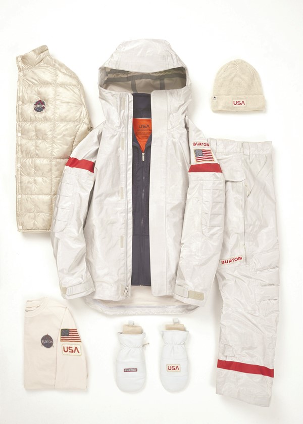
In addition to space-age materials, the kit features Nasa’s iconic worm typeface and deploys the meatball icon on various lapels. The meatball dates to 1959 – pre-dating the worm wordmark – and set the tone for 1950s and 1960s space-inspired design. The logo itself has been slowly replaced because it is ill-suited to most modern uses. “It’s a design nightmare,” says Greg Patt, graphics manager for Lewis’ Publishing Services’ (which designed the logo) contractor, Cortez III. “It doesn’t print well on laser printers because of the gradations on the airfoil, and it can’t be used at less than 5/8 inch because the stars disappear and the type becomes illegible.”
But, in terms of drawing a connection between America’s reputation in aviation and its reputation on the slopes, the meatball’s application on PyeongChang kit is fit for purpose.
One team was not so lucky. The PyeongChang Opening Ceremony parade did not feature – for the first time since 1994 when it began competing as the Russian Federation – the Russian tricolour. The ninth-winningest nation in the Winter Olympics’ all-time medal count, Russia sends a consistently strong delegation to both the Summer and Winter Games. But, its PyeongChang delegation was banned from using any Russian national icons or branding on apparel, flags or insignia during the South Korean Olympics.
The decision was made by the International Olympic Committee (IOC) as a way to allow Russian athletes with proven histories of clean drug tests to participate in a Games in which Russia has been banned. Competing under an athlete’s national flag is a point of pride for Olympians. However, this year’s Russian delegation instead was designated ‘Olympic Athletes from Russia.’ Their apparel could bear at most two colours, to avoid associations with the tricolour Russian banner. Athletes were required to display a round, red-on-white badge proclaiming ‘Olympic Athletes from Russia’ and any writing on their apparel had to be in English. The Olympic anthem was played in place of Russia’s in medals ceremonies.
However, as a brand, the effective white-labelling of its Olympic presence may impact a Russia which held the last Winter Olympics in Sochi in 2014. Russian governmental officials including the minister of sport, Vitaly Mutko, have received lifetime bans from any future Olympic Games The development of a nation brand relies on such elements as international sporting participation, tourism, global investment and other factors. The Olympics can play a strong role, particularly for host countries. “It’s hugely important, because the whole country is in the spotlight,” says Andy Payne, global chief creative officer at Interbrand, which worked on the Sochi and PyeongChang brand’s. “Not only is your country is in the limelight, your future is also in the limelight. Where you are going as a country, what your purpose is, what your vision is, how you’re modernising.
All these things start to come to the fore. Many countries, when they register interest in hosting a games, they will see it as a catalyst for many other circles of growth. In Korea for instance, we worked with the Korean tourist industry two or three years before the actual bid was approved. It’s part of an overall strategy about building nations, building country, building culture into destination, and countries as destinations, and capitals as destinations.”
The Sochi Games was intended to improve the image of Russia’s nation brand. University of the District of Columbia marketing professor Nikolai Ostapenko writes in the Journal of Management Policy and Practice, the Olympics was meant to inspire a “huge international comeback opportunity to present a stronger, better, more glamorous image both politically and economically.” He said the Sochi Olympics was “an opportunity to change the nation’s image is desired from within and expected from without. This historical opportunity must not be missed again. This is a propitious moment for Russia to resume country’s pursuit of international fame, glory, and appreciation.”
But, for Russia, the legacy of Sochi is not a boosted national image and stronger tourism to the Black Sea region, but the black mark of doping. The PyeongChang censure has come in response to concerns over continued doping programmes within the Russian team. IOC president Thomas Bach called the doping scandal, “an unprecedented attack on the integrity of the Olympic Games and sport. This should draw a line under this damaging episode and serve as a catalyst for a more effective anti-doping system.” The IOC has also issued 43 lifetime bans to Russian Olympic athletes for doping.
For North and South Korea, though, the legacy of the PyeongChang Games may be one of cooperation, political collaboration and a historic integration of sporting delegations. And of great design.
The Korean Unification Flag – carried by athletes throughout the 2018 Games – has a heritage of use in sport. It debuted at the 1991 World Table Tennis Championships in Japan when the joint North and South Korean team competed. Its implications on geopolitics are largely symbolic – and still being debated globally – but as a piece of design, the flag is revolutionary for two nations long divided by history. The white banner – the traditional colour of peace – features a light blue Korean peninsula silhouette uses a colour associated with the United Nations.
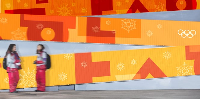
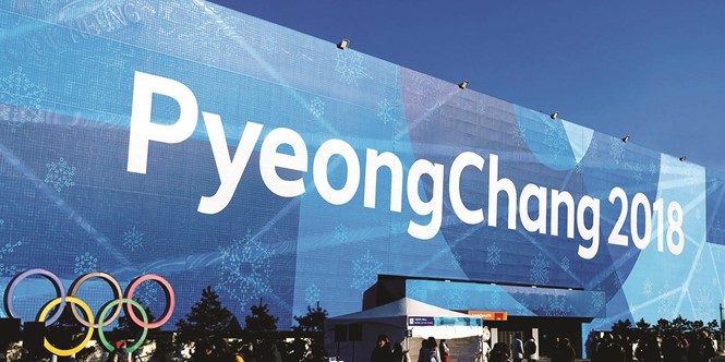
But the PyeongChang Winter Games were not only significant from a political level, but from a branding perspective as well. The official emblems use the Korean alphabet, Hangul, as the primary logo for the Olympics and Paralympics. Alongside those emblems is an Interbrand-developed identity implemented across the countless touchpoints required by any Olympic Games.
Interbrand’s Korea team looked for ways to symbolise Korean culture and tradition as well as showcasing South Korea’s potential for the future. Using a layering, a colour-coded system and relied on the angled lines of Hangul to maintain consistency and clarity across the brand system.
Payne says, “Overall as a principle, the Olympics wants to tap into cultures, authenticity, and so in both of the cases, when we worked on Sochi and when we worked on the Korean one which we did last year. It was very much about the authenticity of the culture and the country. With the Korean Games, it’s all around the unique geometrical language. So our Korean team has built a visual vocabulary around those structures which combined into hundreds of different snowflakes and the snowflakes actually say some of the words that are related to each of the sports.”
The considerations about a country’s future, its vision and its purpose all help to inform the brand of an Olympic Games. Payne says, “Everyone’s looking for the signals to be unique and identifiable, that’s why the visual language of the Games and the look of the Games is so important, because it is the unifying dress or visual representation of that country.”
With the 2018 Winter Olympics in the books, the world now looks to 2020’s Summer Olympics in Tokyo and further, to 2022 in Beijing. Already those organising committees are developing the brands that will be the focus of the world for a few short, but intense weeks.