'Good Fibrations' in yogurt packaging rebrand
Arla, the well-known dairy company that originated from Sweden in 1881, was introduced to the UK in 1990 with Lurpak butter. The company has now turned to Springetts Brand Design in order to have a range of fibre yogurts designed and launched in the country.
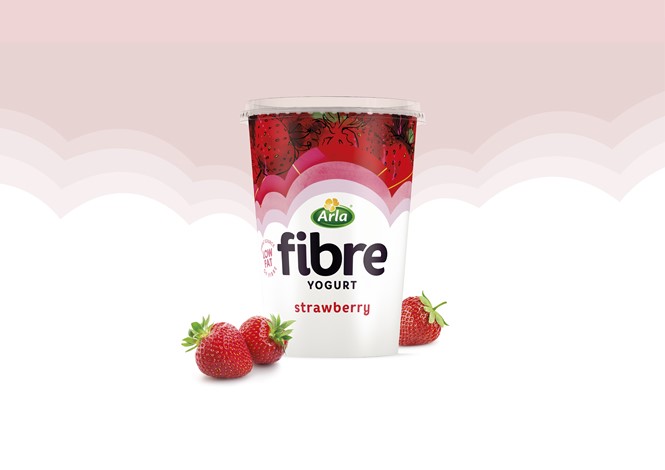
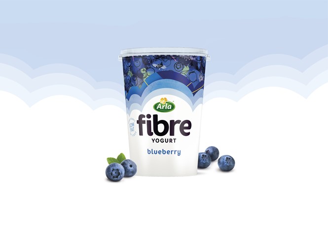
Fibre yogurt isn’t known for its exceptional packaging. Taking as an example one of Arla’s greater competitors in the fibre yogurt department, Activia, it is apparent that there is much room for improvement, considering the rather dull all-green tub the competitor is sporting. Arla saw this opportunity and decided to take it, making itself stand out with a minimalist design that is both modern and eye-catching to the consumers.
According to Springetts, it was “asked to create a design that shifted the landscape of how we see and eat fibre.” With that in mind, the designer agency came up with the idea of the brand essence ‘Good Fibrations’, a phrase that sums up in a catchy slogan the benefits of fibre both in mental and physical health.
Inspiration for ‘Good Fibrations’ came from the classic Arla cloud brand equity that was seen as a metaphor of ‘goodness within’ radiating outwards. The clouds portray layers of taste, flavour and positivity, with each layer signifying the benefits that fibre has on the body with the use of abstract fruit illustrations and patterns. The finished product has a bold, contemporary and fresh aesthetic, which counters the associations between fibre and the colour brown and instead creates a new visual conception for fibre that paints an ethereal image in customers’ minds.
For more from Transform magazine, follow us on Twitter @Transformsays
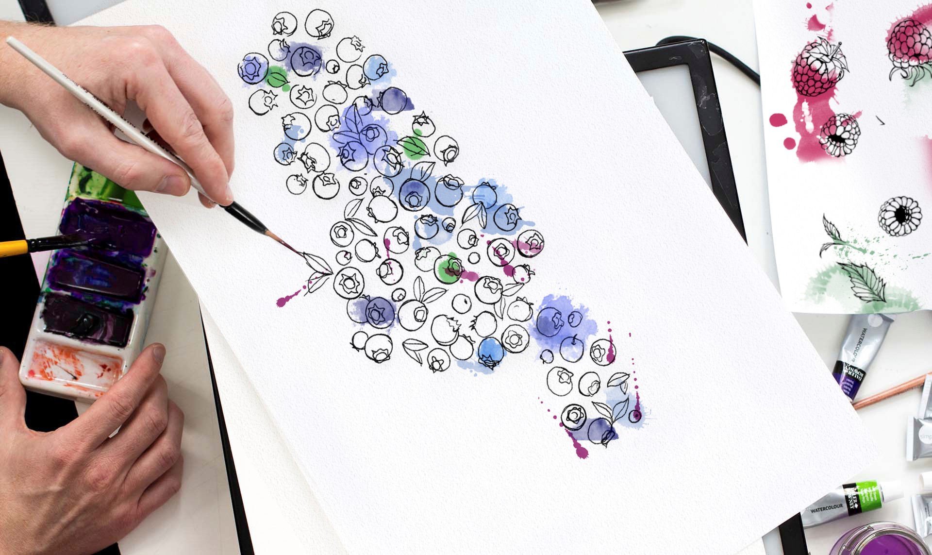
Packaging design process


